Monday, 19 September 2016

The Snazzies: Texturing Theatre Set

Hey Catherine,

Quite a bit to cover but I thought it was better dealt with all at once really just so you can think about it over the next day or so and show it to whoever you wish. This first post is about our set to be honest your not going to be seeing much of it cuz I always planned for us to be mostly in the Slinkies faces... I know you mentioned grunging on the phone but I have spent more time on this then I should have so I think we should leave it.

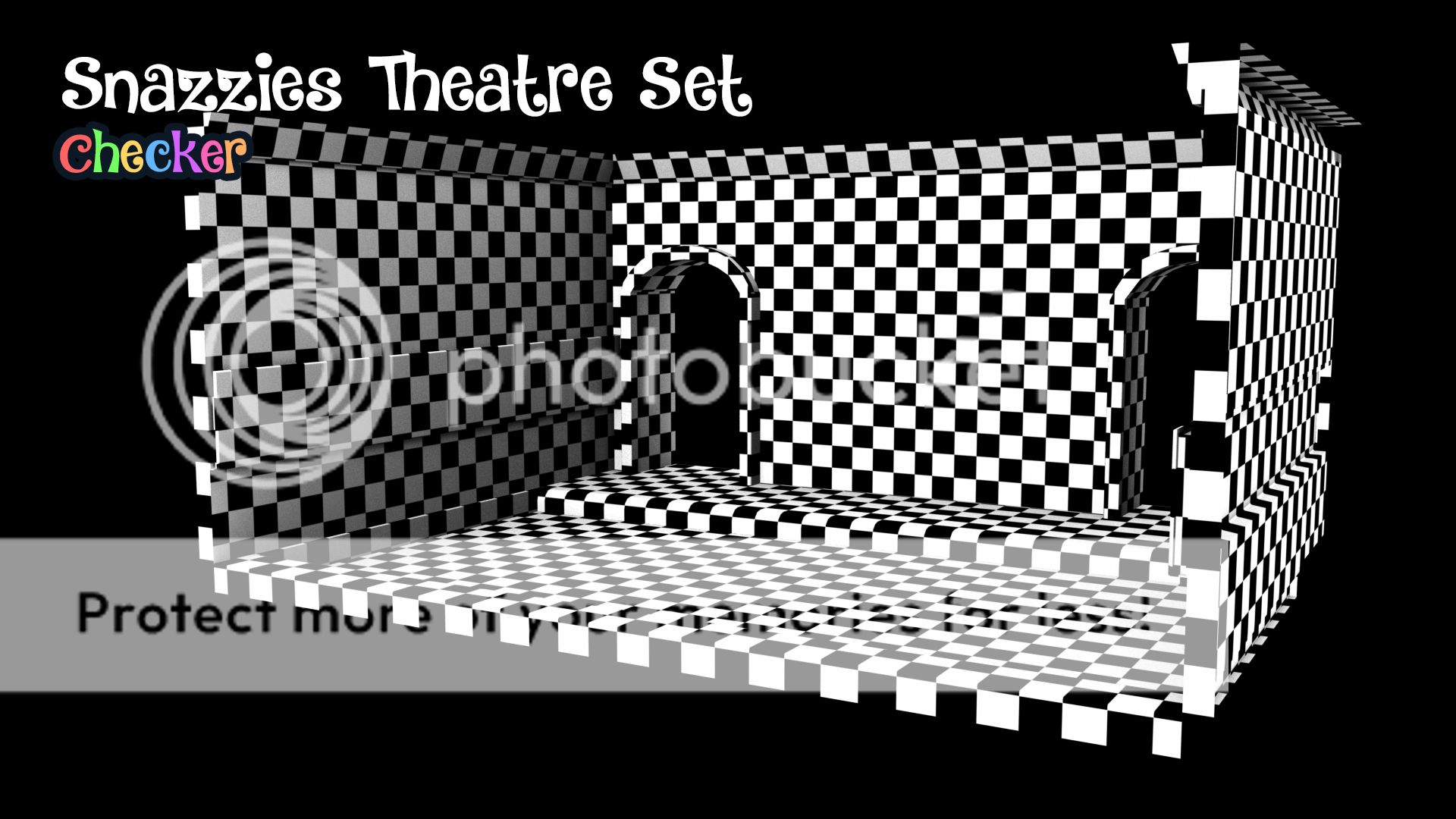
Well here is the standard checker map to see how the textures have gone on.... You should know what this is by now. Basically even spacing for each checker means there's no distortion on the faces of the geometry which means when we lay textures they lay EXACT... Without bumps or any nasty tearing anywhere... The other side doesn't matter because we don't see it hence why its got no opposite side... It looks pretty good to me.

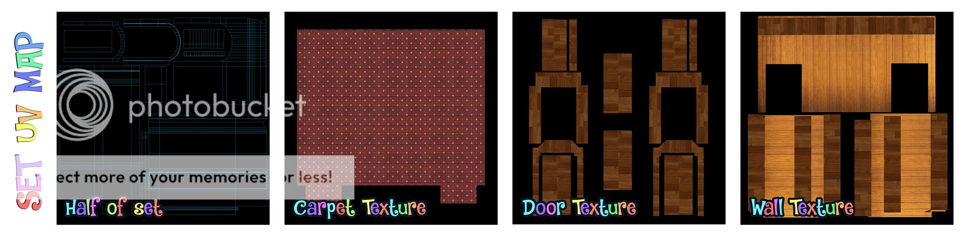
Enter our set UV maps which from this angle look pretty basic (because they are)... I didn't account costings for a set because I wasn't originally going to make one. I was just going to make a very crude box but I wanted it to look nice for the animation... hence why there is not much room for tweaking. If we had added a proper environment to your costing it would have been easily another £500.00 either way you have done good here.

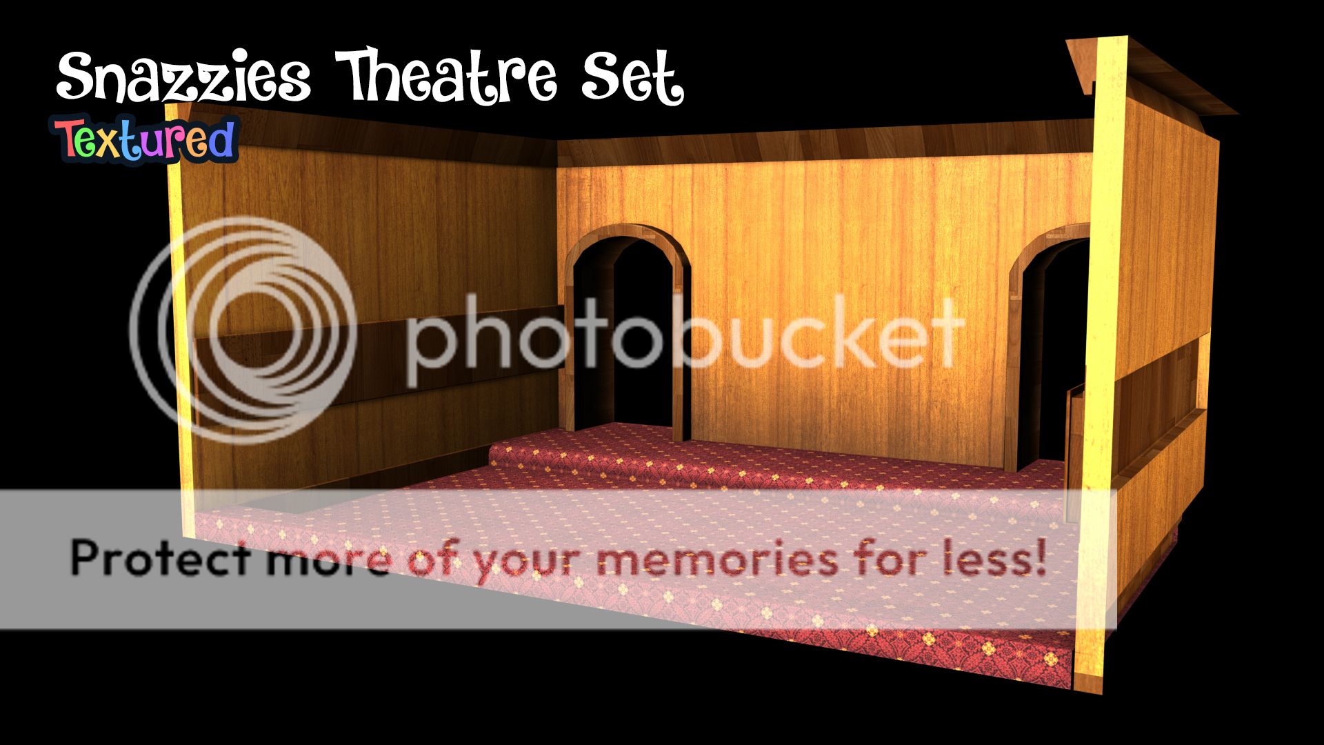
As you can see it laid out really nice on the basic geometry made for the set. I ask that you ignore the side walls... They are there to box the light in the room not so much for decoration... The focal point of this animation is in front of and behind the Slinkies as they chat. The floor is a standard theatre carpet and for walls I made wood because this setting felt more like a shed in a dump... I hope I got that right anyway.

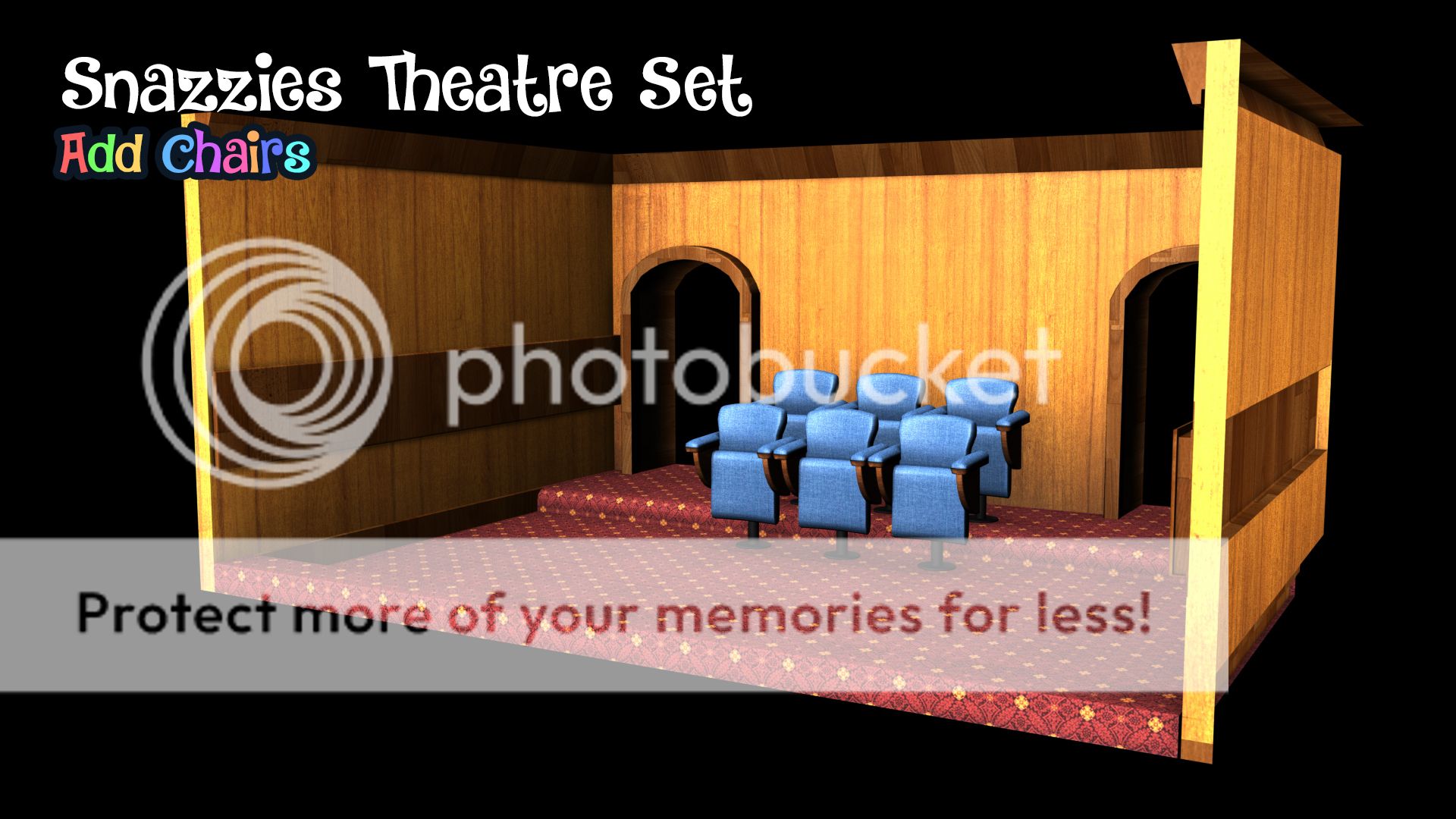
Enter our blue chairs (your choice :) they set off quite nice against the yellows of the wood and the reds of the carpet... its making me yearn for a bit of green in the scene but now I'm just getting a little carried away. Its a really basic setup... to do it properly we would have made everything in great detail from scratch... Its quite a costly exercise but when you see the end result its usually an amazing sight.

Anyway that's one post down, I hope this gives you something to show people/think about.

xXStItChXx

Wednesday, 14 September 2016

The Snazzies: Crude Theatre Set

Hey Catherine, Another quite substantial update... I thought this was going to take longer but I had a good wind tonight so its more or less there... Its perfect for all front end shots (the shots of their faces). I will add a screen and develop the front more (deleting the back wall for the back end (silhouette screen) shots. Ill probably get stuck on that tomorrow... You can probably tell from my email that this has been another late one...

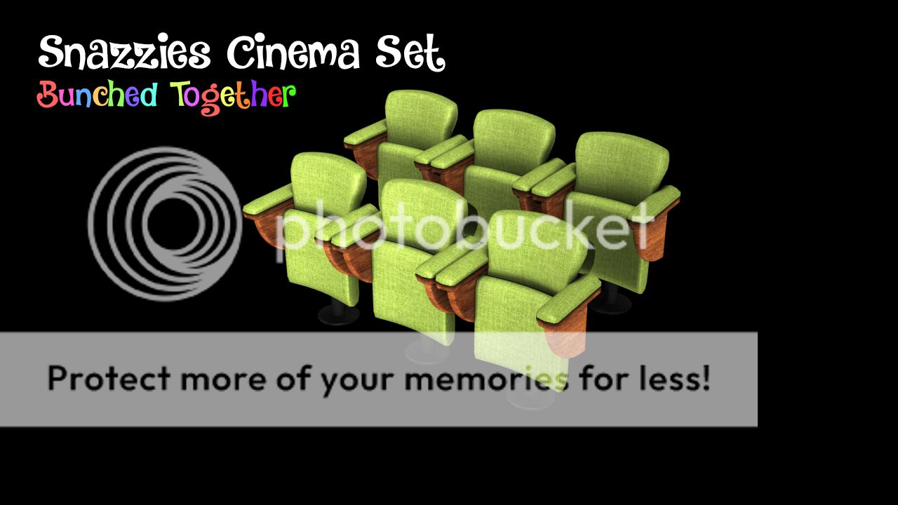
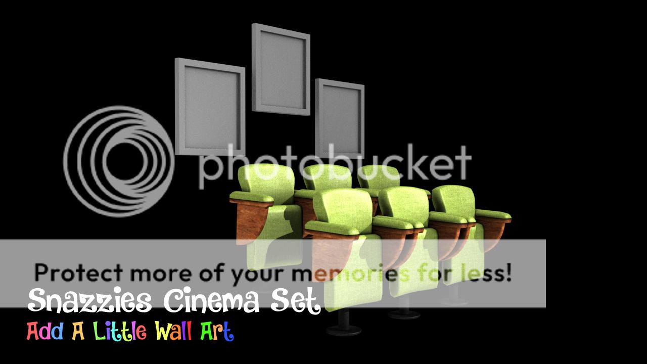
Having not heard back from you about your preferable colour I just dumped in the green ones for now until you have made a decision on the seat colours. Anyway I bunched them together (pictured) the back 3 elevated a little higher then the front (for obvious reasons). I don't think you should need more then 6 chairs we can just pretend this is a home cinema or something... Render times as I said for a big cinema would be longer.

Next I thought id add a little wall art... One of the things you don't want is a bare set. You cant just put these characters in a box if we are to have them quite well lit so we have to consider how the cinema looks around them... I'm not saying we add a loads of things but stuff like skirting boards are so commonly overlooked by people looking to knock together a quick environment... It makes a difference.

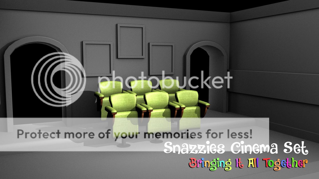
Then we create our set... I built this around the other objects it just made it easier to visualise. As you can see borders around the entrance ways (there are usually 2 in cinemas) I put an upper and lower skirting board just to make the wall a little interesting. I also added a protruding wall feature I imagined its where cables would go but anyway it just makes the scene look less empty. You also have the step that raises the back chairs.

Next we bring it all together (pictured above). We can use the lack of a front screen to look back at the Slinkies as they natter. The roof and doorways can be kept empty unless you want them to be closed but id recommend keeping an open roof... We want as much range as we can get from the front camera. Please also bear in mind that I have yet to texture the set... its lit by occlusion at the moment... Textures will make it better.

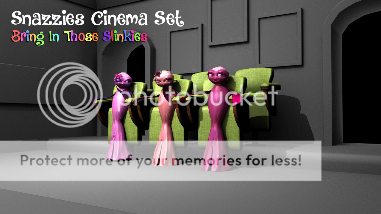
Next I brought in the Slinkies just to see how they rendered with the lighting situated above at an angle... I wanted to try a few shots just to get a feel. I moved the camera to the opposite side of the light so we could appreciate that lovely shadow. It looks really good from more distant shots so maybe that's something to bear in mind. It will look 20 times better once the set is decorated and the wall art has posters in it...

I did a close up render using the same light setting but I wanted to get closer and get my "album cover shot"... Seriously it looks like they are on a bands album cover lol. I think you will agree that its all coming along nicely here. Having those minor details in the background keeps the shot interesting. It will look miles better when we add textures the shot will suddenly come alive. It just doesn't look boring and that's key here.

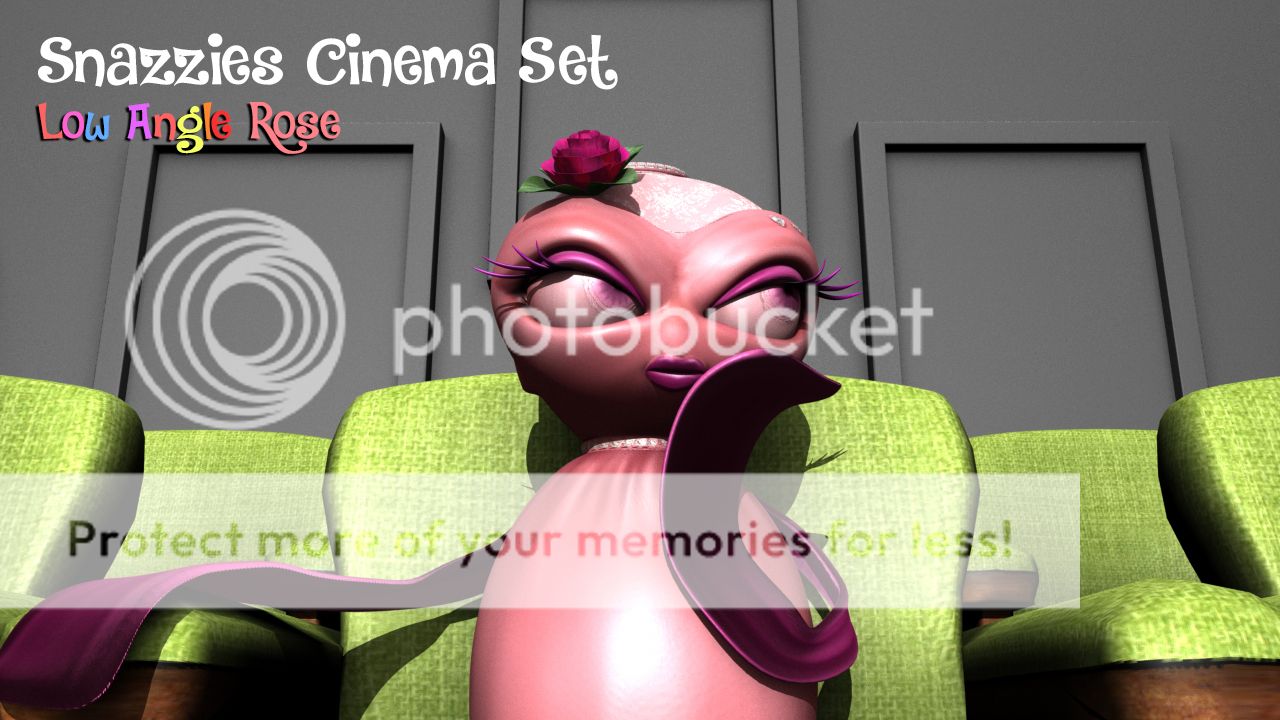
I did a few renders to play briefly with camera angles... The shot above with Rose is on a low angle creating a kind of superior prescience... It also has the awesome feature of kind of showing the pictures behind the Slinkies which is just a nice bonus. I did these just so you can look at the Slinkies one on one really... See if it helps you visualise anymore how you want things to go down. You can think about it while I'm texturing.

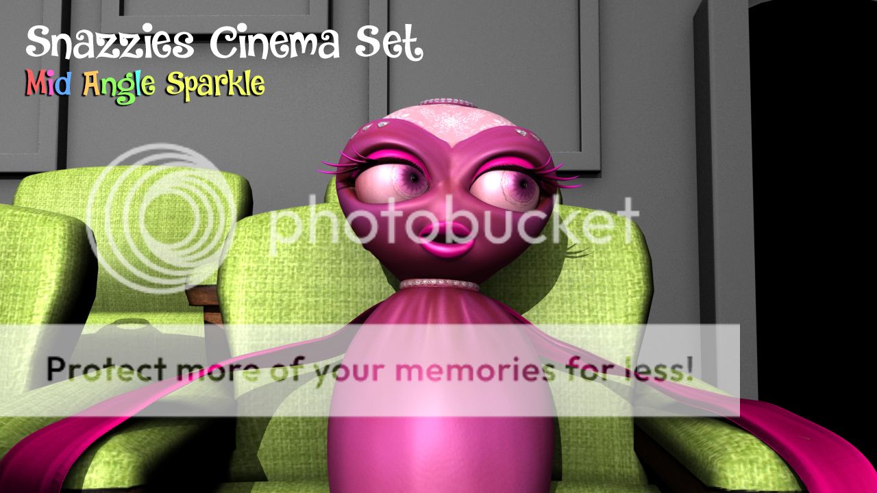
The shot with Sparkle is a bit higher not so low more of a close mid angle. Its less superior. If you can be thinking about these things Catherine in case there are any shots you want specifically for certain sections let me know... I know you told me to go with my gut and I intend to but just in case there is anything you were thinking about. The set pretty much allows us to look anywhere because we have nothing to hide.

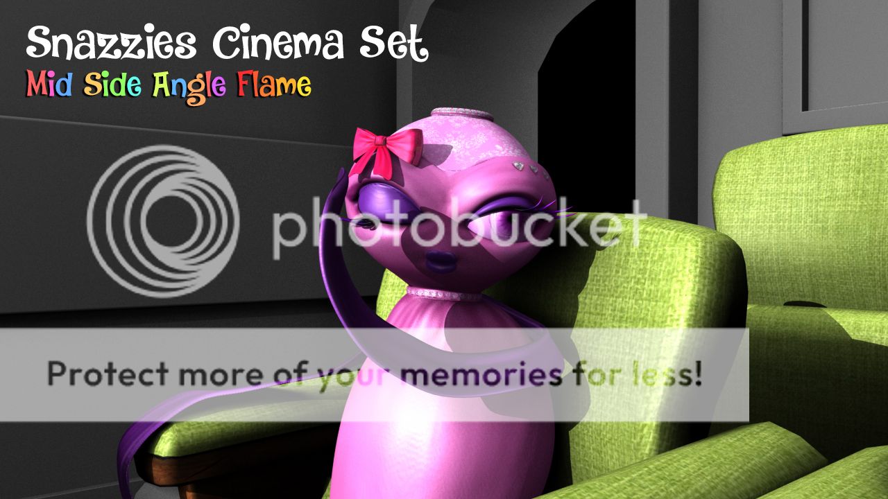
Last but not least we have Flame which due to the angle of per pose I did a mid angle shot across the chairs as opposed to face on like the other two. This again is just to give you an idea of the camera range. It will save on render times to keep it shoulder height but we could probably get away with the odd shot or two. I know you also may want a few of them together and we wont find that out until we kick off a render.

Anyway sorry for the mouthful post but I wanted to keep you apprised...

xXStItChXx
The Snazzies: Theatre Chair Textured

Hey Catherine, Sorry for the delay on this the UV mapping took a little longer because I wanted to minimalize the stretching of the textures... Happy to say this chair is probably one of the best UV mapped items I have done so It certainly should compliment the Slinkies well... I was going to do a normal map but then I thought it was a little overkill, cant spend too long fine tweaking anyway. I did however managed to make a few variants for your viewing pleasure.

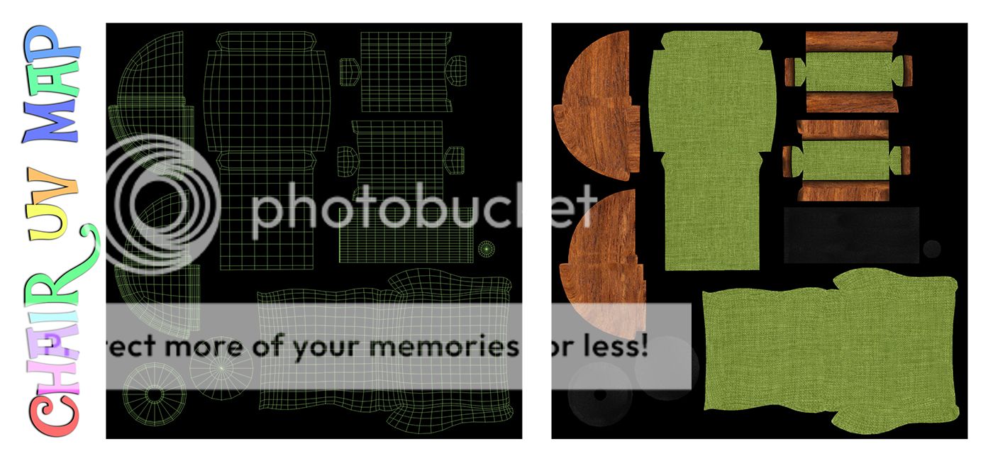
Started with the standard checker map it allows you to see if there is any distortion in the UV and if there is obviously you have to spend longer ironing it out. The fact that this was an object made it a little easier however. Anything that has a curve is a little more of a nightmare to unwrap mainly because the goal of a uv map is to keep things ironed out and even... A curve needs to stretch outwards and isn't very logical.

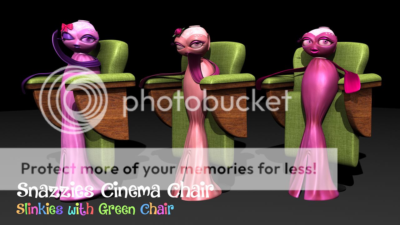
I then threw it in ZBrush just to give it a coat of colour really. I really liked the Green and the wood finish under the arms... I wanted the base to be kind of like a black metal (they are usually oily). I don't know to me it just looks the part... I actually like the green too but I know we talked above looking at a few variants so I have done that below too. Just let me know which one you would prefer to see... I still like the green.

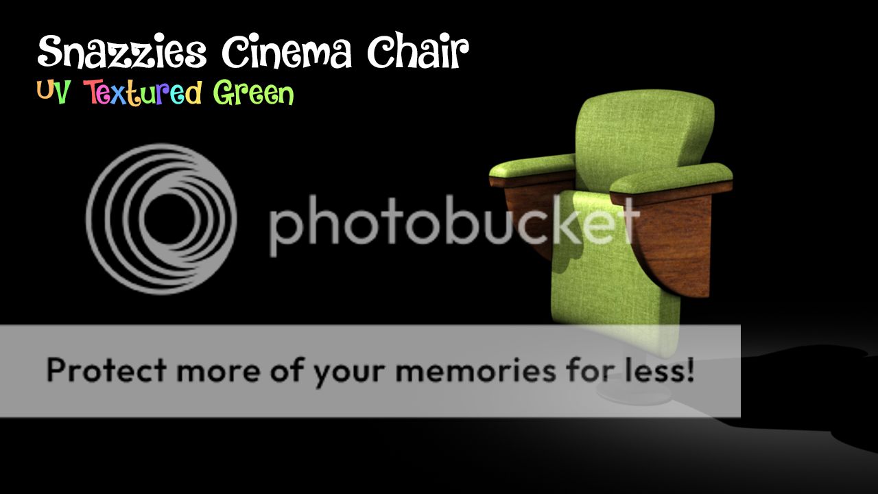
The image above shows the green mapped onto the chair with a bit of basic lighting and ambient occlusion within the texture node. I am actually chuffed with how its turned out considering the painting side was pretty quick... The thing that took the time was the UV mapping which is no surprise the technical shit usually takes 20x the creative shit. I did a group render with the green too just so you could see how it works with them.

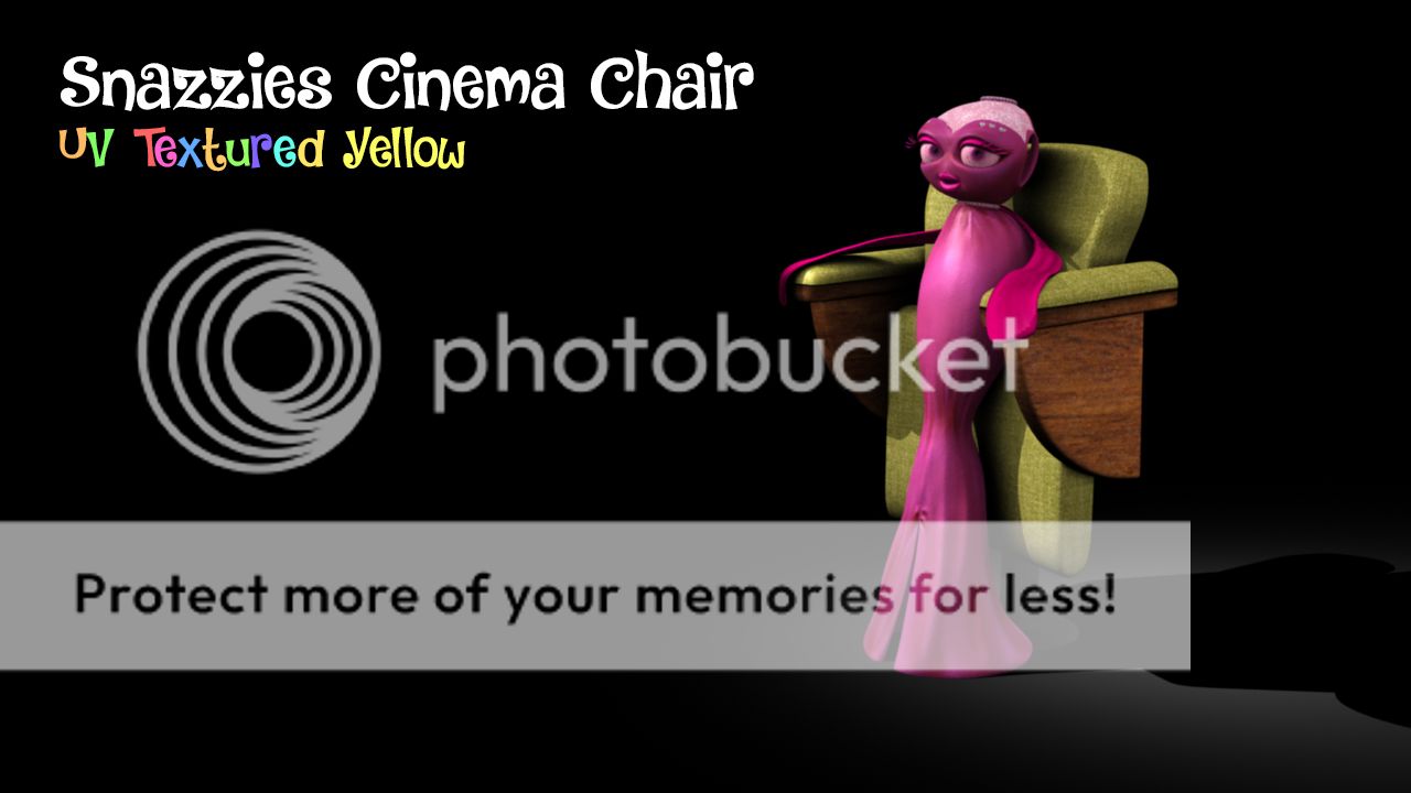
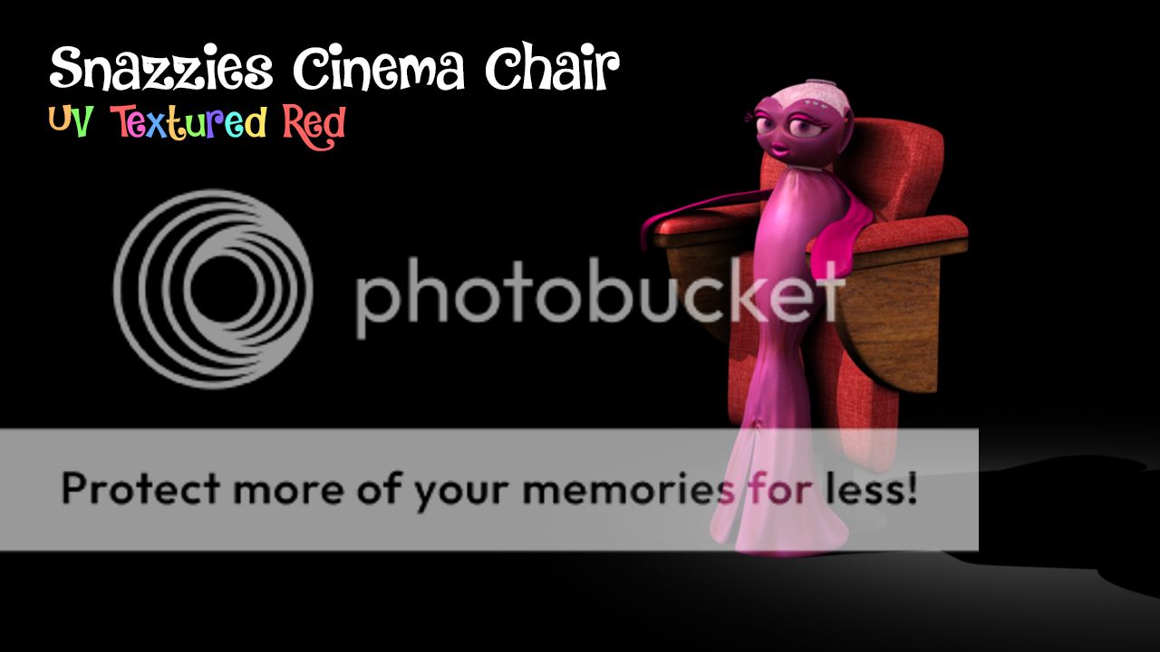
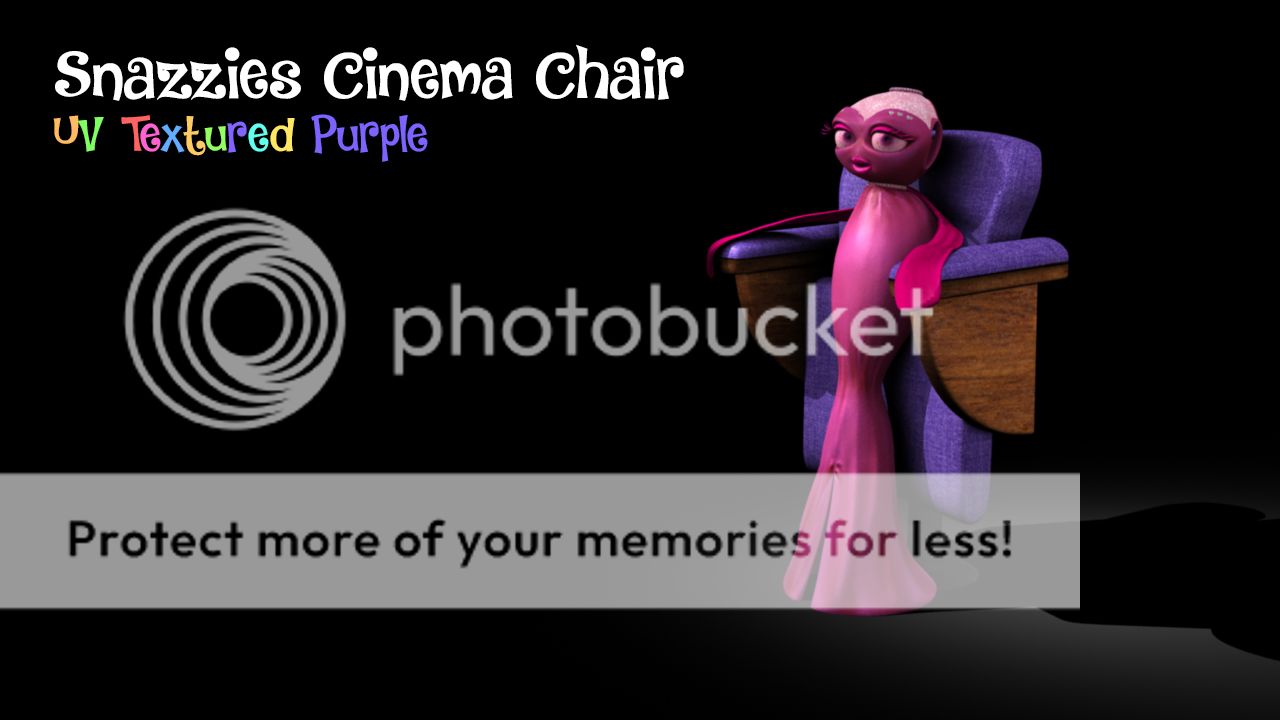
I think it looks pretty good but again its completely up to you I know colour is an important thing to this concept (you love your wackiness) the blue version I did (below) is also quite nice but I thought id leave it to you to throw your verdict. The wood finish for me is a very nice touch everything is plastic nowadays and I don't like it... It breaks. Anyway if you don't like the green check out the 4 other colour variants below.

Click the images to enlarge (as you should know by now anyway) I didn't render with all 3 you just need one of them really to get a feel. Just get back to me with which one you prefer I could have gone crazy and done loads but this is a fairly low priority thing... The key here is the animation. Anyway as always I hope this post has been a little informative and if I'm doing it right a little entertaining too lol..

xXStItChXx
Monday, 12 September 2016

The Snazzies: Slinkies Cinema Seat

Hey Catherine,

Its been a while since I have posted on here but I think we have gotten to a place where the old will do us a favour... Besides I do miss doing the odd blog post, its kind of become a part of me. Anyway this post is about how I see the Slinkies sitting in our infamous cinema scene. I started by making a basic chair but then I had an idea... I still want them to sit even if its a lean... Lets go through the little journey.

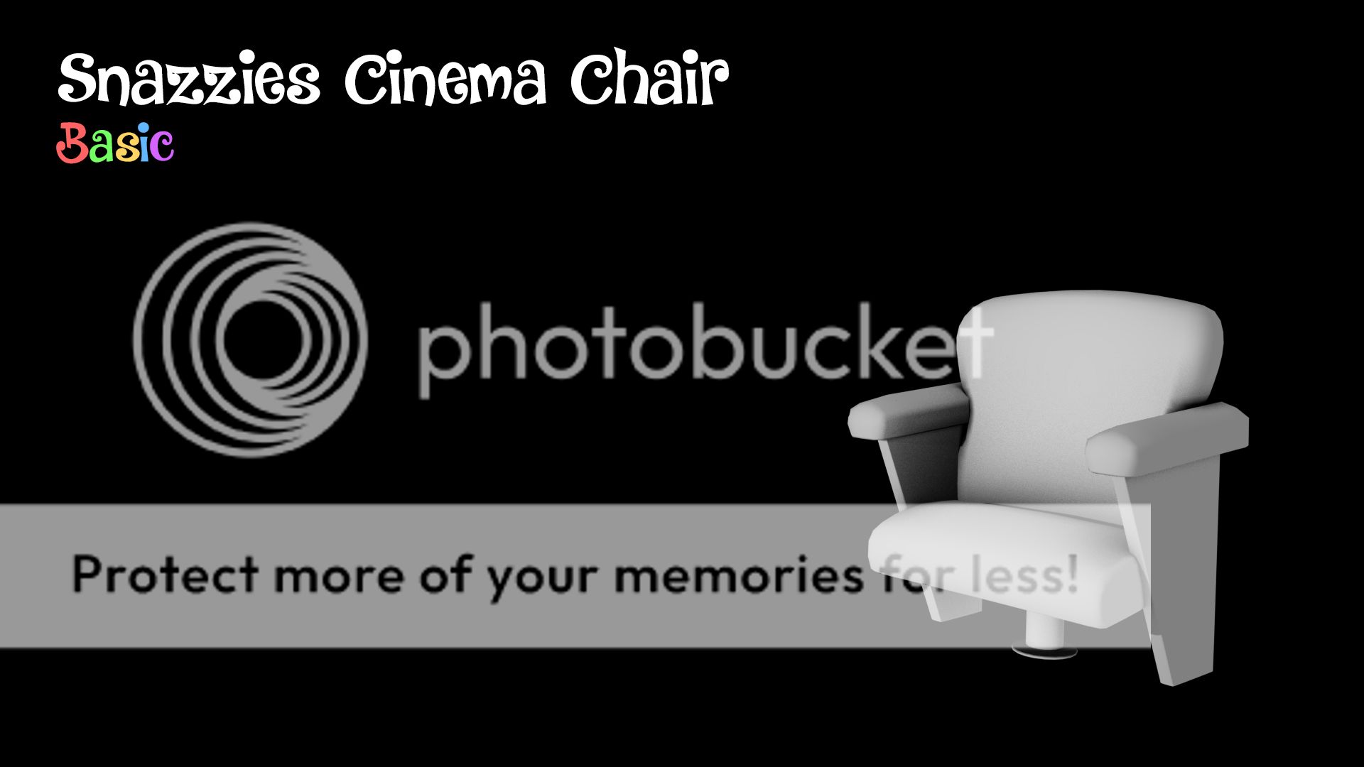
The image above shows the basic chair... it started as a port from our cinema scene but I cleaned the geometry up smoothed it and changed a few bits here and there to make it more like a cinema chair. Long story short its no longer low poly. It looks okay but then I had a little bit of an epiphany when trying to sit the Slinkines onto it (causing their dresses to bunch and look quite crap). I defer your attention to the next image.

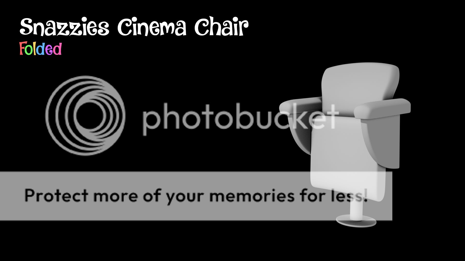
Make the chair folded (as it would be if it wasn't in use) this creates a little ledge for the Slinkies to lean into allowing them to stand and sit/lean slightly on the little ledge of the upper seat. It also works quite well with scale (if a person was in the dress it would be right). In my mind this would work perfectly for this but I wanted you to see my thought process... We need to start this somewhere... and guess what we have started.

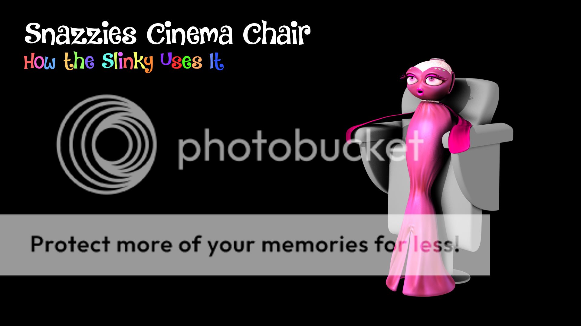
For the above image I sat Sparkle in the chair and did a sole render with a basic light setup and some ambient occlusion in the chair to give it a little depth. Obviously the chair would have some basic texture but I did this just so you could see how the Slinkies would use these chairs. I hope you like this it provides us a perfect opportunity to "seat" the Slinkies without them looking rubbish by bending them over too far.

I did a small pose for each slinkie in their chairs I don't see the range of movement going to the feet but we can do quite a range in the upper quadrant of the body as you can see from these 3 test renders. Obviously to situate all 3 I am gonna have to play with the lighting a little more but one at a time we can stick to a basic setup. Next I will put them in a basic scene with a floor and a back wall... Ill knock up a basic telly in case we need it.

Anyway I hope this is a good idea... I am going with my gut here and my gut loves to have some logic to grab onto. In my opinion fantasy works better if there is some logic to it... it almost makes things more believable. Hope you enjoyed the post.

xXStItChXx
Friday, 28 August 2015

The Snazzies: Saggy Hitch & Rocko BG Poses

Hey Catherine,

I thought I would finish this thought with a little post just so you can show any passers by with ease the poses in action. I thought I would keep this just for the textured versions only mainly this is to show what I can do beyond the initial pose concept. Anyway I created these textured versions with a simple background and in some places added some sheen or drop shadow. Its essentially making renders into concept art.

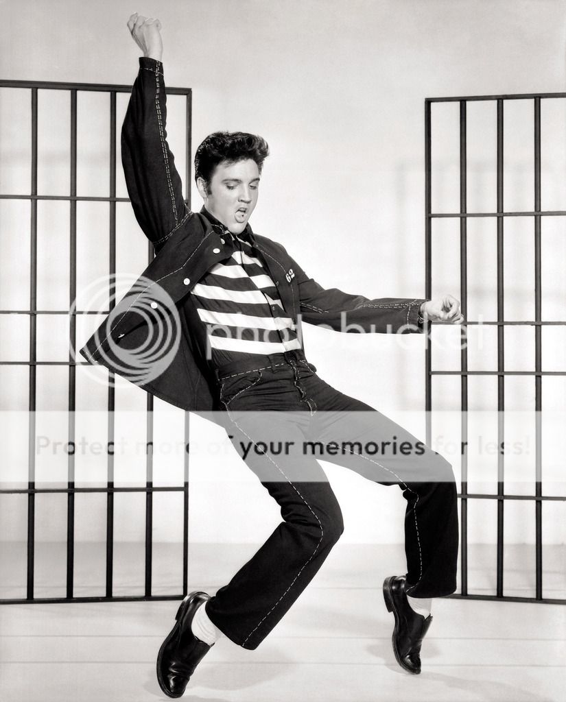
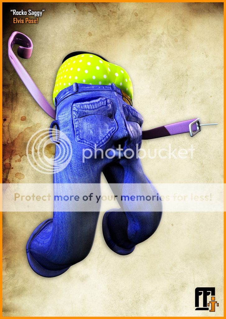
The first pose is a Spanky Elvis jump pose. In the Saggies case I had to elevate the legs a little more to get the knee bend I wanted. This makes it similar to the original reference. I created the closed fist in the right hand by coiling his belt arm. The closest leg is at the end of its foot roll capacity as is Elvis's in the reference. Elvis's eyes are also looking down/closed closest I could get was closing his eyes.

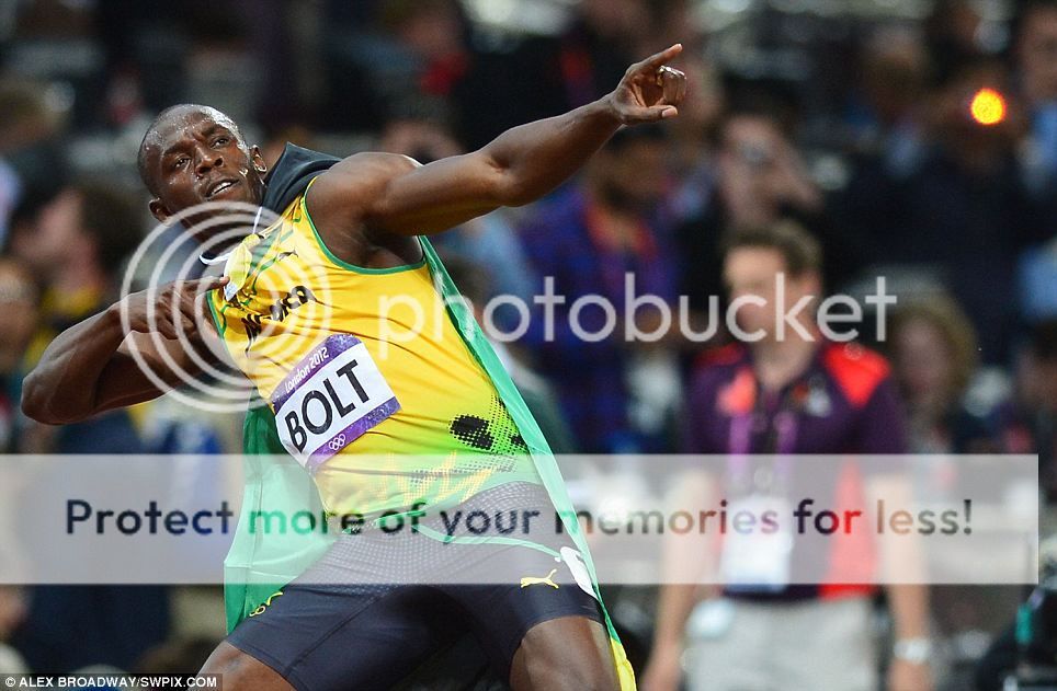
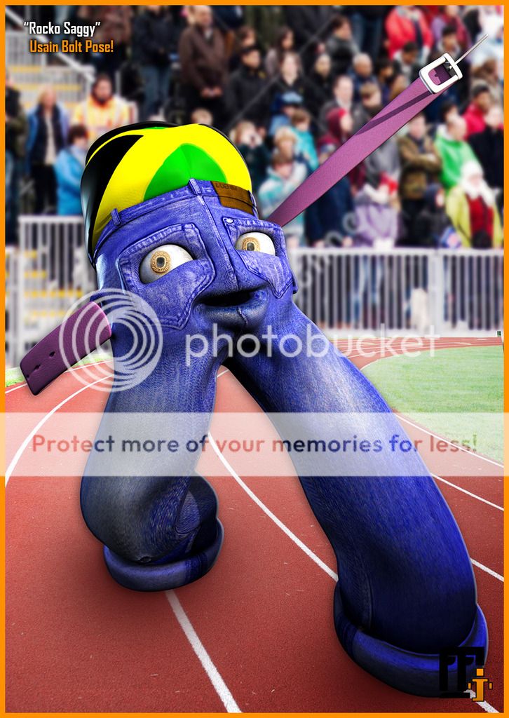
The second pose is based on the Olympic athlete "Usain Bolt". The difficulty here was finding the correct orientation for the waist and trying to simulate that within the constraints of the Saggies belt arms. I also wanted the arms to line up in the shot which meant moving the composition of the shot to fit the correct pose angle. The arms as always are a difficult thing to navigate due to their gradual default rotation.

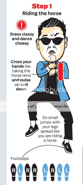
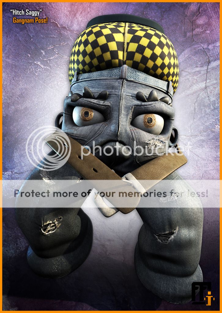
The third pose is based on the internet sensation "Gangnam Style". This pose pretty much fell into place until I got to the length of the belt arms. It might be recommended in the future that we come back to give the arms additional functionality. The pose required close examination of the arm rotations. I adjusted lighting and texture detail of this pose within Photoshop to make it punch out beyond the basic Maya mental ray render.

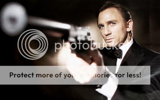
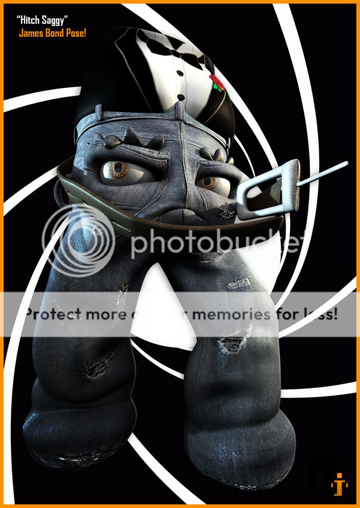
The fourth pose is... you guessed it "James Bond". This pose was relatively simple to create with the main issue being the arms eclipsing the Saggies face. In order to angle the gun exactly like the reference the arms would cut the face from the shot. Instead I opted for a lighter touch to keep the face a pivotal part. The background was dropped in from a google image search. The tux underwear was added as a gimmick after the bolt image.

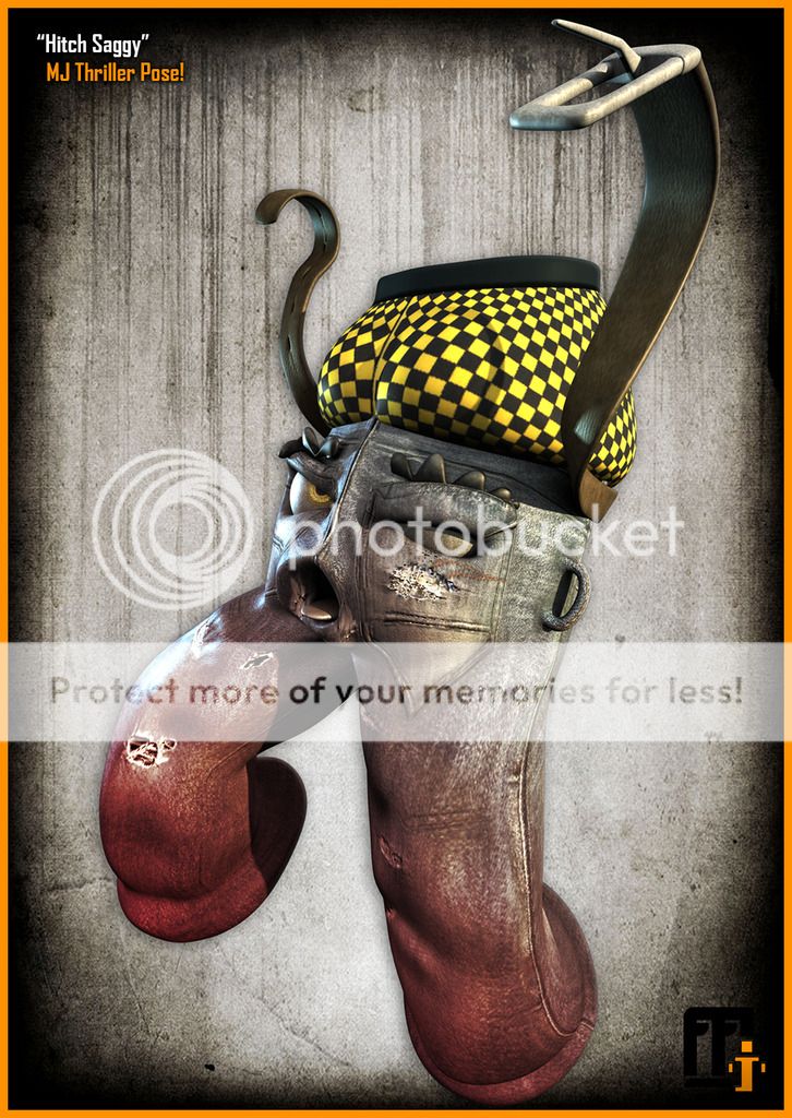
The fifth pose is Michael Jackson's thriller zombie pose. My only concern with this pose is it might be a bit more zombie then an iconic Michael Jackson pose, that being said its still a valid idea. The difficulty here was once again with the arms which I had to temporarily lengthen to achieve the desired result. I moved one of the eye controls out of sight so it would look like he was missing an eye. I also utilized his tongue.

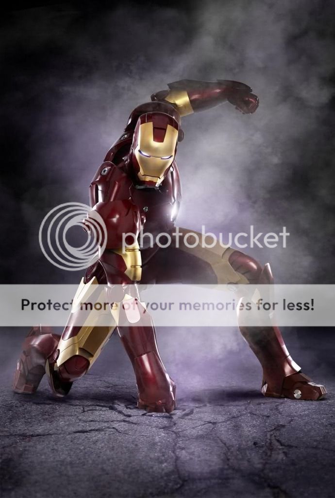
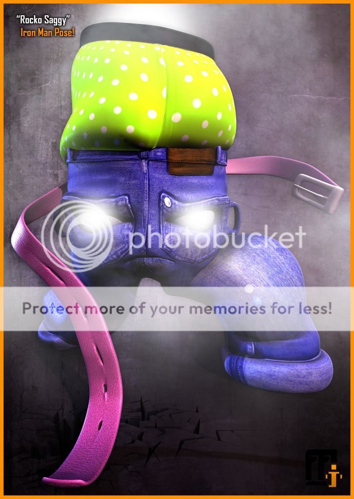
Last but not least is the Iron Man Pose. My only concern with this one is I believe I turned the belt arm the wrong was so it doesn't look like a fist impacting the pavement. There was a lot of retouching done in Photoshop particularly the smoke effects and eye auras. I did my best in a brief time to imitate the details in the iron man reference. There was a difficulty moving the back leg into the correct position while keeping the knee bent.

I hope that you like these Catherine, I did have a bit of fun making them I have to say. Lets hope the group shot we do when we meet will come together just as well. I think the boxer costumes could work from time to time, just food for thought.

Ill talk to you later!
xXStItChXx
Saturday, 22 August 2015

The Snazzies: "Rocko" Saggy Model Complete

Hey Catherine,

Well we are at the very last Saggy "Rocko" and I have to say it feels like forever ago we started this its been quite a journey ha-ha. The characters are all very appealing and seem to have their own quirks which is great. We will continue to communicate this on the animations but even and a very basic level they are their own characters which is great. Its not easy to make the same kind of mesh unique so its good to feel that.

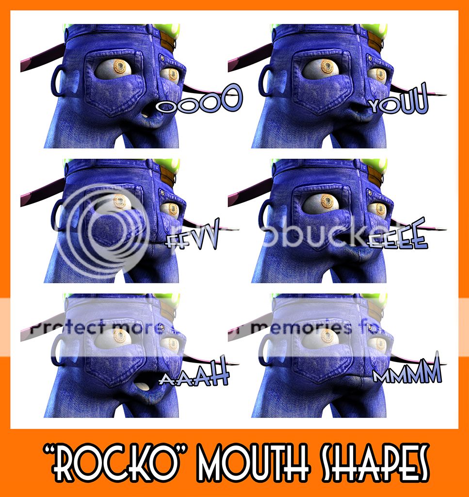
The mouth shapes above again communicate the vocal phonemes the character will be using to talk. I have tried to separate them slightly but there were some which have to remain very basic to communicate accurately. Again I won't know for certain if these work without testing them with audio. I plan to do that before we get stuck into the animation. Its best we find out before we are knee deep in an animation so I will get that going next.

The video above are Rocko's expressions. There was a slight issue with his default mouth being so close to a smile already. This is why its always best to use a standard bored expression as default so then you can turn on happy. You may wish for us to create a "standard" mouth shape so you have that option. I know Ross did it so the character would be different but everything starts with boredom you can create a range of expression after.

Last but not least is the Rocko motion test. I worked a little harder on this one trying to finesse the movement a little more within my 100 frame boundary. I couldn't though (I went 10 frames over). This is why the motion is fast, I was trying to do more with less. Still its pretty fun to see him moving a little more realistically. I worked harder on this one then the basic initial "Tim/Hitch" and a more then "Stitch" too. I hope you like it!

Well that brings the Saggies to a close for now.
3 down!! We are nearly there!!

xXStItChXx
The Snazzies: "Stitch" Saggy Model Complete

Hey Catherine,

Okay the Stitch Saggy is complete from my end I hope it is acceptable and I would like your confirmation via email that all is good with it. I have essentially duplicated the same videos and image for each Saggy so you can give an accurate approval of the work carried out. We like to know that you are happy with the results so we can move forward with the next steps. Apologies for the crude animation its just test movement.

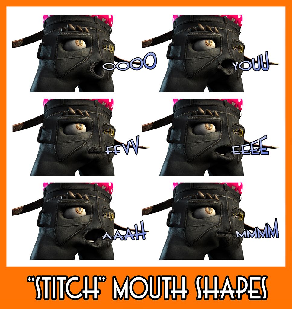
The image above are Stitch's phoneme shapes which may slightly vary across each Saggy as to individualise them. This was one of the reasons me and Ross were hoping to divide them so each would be unique so instead I had to simulate it on my own. Again I hope these are all acceptable. They were not a quick job as I'm sure I told you Stitch has a little problem but we can navigate around it so don't concern yourself, we know what we are doing.

The next video is some expression roughs as before. There is a slight issue with the Sad expression and the eye blink. You can get this on occasion with face shapes sometimes you exaggerate the expression and it eclipses the boundary of another control. I'm hoping it wont be an issue but if for whatever reason it does we will be ready to create an alternative sad brow/eye shape. Other then that everything has gone smoothly so onwards!

Last but not least is my run of the mill 100 frame movement test. Apologies for having to make the frame counts so brief but it takes literally an entire evening just to get 100 frames. I just want these videos to demonstrate the potential of the character. You will see that more as we get stuck in to the animation going forward but this is just for your confirmation of the characters as they are. Confirmation is how I gauge our success.

I hope you like these posts (1 more Saggy to go!!)
2 down!! Woop Woop!!

xXStItChXx