Hey Catherine,
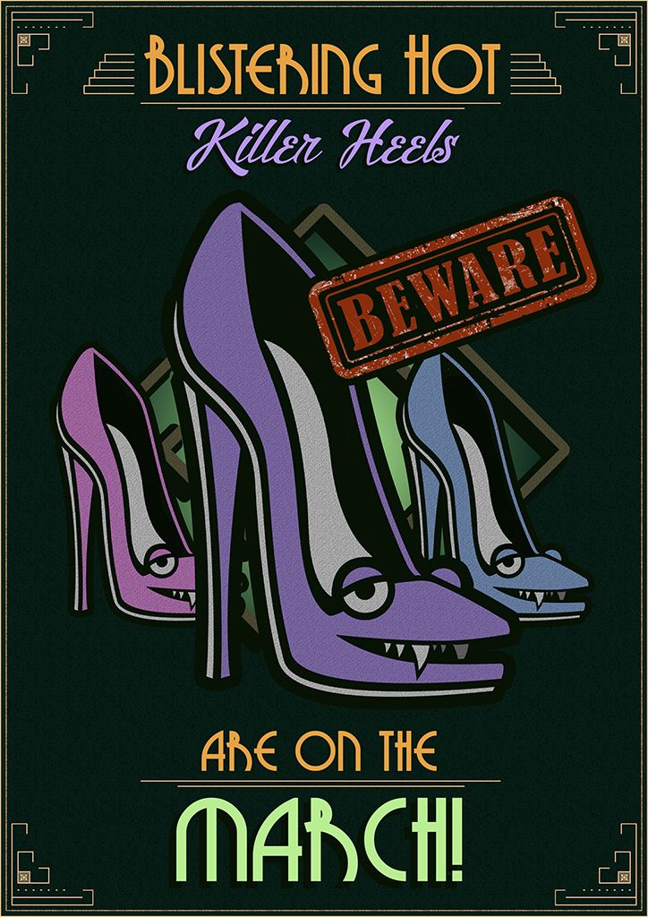
This is the first of the two posters you commissioned me to make extra this is the one with the words "Killer Heels are on the March". I went more towards a muted green feel with the core colour on this one just to make the background more interesting. I think you will find this one more colourful. I also copied the design of the shoe more closely based on the concept art you gave me. The only thing missing is the eyelashes but this works without.
Voila this is the design in full I hope you like it. Originally I had only one heel there but I felt I should add more because its Killer Heel"S". The font is understated but it I think you will agree that it works in the context of this image. I added the "Beware" graphic as an extra I cant put my finger on it... it just felt more right with some kind of warning. This is also more in-keeping with the pop art style we have had on the environment outside.
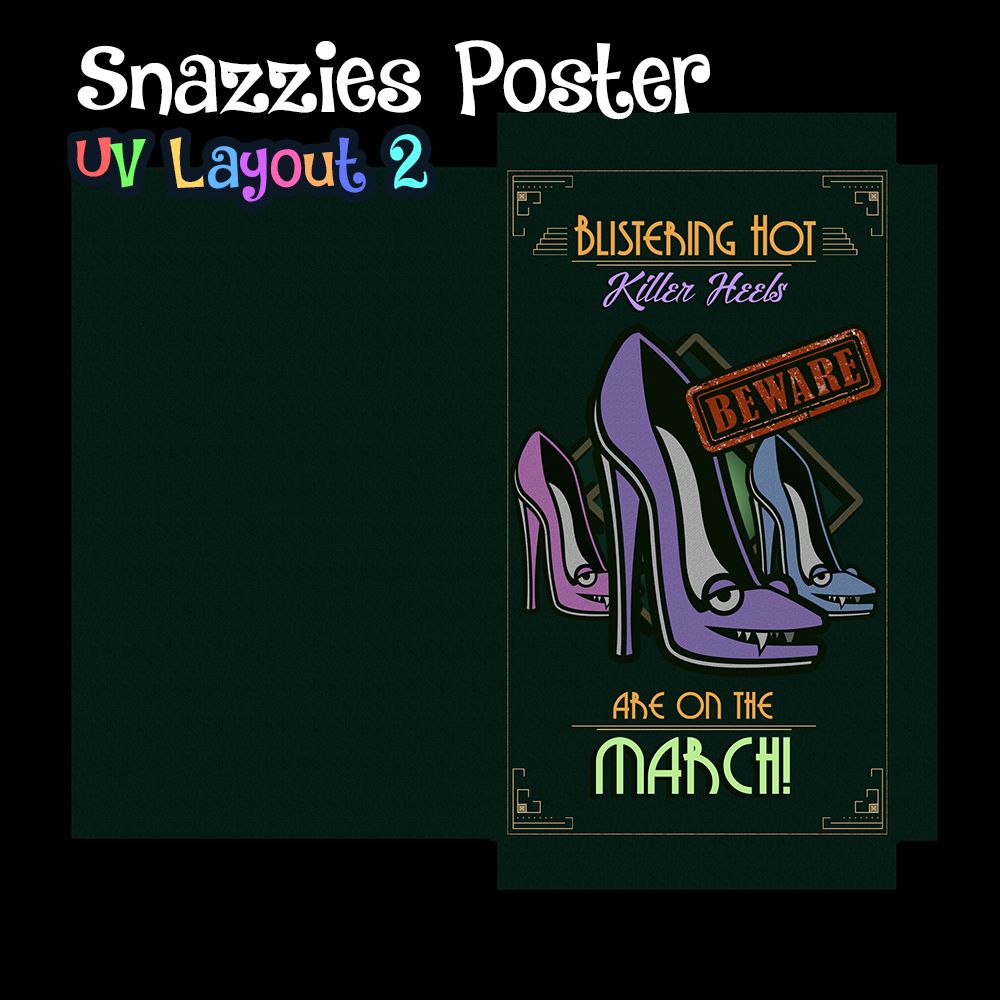
This is the UV layout of the design render to be thrown in to Maya as a texture on our wall frame. It is missing its double border but the UV didn't really work well with it in the scene so like the original one I kept it out for now. You cant really tell but there is a fabric texture to this image. It has an underline cotton finish and the background has a stretched texture... It makes it less shiny and more grounded in reality.
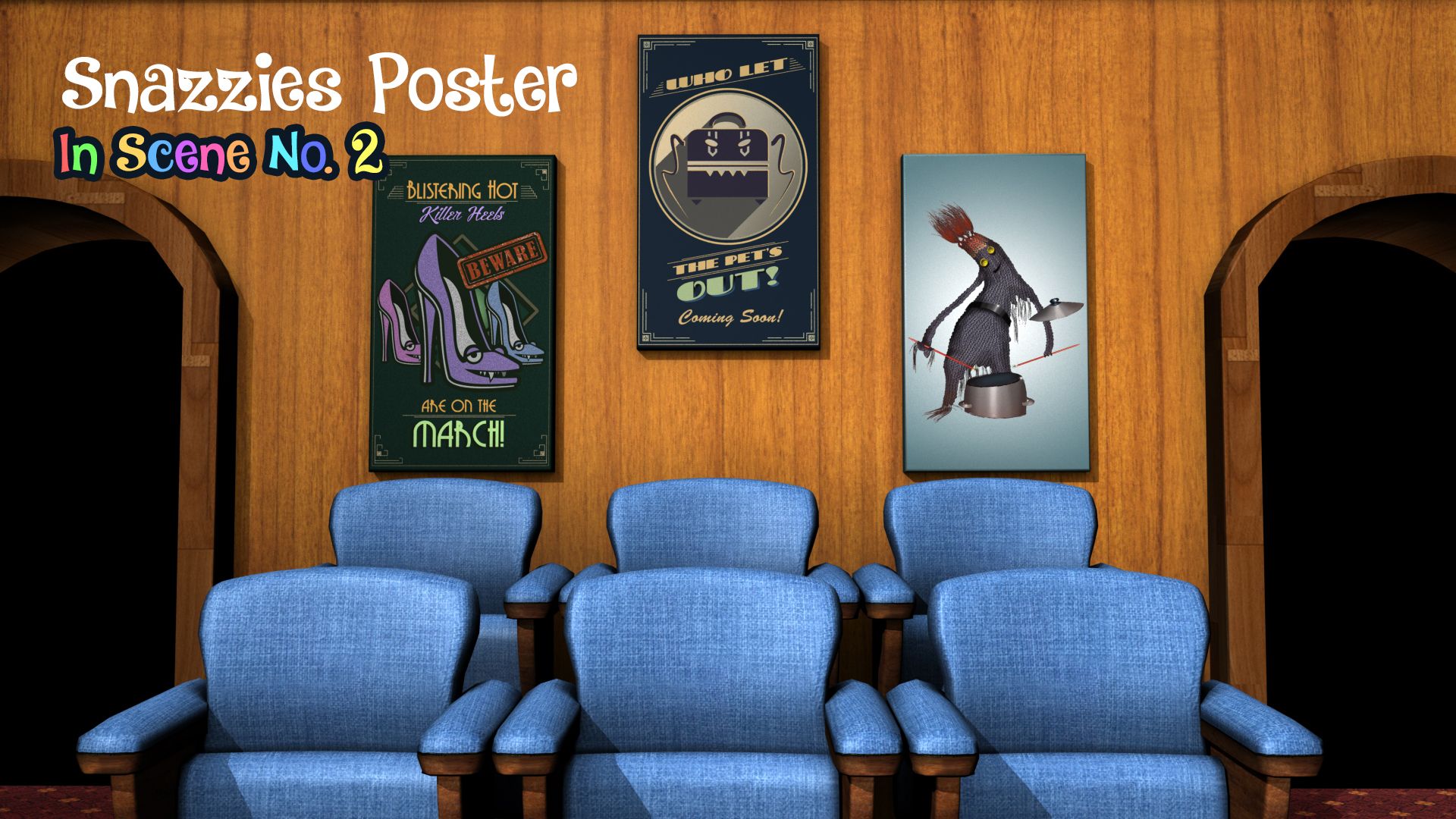
This is how it looks in the scene next to the other poster design... I hope you like it! I think they compliment each other quite nicely I think the next one I make will have a kind of muted red background kind of in the same vein as these two. I will do my best to implement some elements of your characters but they have to be kept understated which means not too many bright colours and we keep to vectors/minimal colour pallet.
Hope you like it!
xXStItChXx


No comments:
Post a Comment