Hey Catherine,
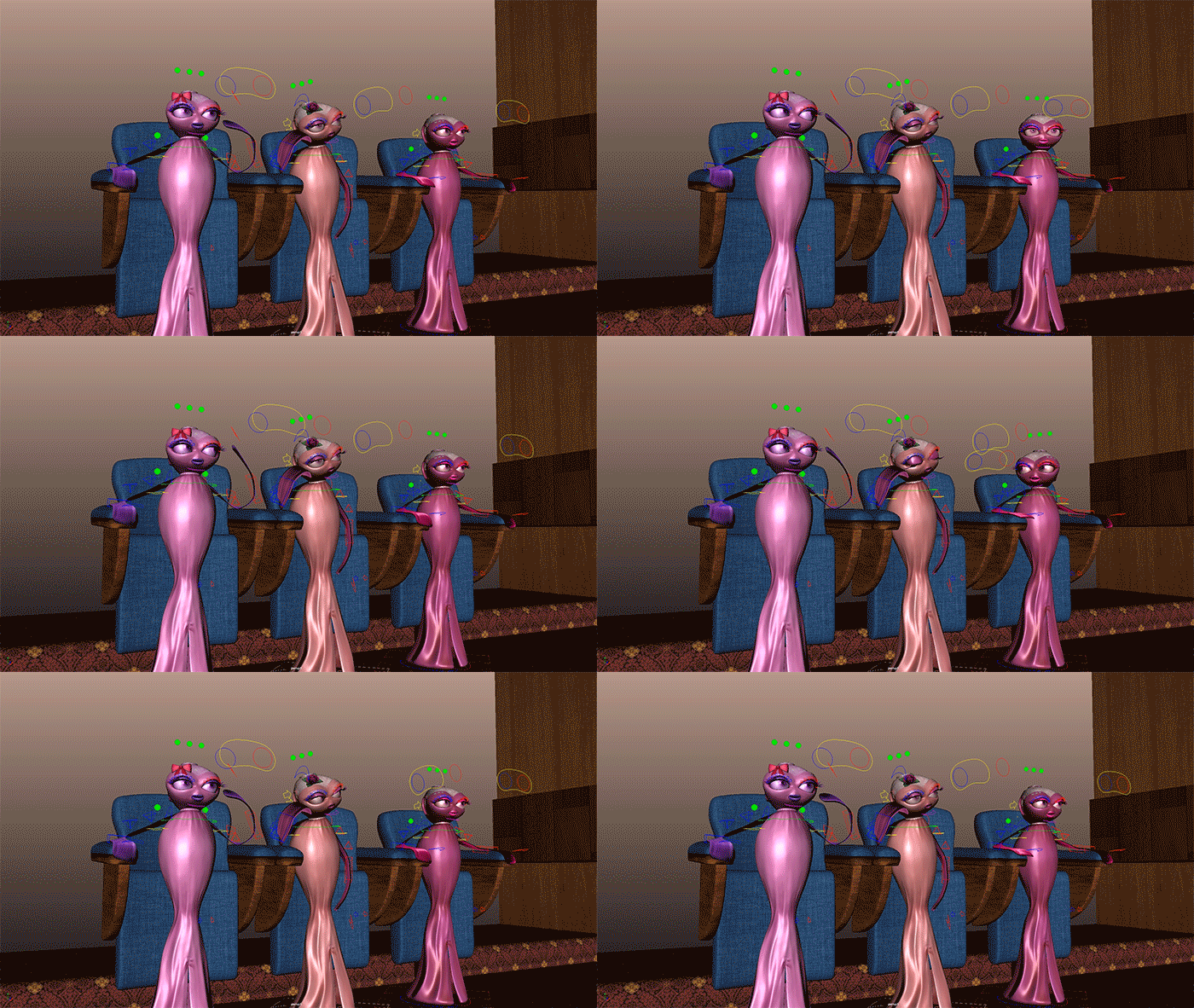
Now this is the idle section for the cinema interior. The point of this idle is for those moments where we want the Slinkies looking passive. They look good from the front and back (I animated it from the front to make sure it worked). To break it down we have Sparkle who is a figit... cant sit still, we have Rose who is cheesed off/bored and Flame who is doing his best to look effeminate.
The gif animation above shows a playblast from the Slinkies front on. Again this is not the angle we are going to be seeing them from mostly but the poses they are pulling here could be a default frame that leads into other animations giving us a good starting ground moving forward. Every section of this animation needs a good foundation so I recommend we use the idles for that. Ill show you as we get further in.
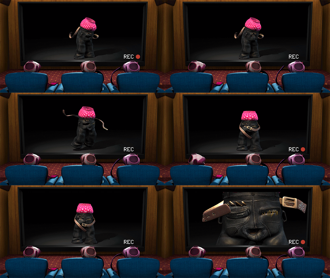
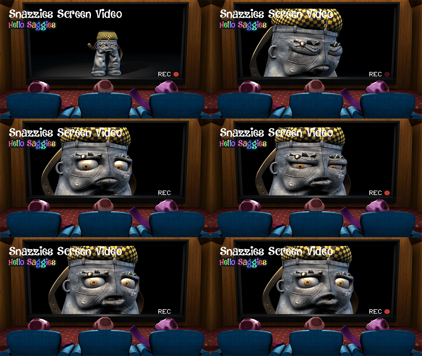
Now the next gif animation (above) shows the same idle animations but set from the back of our cinema so we can see the Slinkies watching our transparent television screen. This is also a 1080 render, I thought I'd get a jump on the rendering just to gauge a timescale for all 3 on screen at once... It took roughly 6 hours 30 minutes to render this 10 seconds out. It is for this reason I still recommend we keep shots of all 3 of them to a minimum.
The gif animation above now shows Hitch in the screen, just so you can kind of see how it looks with the Slinkies watching as the video plays. As you can see the idles loop so you can get away with seeing a few seconds of this loop before cutting to a closer shot or even cutting back to the Slinkies for comment. It just gives us the ability to be a bit more dynamic without having to do more animation, it saves us a hell of a lot of time.
The next gif animation is just the same exact video but with Stitch in the screen. I just wanted you to see what it looks like with each character in the screen to give you a better idea of how things will look going forward. I am really happy with how the render came out and the animation is just subtle enough not to draw attention to the fact it is the same 10 seconds looped over and over. I really hope you like how it's going.
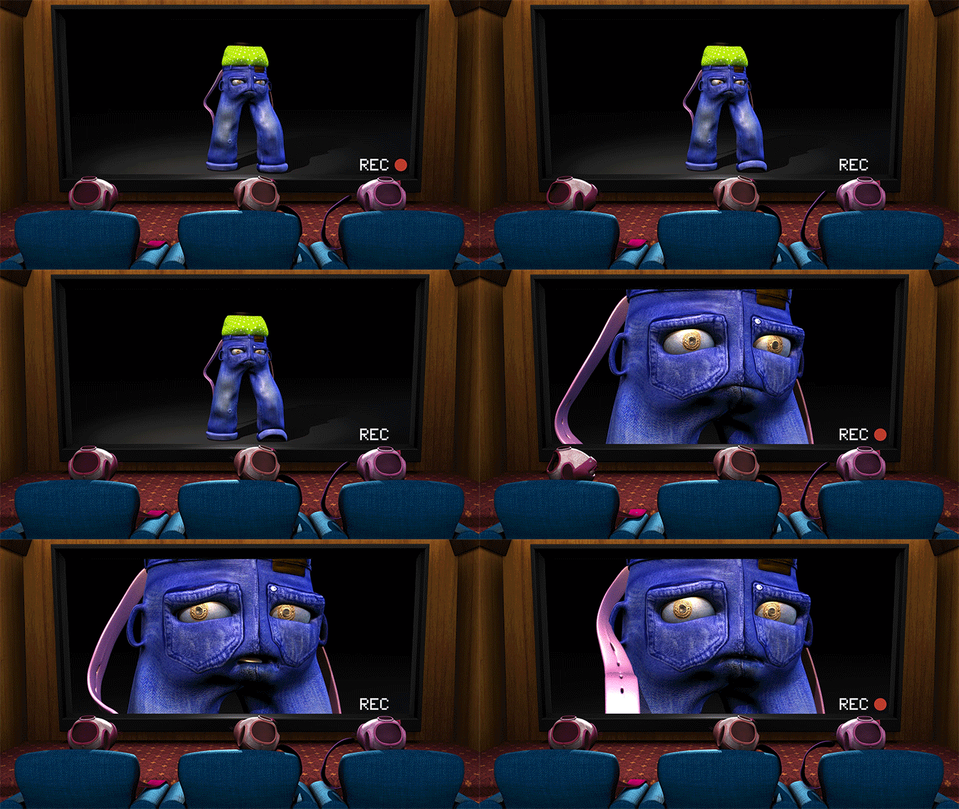
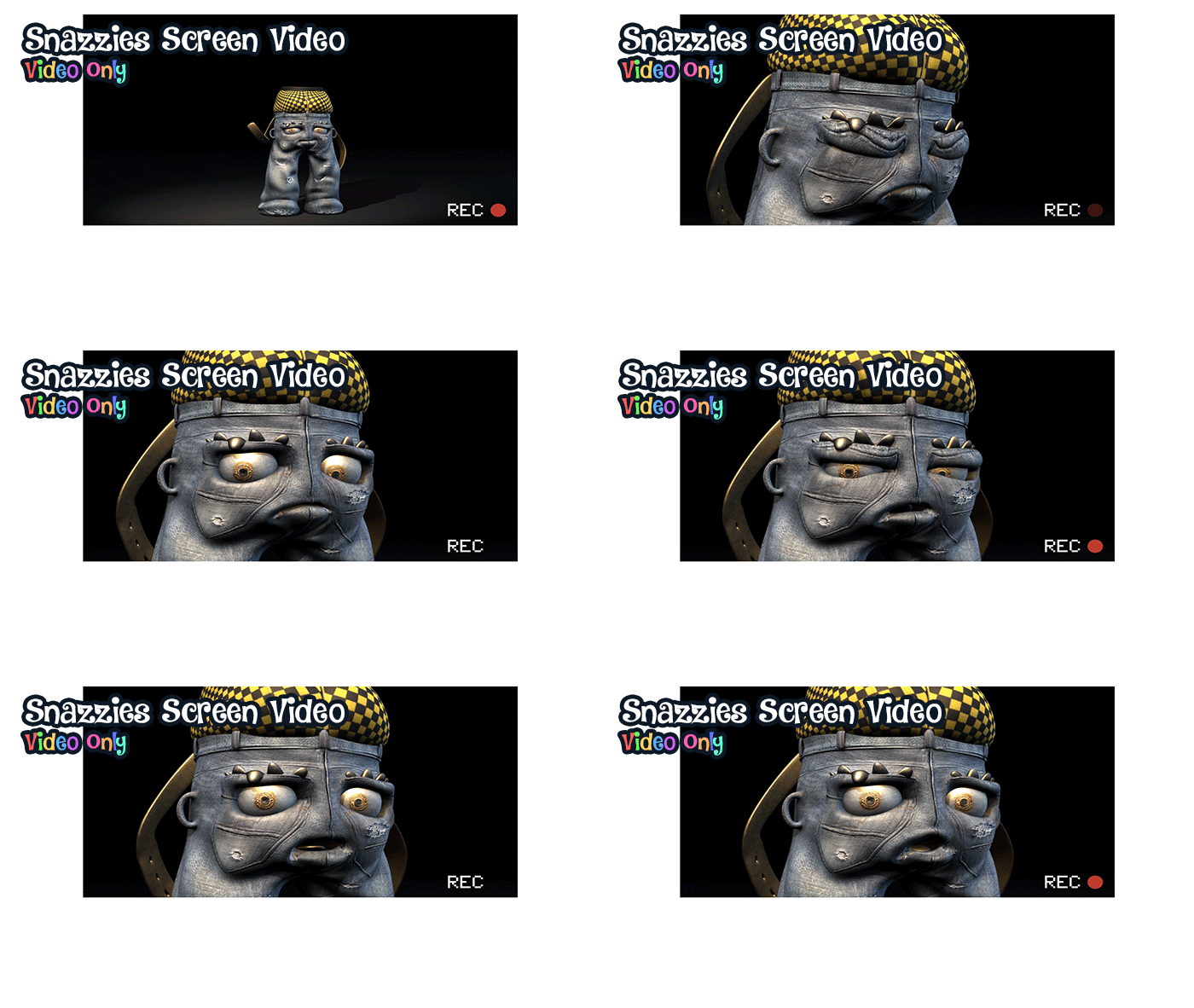
Lastly the Rocco animation (I can only apologise for the page loading times) these files are like 10mb each so unless your watching on a fast connection this post is going to drag lol. I just want to provide you a full picture... The playblast at the top of this post is how I will do most of the animation posting on this blog... for your confirmation... I rendered this idle just because I wanted to scope the time.
Anyway I hope this post has been informative and I have given you something to look at. The environment from Ross's side is also on track I will post a flythrough of that on here once he has finished the last of the texturing. We will talk soon!
xXStItChXx
Tuesday, 29 November 2016
Tuesday, 27 September 2016
The Snazzies: Reverse Theatre Set/Video
Hey Catherine,
Another significant update for you to peruse today... it took a day or so longer then I wanted it to but I think I have gotten it to where I am kind of happy. In other good news Ross is getting on the Storyboards for this animation while I wrap up a few things then me and him are going to sit down and crack out your animation in a big shot. I had a feeling this part would be the nightmare and it wasn't easy but it works now so that's good.
The image above shows where I see the fixed camera from behind them sitting... I also sat down and added a normal map to the chair arms (they were quite smooth and shiny on the earlier renditions... something I have addressed now... it was just too shiny. I want to keep this camera still otherwise I have to add tracking which is another thing I didn't factor into our costs. I think its perfect at this angle though.
This image shows the Slinkies in the cinema seats from behind. The Slinky animation will work outside of the video which will be embedded in post. The television has no screen or background so it is essentially an alpha which means I can transpose anything through it. Best way I can explain it is its more like a window then a television. We can see what's going on through the scene because the area has no background.
This is a partial video (animated gif) of our animation running on its own. Notice the white space around it which is where our Slinkies are going to sit over the top of this screen. They can animate over the top because they are independent of what's going on in the background. In terms of layers the video sits at the bottom so everything can happen in front of it. This also has the advantage of allowing us to lay whatever video we want.
Last but not least here is the video again but with our Slinky still over-layed on top. Obviously our Slinkies will be moving but the point is this screen will always have a blank spot so we can put anything in there for them to discuss. This is how I see us handling the back end shots anyway. The reason I want to keep the camera movement still is because this changes the perspective of the whole in the screen...
Anyway I hope you like how it looks. Not long to go now.
xXStITChXx
xXStITChXx
Saturday, 24 September 2016
The Snazzies: Thredz Band Wall Art Design
Hey Catherine,
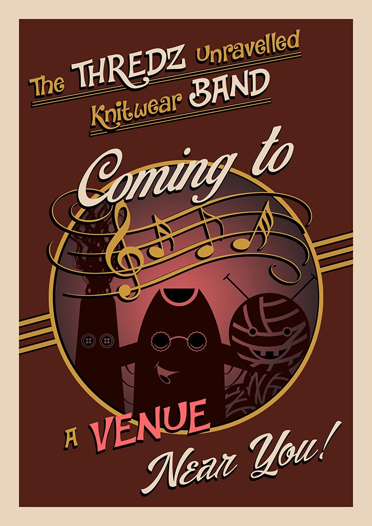
This is the third and final wall art design for the Theatre set, I hope its what you had in mind. I decided to let go a little on this one and make it a little more whacky hence the punchy text but I think you will agree that it compliments the other two. I also decided to keep it simple although I did recreate your band in silhouette it gives more of a party vibe I find. The muted red sinks the flyer into the back but also works well with the other two.
Ta-da! The final flyer in all its glory, probably my most favourite because I just kept it simple. The deep red and gold compliment nicely and with a nice punchy cream to knock out key elements of the text. The music notes were a later addition but they look right in the void above the bands head. Most of the font also has a nice drop shadow of black to punch them from the background even more... its fun and quirkly... Good stuff!
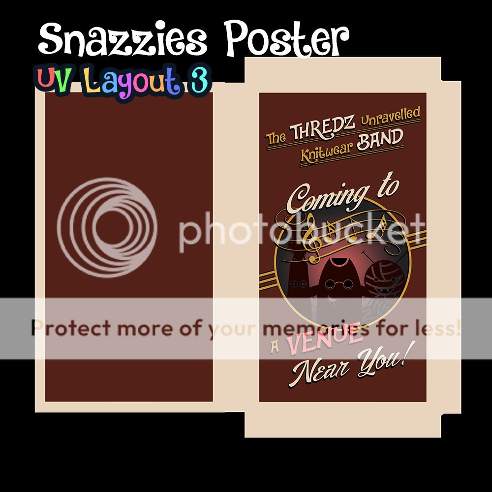
And once again the demonstration of the poster opened out in UV map form... I think the heavy border is probably what I like best it looks quirky but old school a good combination. I also moved away from the fabric patterns on this design... Just wanted to go back to what worked on the original "who lets the pets out" poster. I don't know why but I get a only fools and horses vibe not sure why lol. Anyway lets move on to the final image.
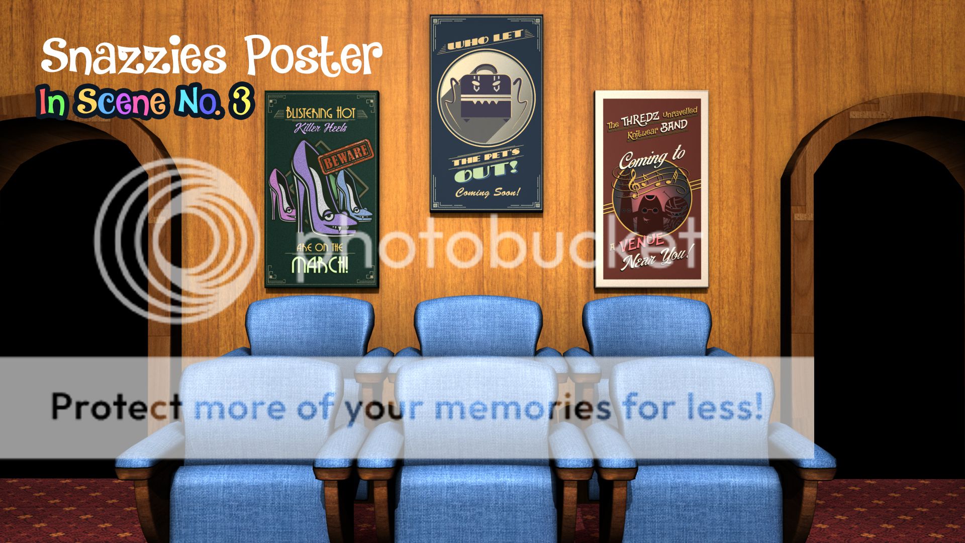
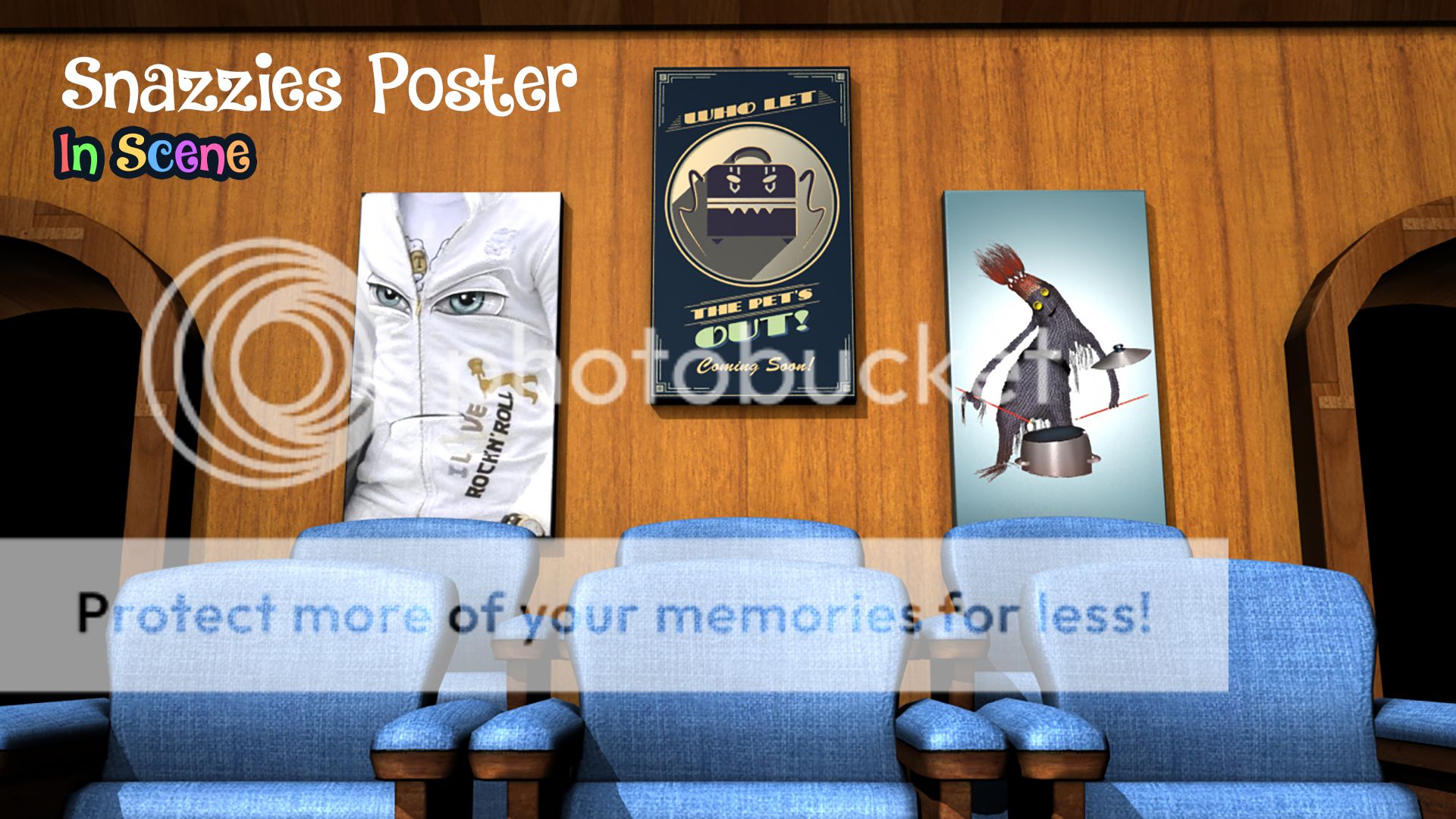
Last but not least you have all 3 of our posters in the scene lit by our basic light setup. They all compliment each other perfectly and will keep things interesting especially when we come to multiple viewings of this animation. What I love about it is you are advertising other brands which when it comes to this animation no one has seen. It expands the Snazzies universe virally and that will make the whole thing more interesting.
Anyway that's me I hope you like everything!
xXStItChXx
The Snazzies: Killer Heels Wall Art Design
Hey Catherine,
This is the first of the two posters you commissioned me to make extra this is the one with the words "Killer Heels are on the March". I went more towards a muted green feel with the core colour on this one just to make the background more interesting. I think you will find this one more colourful. I also copied the design of the shoe more closely based on the concept art you gave me. The only thing missing is the eyelashes but this works without.
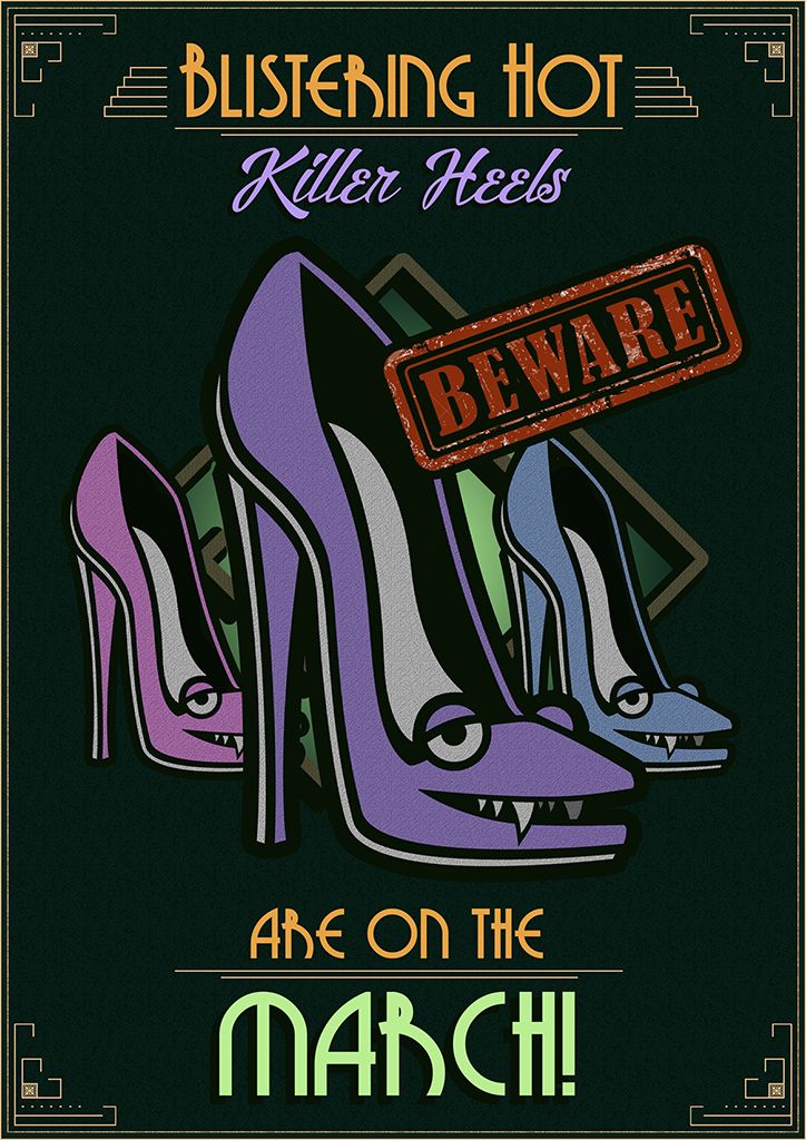
Voila this is the design in full I hope you like it. Originally I had only one heel there but I felt I should add more because its Killer Heel"S". The font is understated but it I think you will agree that it works in the context of this image. I added the "Beware" graphic as an extra I cant put my finger on it... it just felt more right with some kind of warning. This is also more in-keeping with the pop art style we have had on the environment outside.
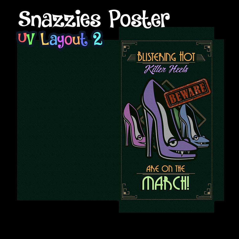
This is the UV layout of the design render to be thrown in to Maya as a texture on our wall frame. It is missing its double border but the UV didn't really work well with it in the scene so like the original one I kept it out for now. You cant really tell but there is a fabric texture to this image. It has an underline cotton finish and the background has a stretched texture... It makes it less shiny and more grounded in reality.
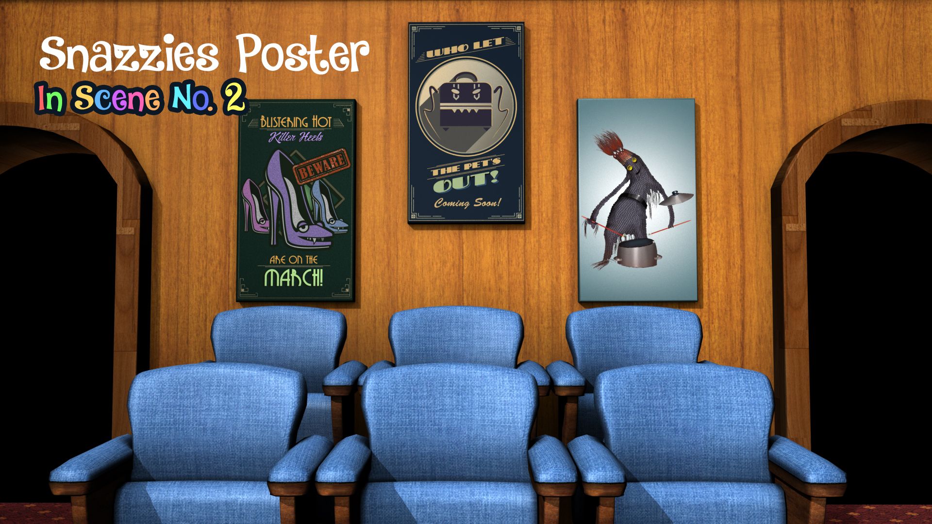
This is how it looks in the scene next to the other poster design... I hope you like it! I think they compliment each other quite nicely I think the next one I make will have a kind of muted red background kind of in the same vein as these two. I will do my best to implement some elements of your characters but they have to be kept understated which means not too many bright colours and we keep to vectors/minimal colour pallet.
Hope you like it!
xXStItChXx
xXStItChXx
Monday, 19 September 2016
The Snazzies: Theatre Set Lighting Tests
Hey Catherine,
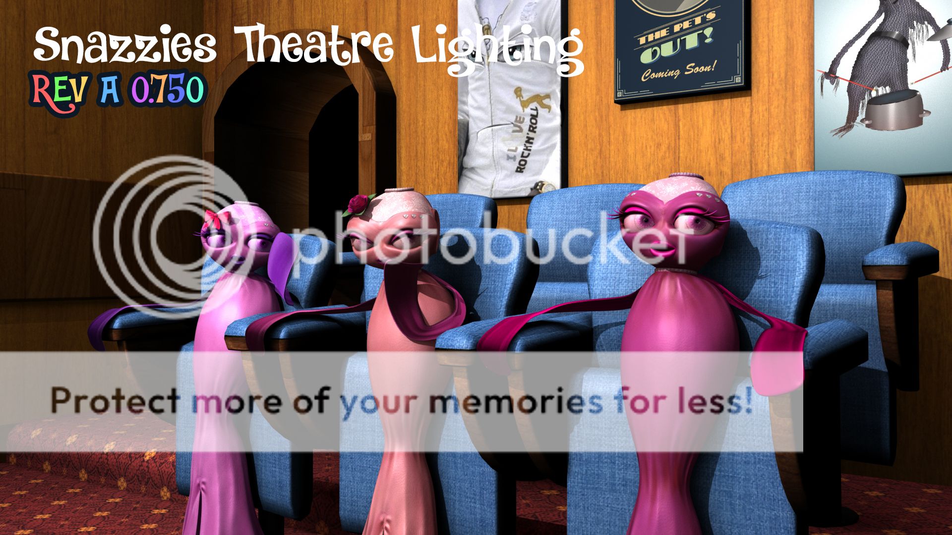
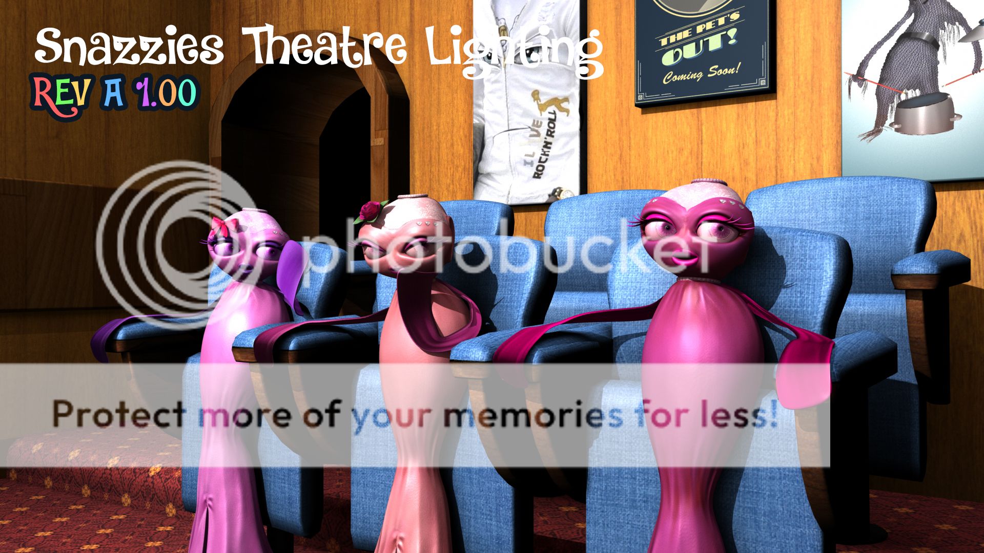
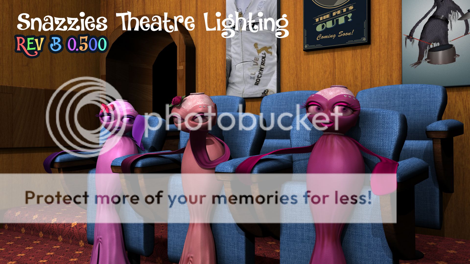
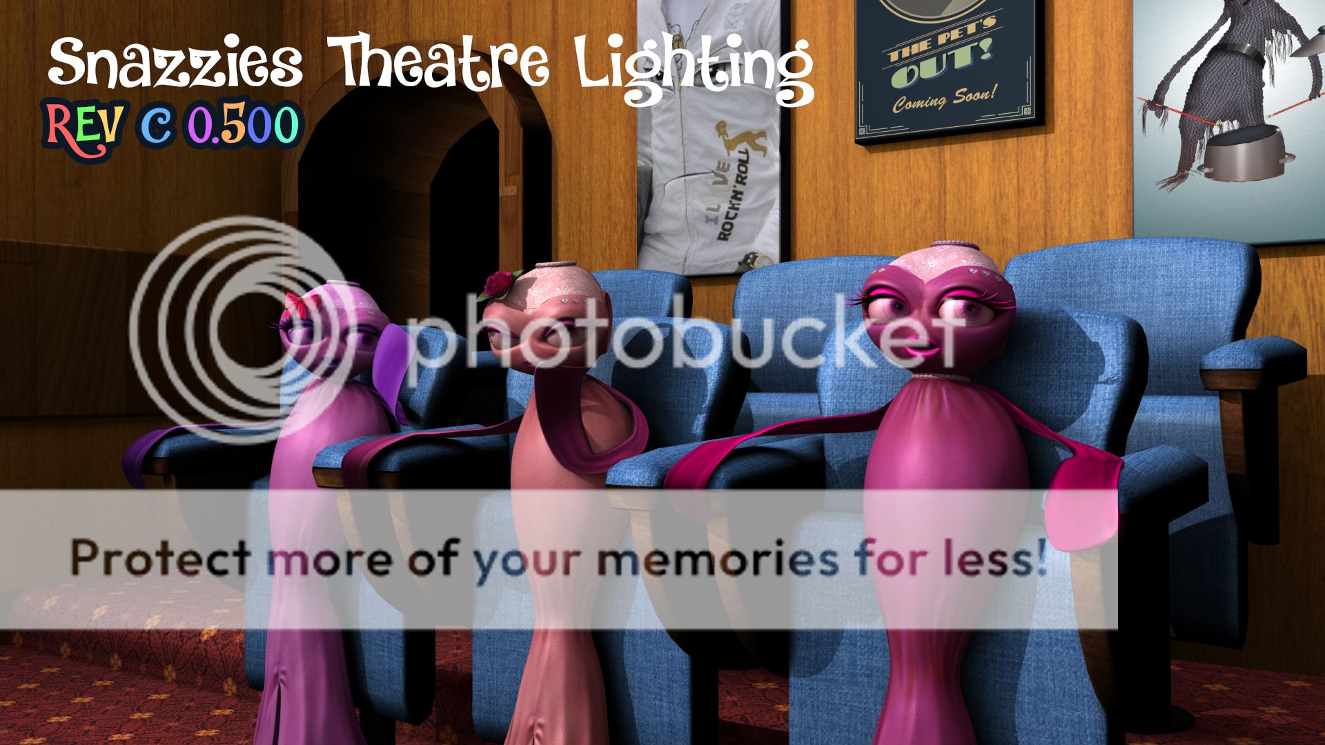
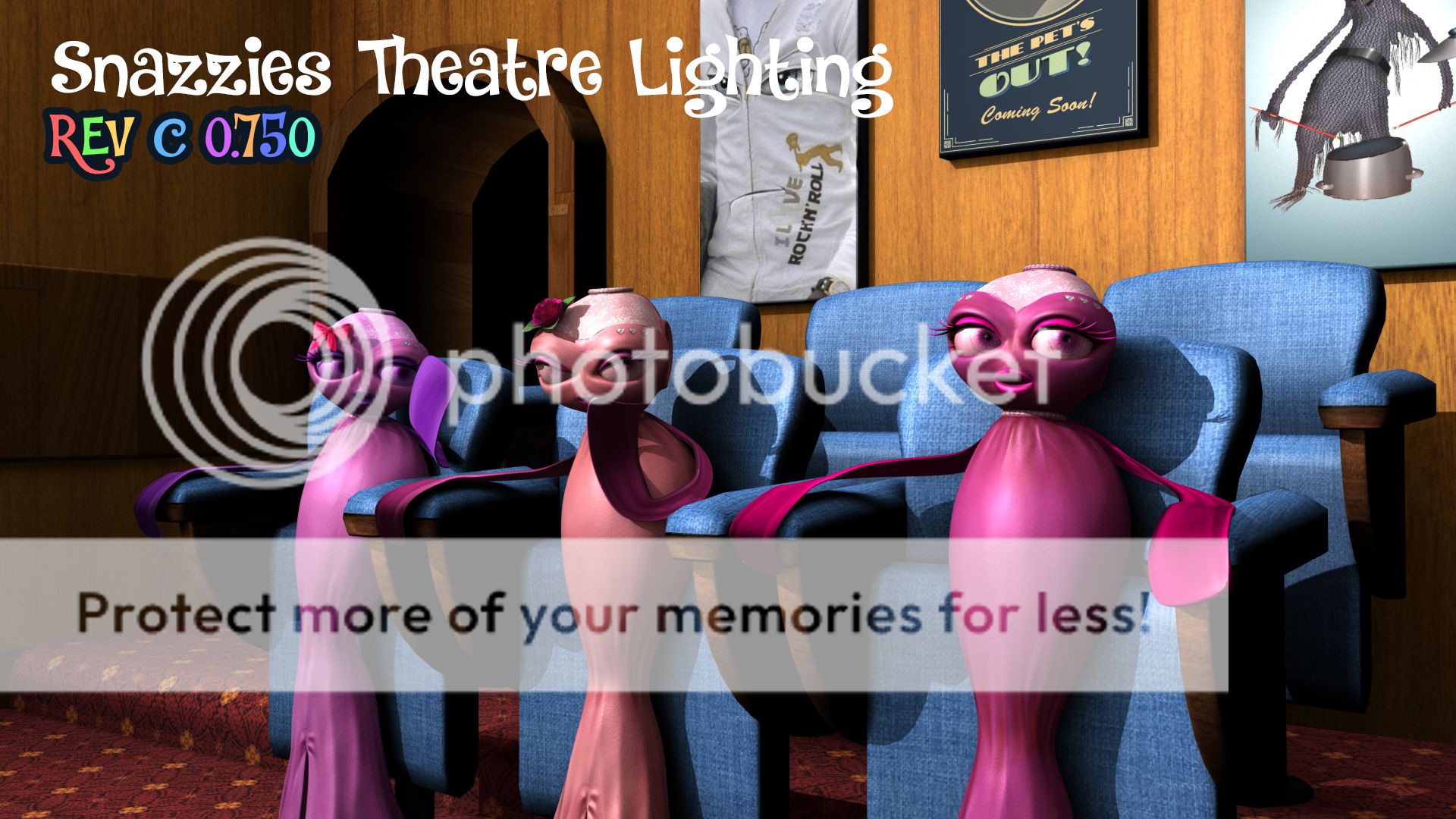
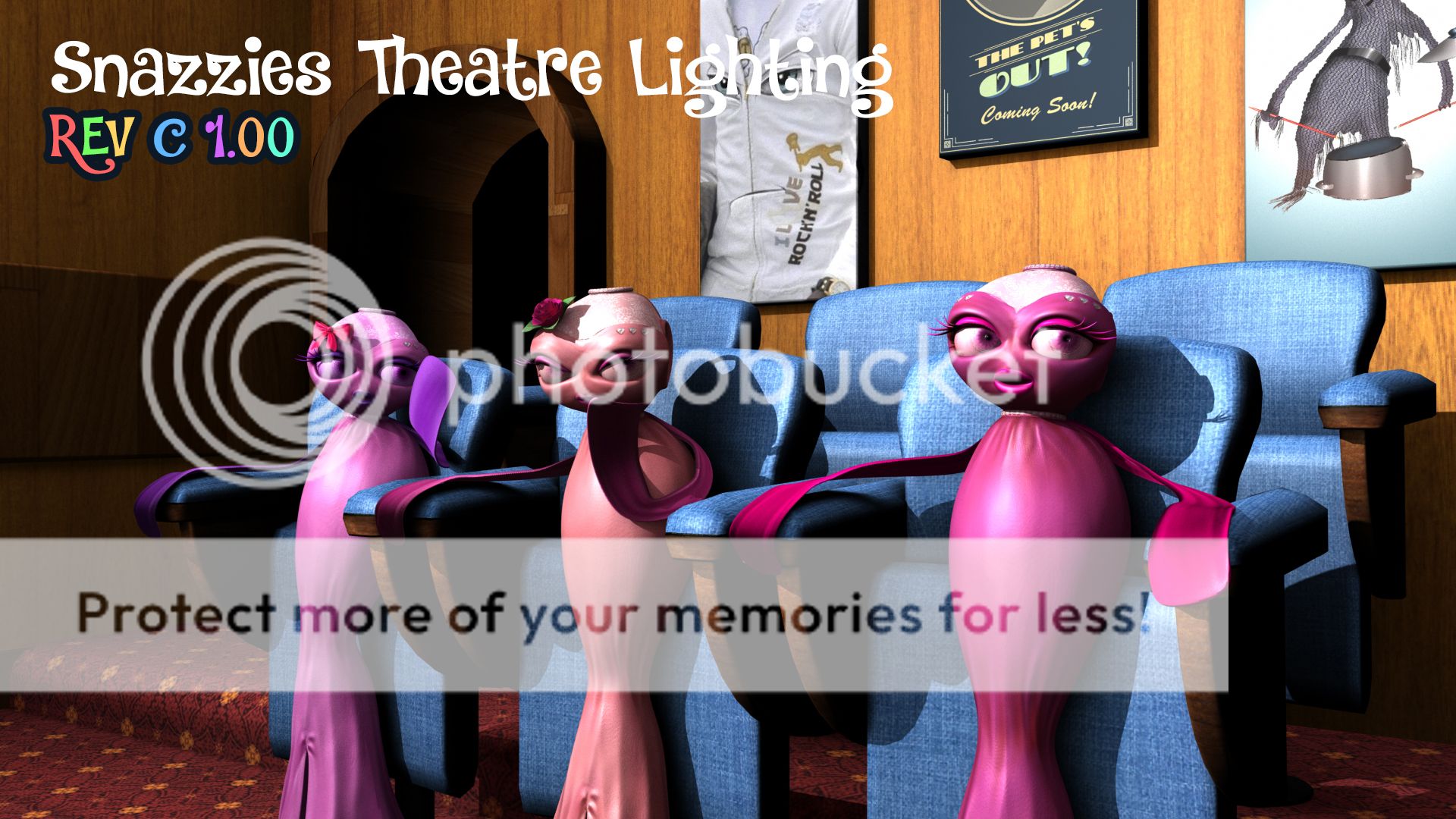
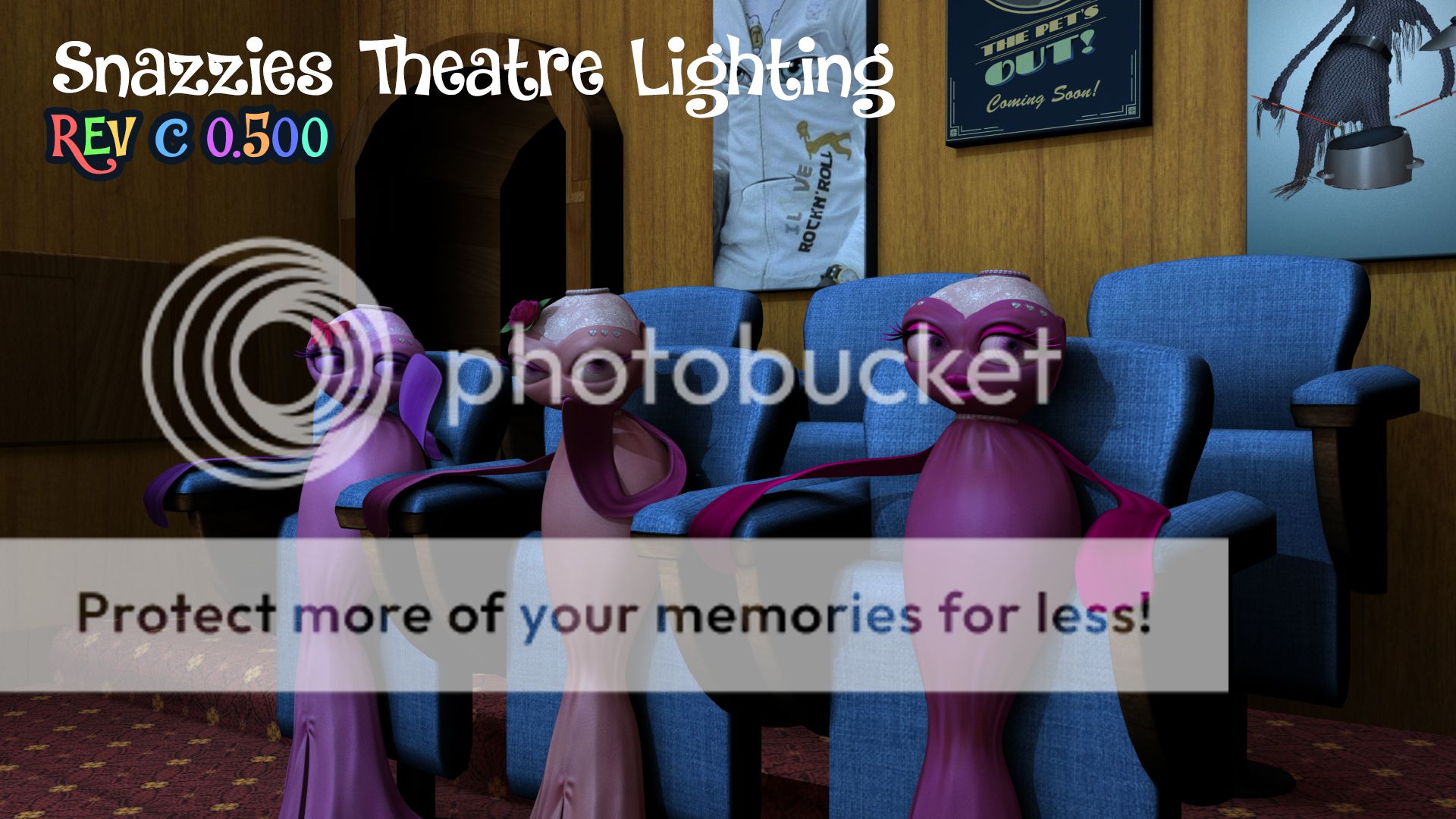
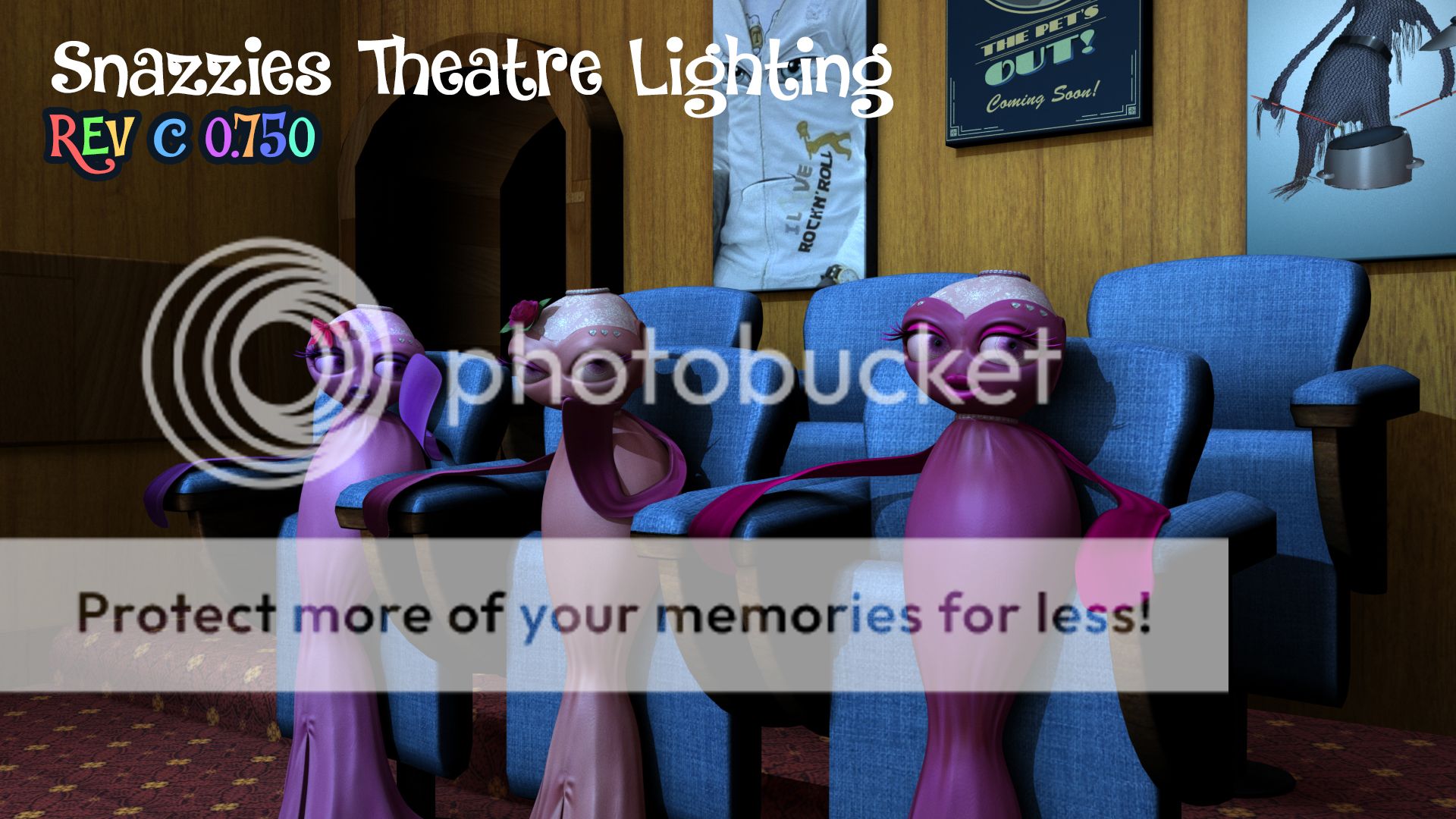
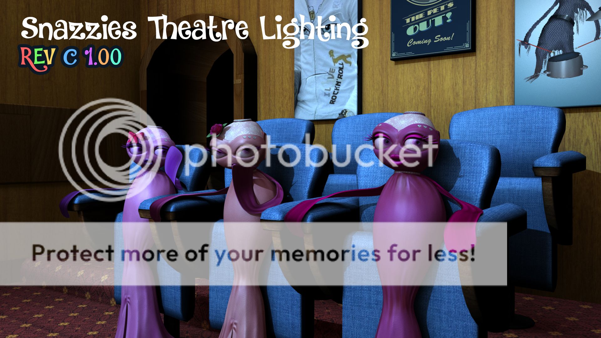
Last but not least a few lighting tests I did for this scene. I ranged them from REV A - D I just thought id clear up a few last minute lighting queries should they arise. Each test has 3 ranges of light intensity (from 0.5 - 1) which strengthens light and resulting shadows. I moved the light for some and changed the colour of it just to see it if it was blue. I know you don't want it this way but I did the last light passes for me really lol.
You will have to click these to enlarge them I wanted to keep the amount of images down so I put 3 in a line. The first shot of REV A has an 0.5 light intensity REV A is also our standard white light directly in front of the set. The second shot is the same light position but with an 0.75 (default light value). Lastly the strongest light value of the 3 with an intensity of 1.0 is the third image along... Just look at them and let me know.
REV_B is the light on the right side of the set looking down at them (look at the shadows). It has the same intensity values the shot before I just moved the light to the right hand side looking down at them. I thought I would let you pick this hence why I did quite a few renders. When it comes to lighting we kind of disagree so I'm just willing to go along with whatever shot you prefer... Ask people and just see which you prefer too :)
REV_C is over the left hand side looking down at them... I did this originally and its nice to be able to see the shadows from the angle of the camera. Then again if you look at it from the other side you are potentially losing them again. It might be safer to save switching lights around based on the camera angle to keep the lighting face on. Again though that is completely up to you just let me know which of all these tests you prefer.
REV_D is based on the settings I used before... I kept the colour light in the Slinkies and dark in the background so it falls back. Regardless I just did these 3 for me so it feels like they are in a dark room watching television. I get your motivations but I always say things are more believable the more grounded in logic they are. This is my last look into the topic so whatever you decide here I will go along with. Just let me know your preferred setup.
Well that's me 4 for 4 posts... Now to send you an email.
xXStItChXx
The Snazzies: Theatre Set Complete
Hey Catherine,
I'm back with yet another post (3 of 4 if you can believe that). This one is about bringing everything together all the models/assets/characters into one scene for your viewing pleasure. Everything is lit from the light you helped me make from a front on shot (notice the shadows). I have seated our slinkies in their places and the artwork is on the wall. I just hope it doesn't disappoint whoever you are showing this too lol... Anyway onto business.
This is more of a distant render. You have to realise that our camera cannot go outside of the boundaries of the wall (with the exception of the back doors). Otherwise it just looks odd like they are actually sitting in a set. The camera will have to be close to them mostly (as I suspected we would). This is why there will not be much viewing of the side walls its just front and back shots mostly. If I recall its this simple in the script.
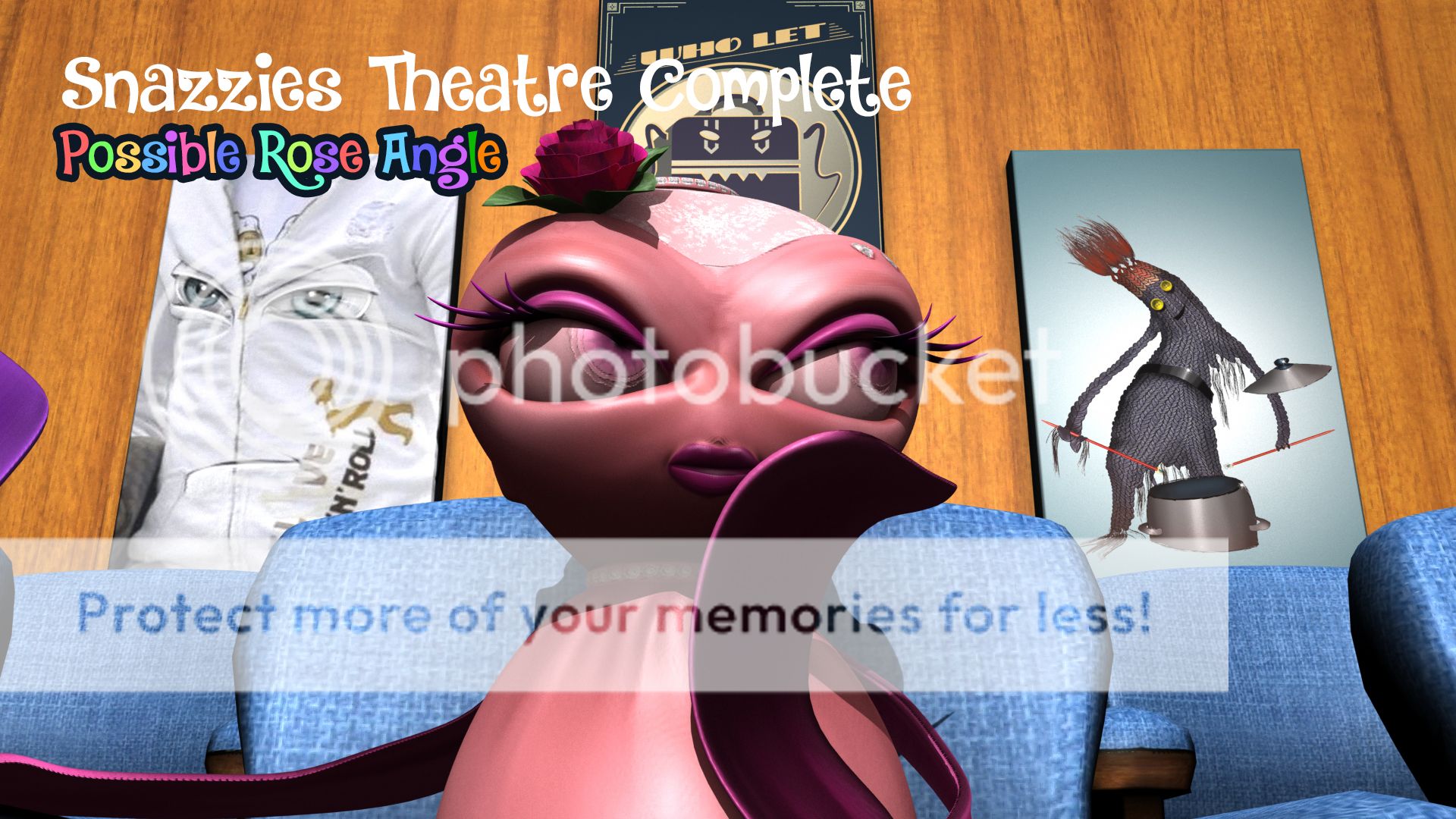
This is a shot looking up at them from a slightly lower position it brings their heads into the centre of the shot and also allows us to appreciate our lovely wall art. Its little flourishes like this that make the scene feel alive that were not just floating around in the dark with no substance. If I'm honest I saw us seeing much of this animation close to their faces not this far back... Except obviously when you have a shot of all 3.
This shot is a close up of rose at a slight lower angle. As you can see the wall art is still present in most of the shots as clear as day. In an animation you could appreciate it but the point is that the Slinkies are the primary focus... Little decorations can sometimes inspire multiple views of animations. The colours of the images in the background are muted so they do not distract from the strong pinks on the Slinkies its a nice range.
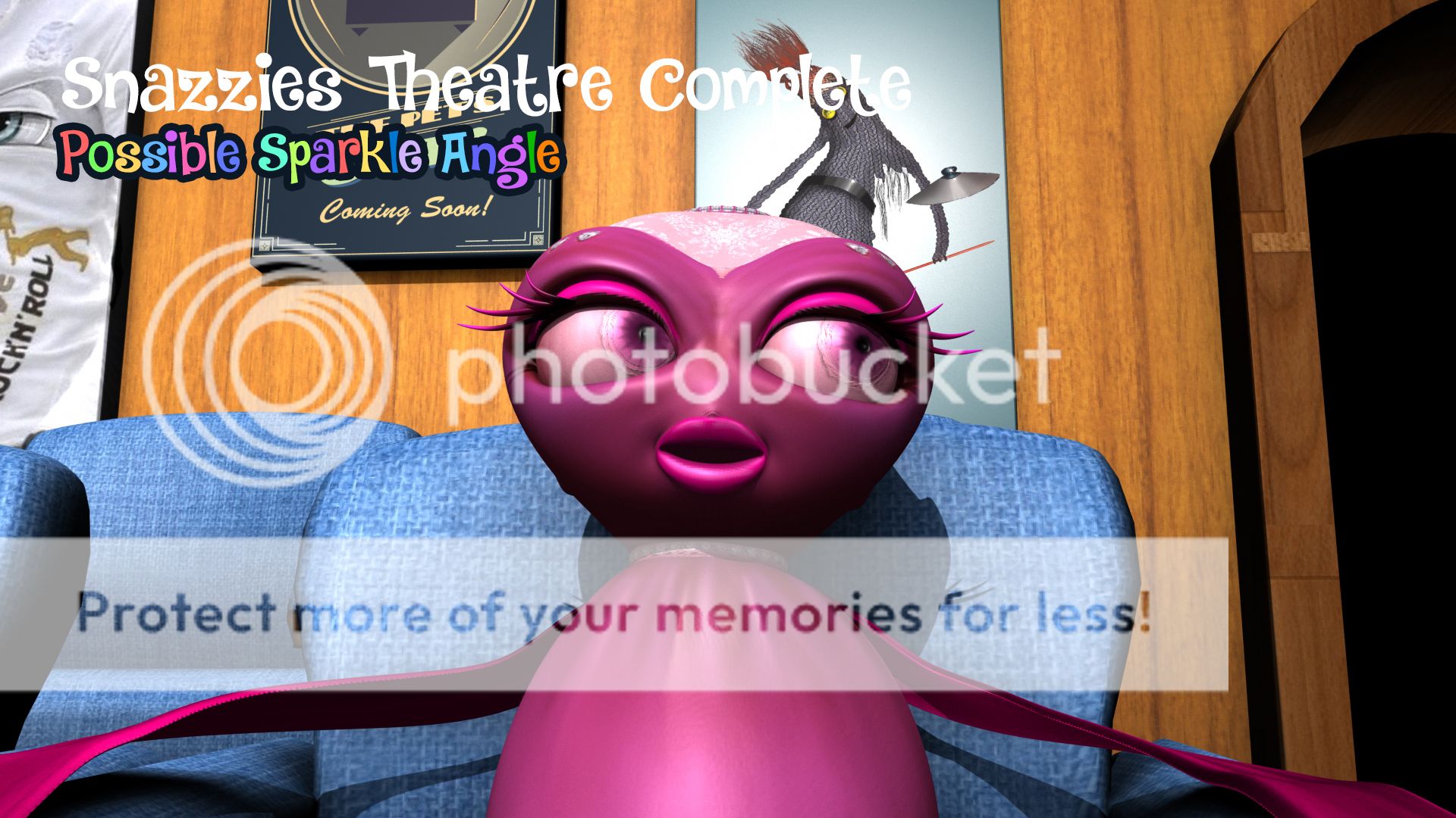
Next we have Sparkle at a slightly raised angle which I did similarly before... I kept these poses generic for now. No point in working your ass off on test shots. The lighting is quite nice here you cant even see the flaws in the geometry. If we had more time we could have done normal maps to give the chairs more depth and the walls but again that's more time on this and if I'm honest I wasn't supposed to go this far with the set.
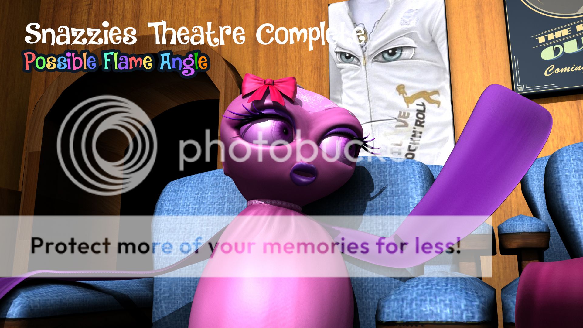
Last but not least we have flame I moved her hand out to get rid of the shadow but just so you know a front on light will cast shadows of their faces should they put their arm infront of their faces etc. so you'd best keep that in mind for the next post (lighting). Flames angle is less central here more off to the side. I figured you may want a bit of range in the camera angle as they discuss things... I don't mind going with my gut however.
Well I hope you have enjoyed this journey so far.
xXStItChXx
The Snazzies: Poster/Wall Art Designs
Hey Catherine,
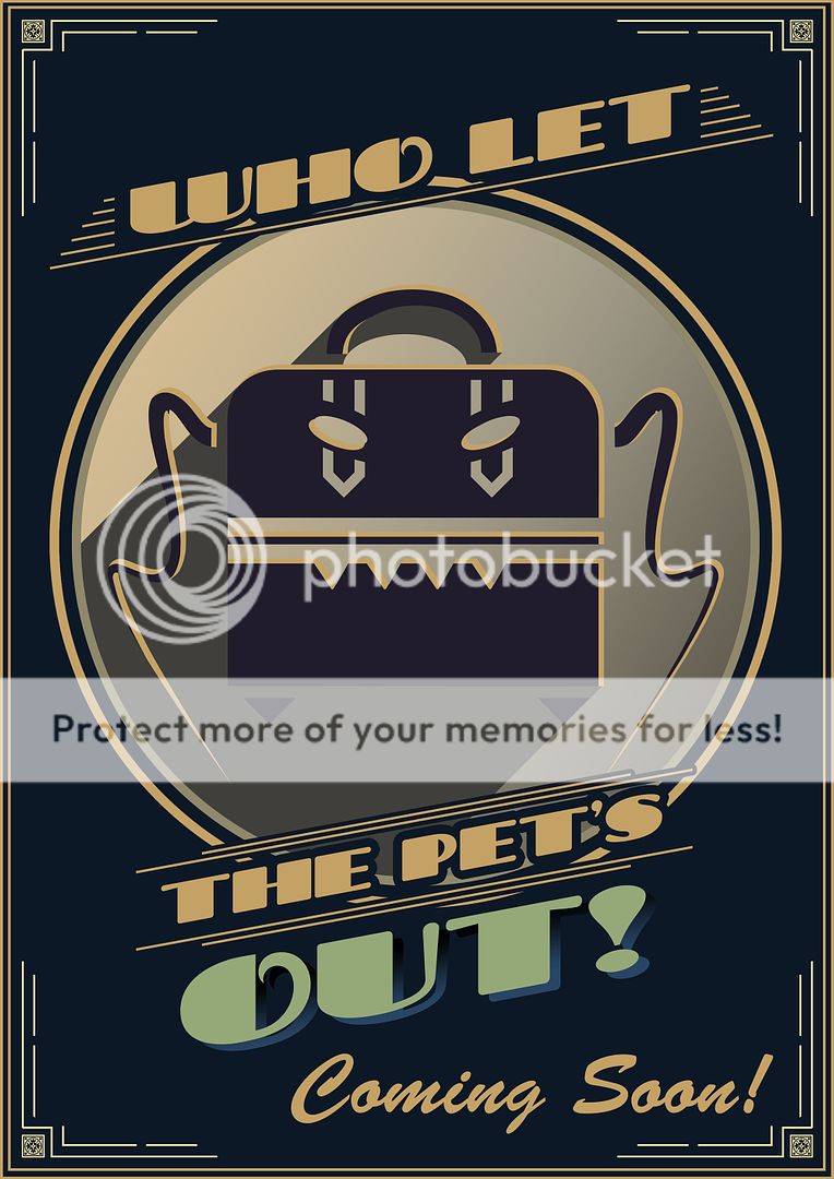
Long time no speak (joke lol). From our discussion I get what you are saying about the poster designs but stylistically the poster I made is meant to be kept "low key"... I didn't want it taking attention from the Slinkies and putting bright wall art behind them will not only merge colour with their bodices it will potentially distract from the animation. From a style point of view these posters shouldn't have fine detail they should be quirky.
Enter my design, now I get what you are saying people might get confused as to what it is in this style but I think it proves the right amount of intrigue. The style lends itself to classic golden age of film making when posters were crude. You said to me the other day that we are not Pixar and to me they are all about the bright colours and the "norm" of creativity. This breaks it from the present and takes us to a time before them.
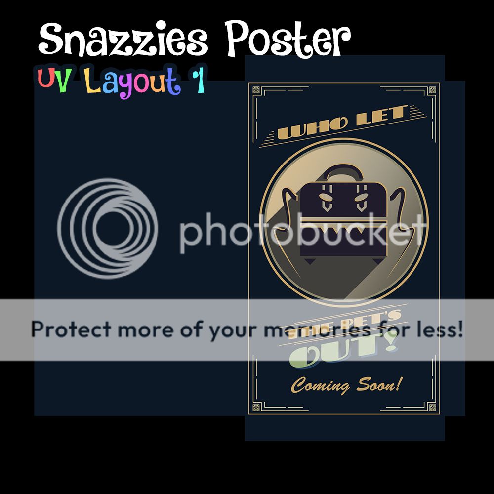
This is the poster laid out ready for distribution onto the model in the scene... I love it. The thing I love most is probably the fact that it nods to something that to this point no one knows about (other then a select few). The only thing that bugs me about it is that I couldn't put on it "Featuring Croc the Lethal Pet". Just forgot I guess but regardless It still works. Anyway enough rattle about this one lets move on to yours.
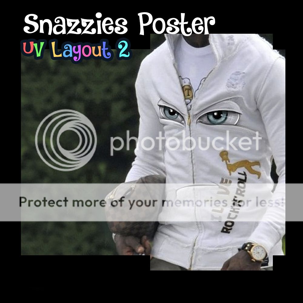
To be fair this could be a good film poster if you put a slogan with it. It could just be a standard run of the mil advertisement reminding people to wrap up warm for winter or something. These are just pie in the sky ideas but still its a very valid route. The white light in the models ambient occlusion may need to be adjusted a bit for this shot because of the white but I think I have a way round it... watch this space in a sec.
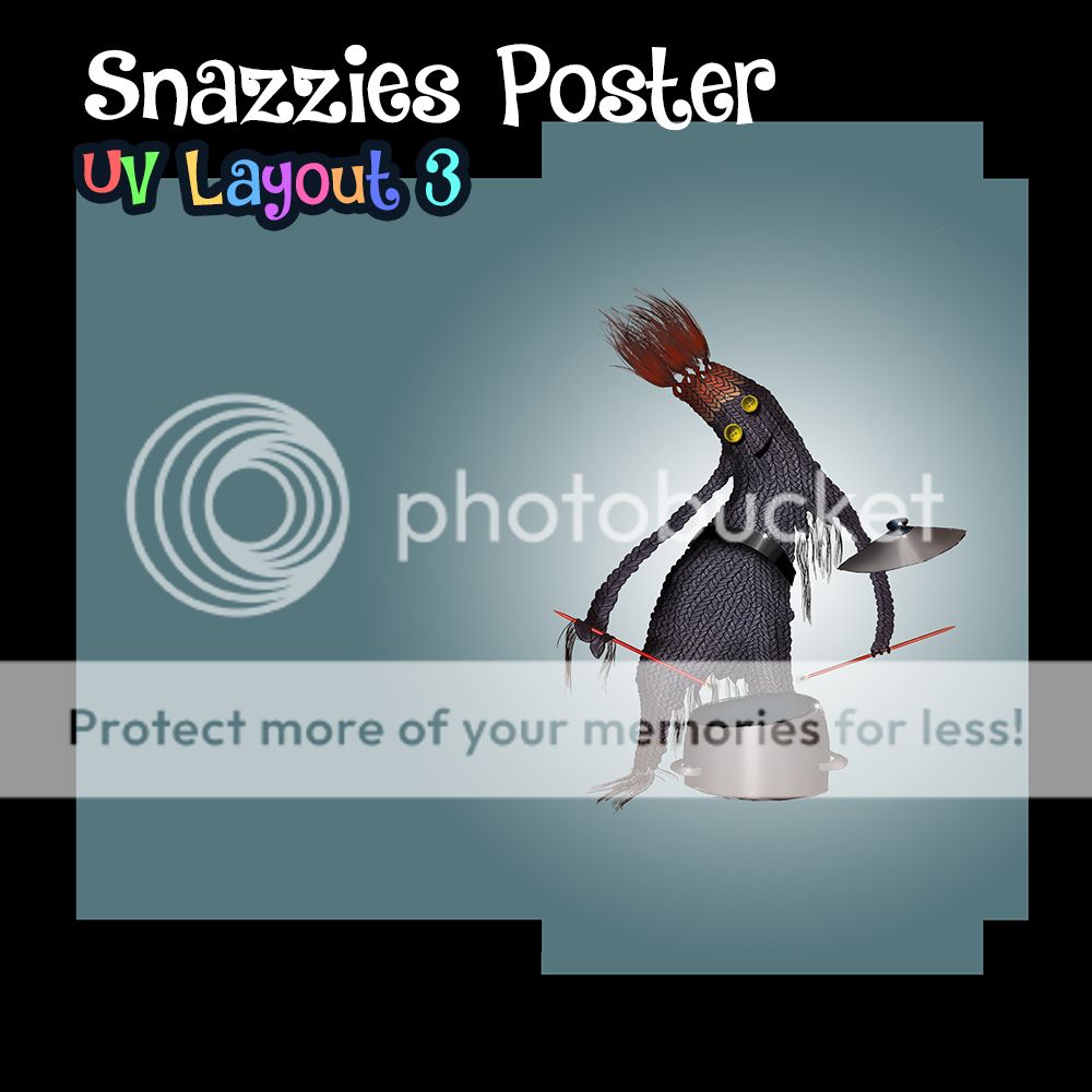
Second not up yet (patience) this is the third poster layout you wanted... This is probably the only one which to me doesn't really work. If it were me I would have made a band poster about a gig on the 30th or march or something. Its what I was going to work on next as a poster design. Regardless you are probably right these posters do take time to make I just wanted this set from our close angles to look as lively as possible.
The drum roll has finally ended VOILA. With the front on white light which you picked when we met a few weeks back... that's how the frames look lit. As you can see they light quite nicely. Do you see what I mean about the potential slogan for the white jacket one. It could have a kitchy font underneath or overlapping the picture with a drop shadow... Either way send these to whomever you wish and I hope it helps you make a decision.
That's another post down, I'm on a roll!
xXStItChXx
Subscribe to:
Posts (Atom)