Hey Catherine,
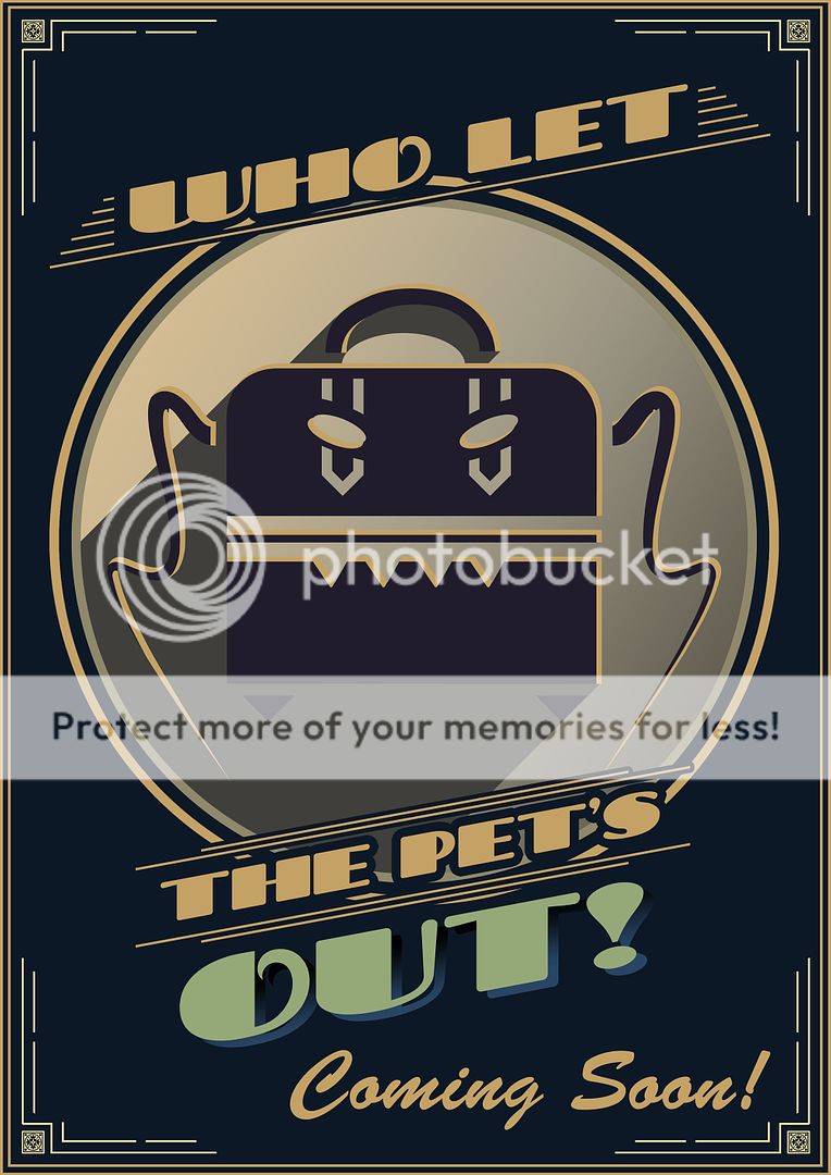
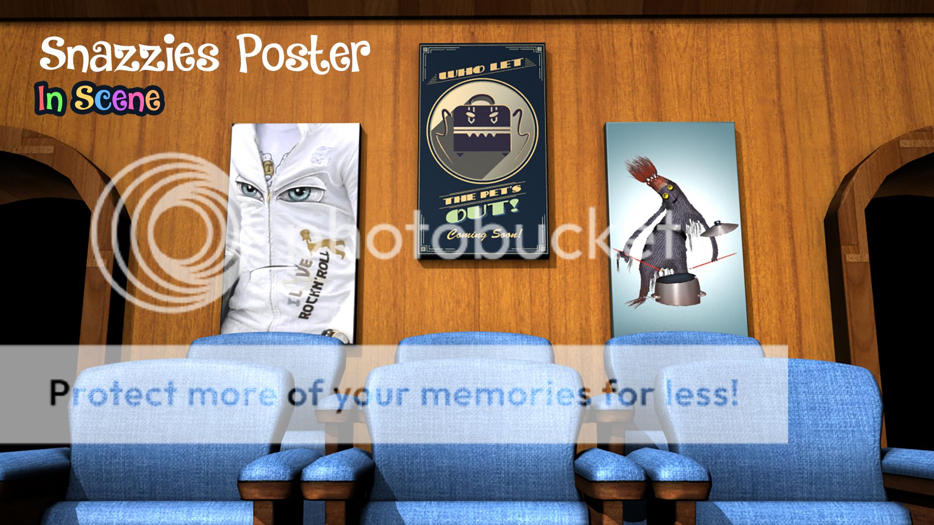
Long time no speak (joke lol). From our discussion I get what you are saying about the poster designs but stylistically the poster I made is meant to be kept "low key"... I didn't want it taking attention from the Slinkies and putting bright wall art behind them will not only merge colour with their bodices it will potentially distract from the animation. From a style point of view these posters shouldn't have fine detail they should be quirky.
Enter my design, now I get what you are saying people might get confused as to what it is in this style but I think it proves the right amount of intrigue. The style lends itself to classic golden age of film making when posters were crude. You said to me the other day that we are not Pixar and to me they are all about the bright colours and the "norm" of creativity. This breaks it from the present and takes us to a time before them.
This is the poster laid out ready for distribution onto the model in the scene... I love it. The thing I love most is probably the fact that it nods to something that to this point no one knows about (other then a select few). The only thing that bugs me about it is that I couldn't put on it "Featuring Croc the Lethal Pet". Just forgot I guess but regardless It still works. Anyway enough rattle about this one lets move on to yours.
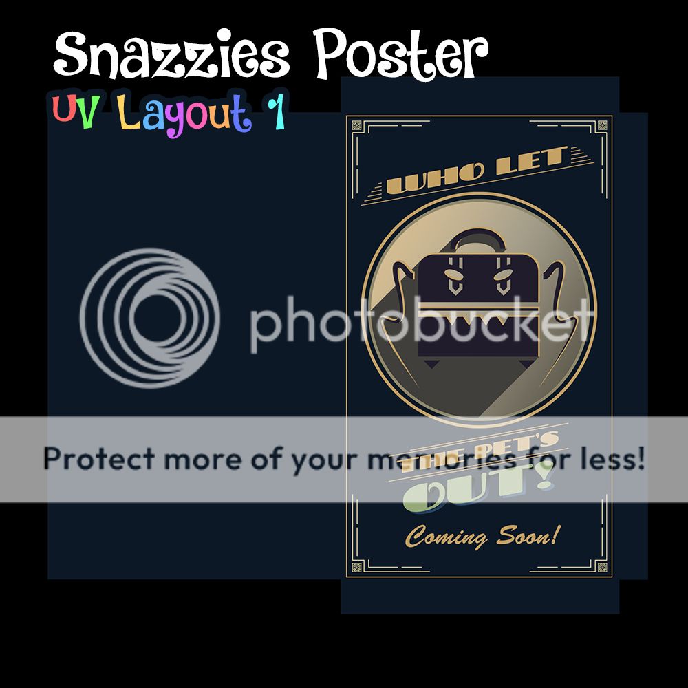
To be fair this could be a good film poster if you put a slogan with it. It could just be a standard run of the mil advertisement reminding people to wrap up warm for winter or something. These are just pie in the sky ideas but still its a very valid route. The white light in the models ambient occlusion may need to be adjusted a bit for this shot because of the white but I think I have a way round it... watch this space in a sec.
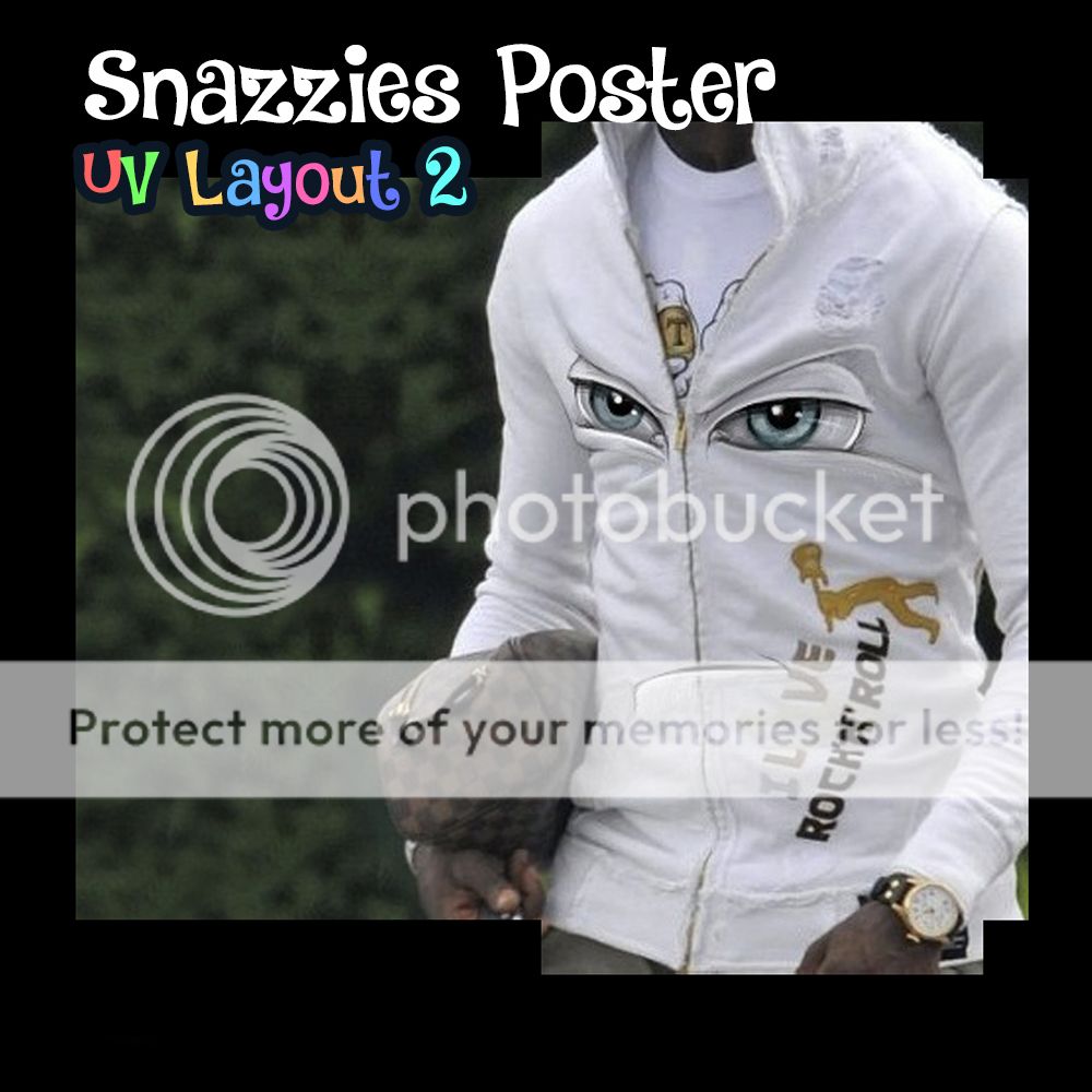
Second not up yet (patience) this is the third poster layout you wanted... This is probably the only one which to me doesn't really work. If it were me I would have made a band poster about a gig on the 30th or march or something. Its what I was going to work on next as a poster design. Regardless you are probably right these posters do take time to make I just wanted this set from our close angles to look as lively as possible.
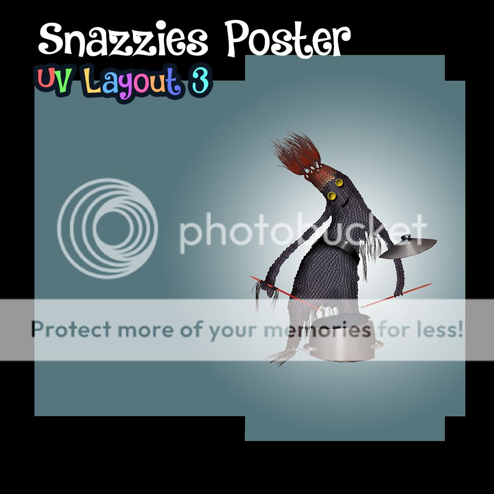
The drum roll has finally ended VOILA. With the front on white light which you picked when we met a few weeks back... that's how the frames look lit. As you can see they light quite nicely. Do you see what I mean about the potential slogan for the white jacket one. It could have a kitchy font underneath or overlapping the picture with a drop shadow... Either way send these to whomever you wish and I hope it helps you make a decision.
That's another post down, I'm on a roll!
xXStItChXx

No comments:
Post a Comment