Hey Catherine,
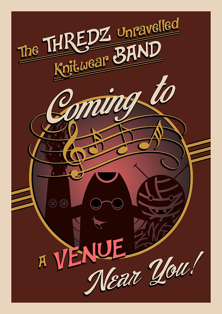
This is the third and final wall art design for the Theatre set, I hope its what you had in mind. I decided to let go a little on this one and make it a little more whacky hence the punchy text but I think you will agree that it compliments the other two. I also decided to keep it simple although I did recreate your band in silhouette it gives more of a party vibe I find. The muted red sinks the flyer into the back but also works well with the other two.
Ta-da! The final flyer in all its glory, probably my most favourite because I just kept it simple. The deep red and gold compliment nicely and with a nice punchy cream to knock out key elements of the text. The music notes were a later addition but they look right in the void above the bands head. Most of the font also has a nice drop shadow of black to punch them from the background even more... its fun and quirkly... Good stuff!
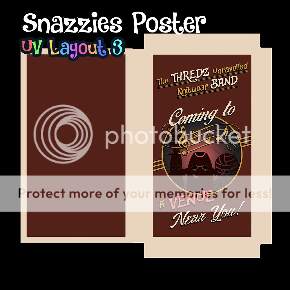
And once again the demonstration of the poster opened out in UV map form... I think the heavy border is probably what I like best it looks quirky but old school a good combination. I also moved away from the fabric patterns on this design... Just wanted to go back to what worked on the original "who lets the pets out" poster. I don't know why but I get a only fools and horses vibe not sure why lol. Anyway lets move on to the final image.
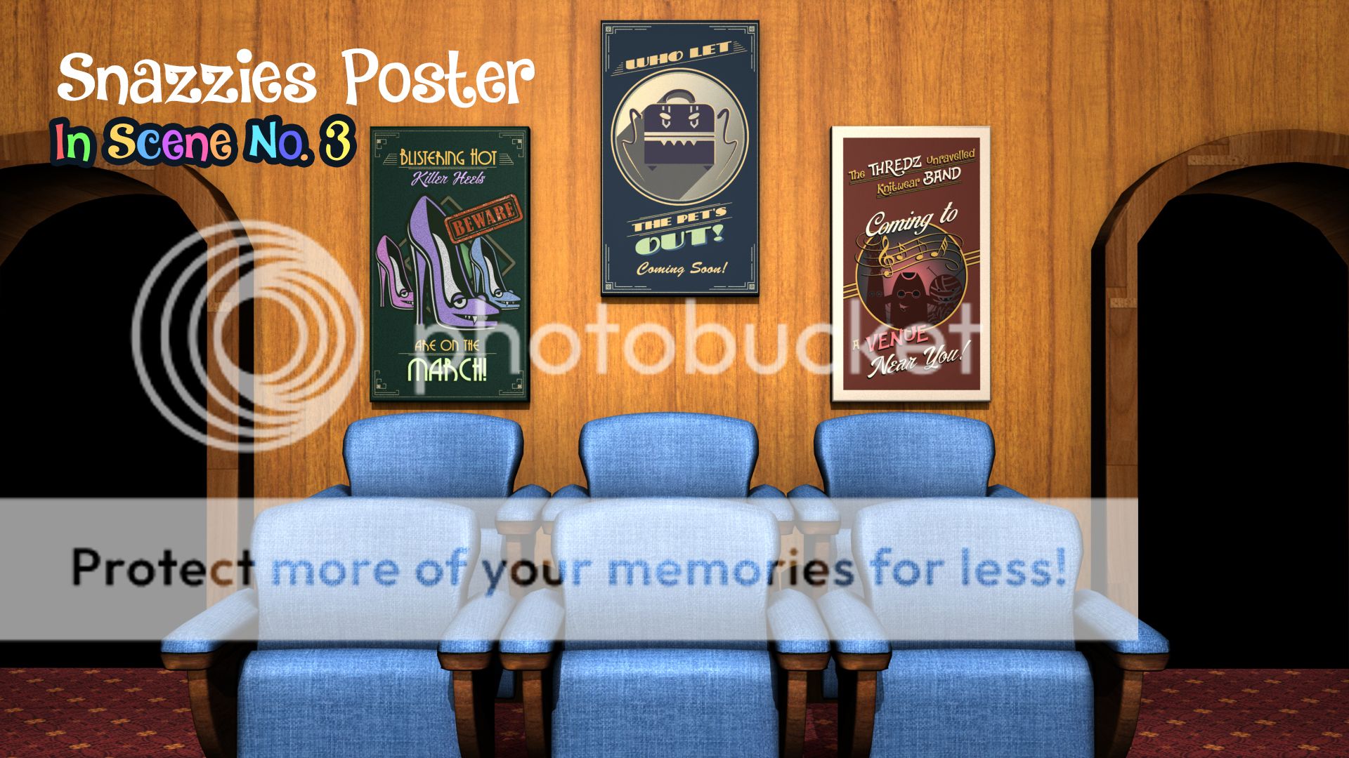
Last but not least you have all 3 of our posters in the scene lit by our basic light setup. They all compliment each other perfectly and will keep things interesting especially when we come to multiple viewings of this animation. What I love about it is you are advertising other brands which when it comes to this animation no one has seen. It expands the Snazzies universe virally and that will make the whole thing more interesting.
Anyway that's me I hope you like everything!
xXStItChXx

No comments:
Post a Comment