Hey Catherine,
I'm back with yet another post (3 of 4 if you can believe that). This one is about bringing everything together all the models/assets/characters into one scene for your viewing pleasure. Everything is lit from the light you helped me make from a front on shot (notice the shadows). I have seated our slinkies in their places and the artwork is on the wall. I just hope it doesn't disappoint whoever you are showing this too lol... Anyway onto business.
This is more of a distant render. You have to realise that our camera cannot go outside of the boundaries of the wall (with the exception of the back doors). Otherwise it just looks odd like they are actually sitting in a set. The camera will have to be close to them mostly (as I suspected we would). This is why there will not be much viewing of the side walls its just front and back shots mostly. If I recall its this simple in the script.
This is a shot looking up at them from a slightly lower position it brings their heads into the centre of the shot and also allows us to appreciate our lovely wall art. Its little flourishes like this that make the scene feel alive that were not just floating around in the dark with no substance. If I'm honest I saw us seeing much of this animation close to their faces not this far back... Except obviously when you have a shot of all 3.
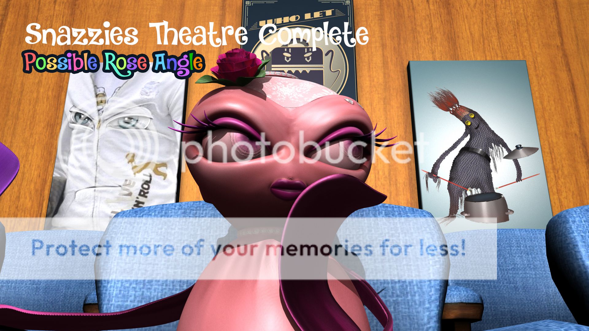
This shot is a close up of rose at a slight lower angle. As you can see the wall art is still present in most of the shots as clear as day. In an animation you could appreciate it but the point is that the Slinkies are the primary focus... Little decorations can sometimes inspire multiple views of animations. The colours of the images in the background are muted so they do not distract from the strong pinks on the Slinkies its a nice range.
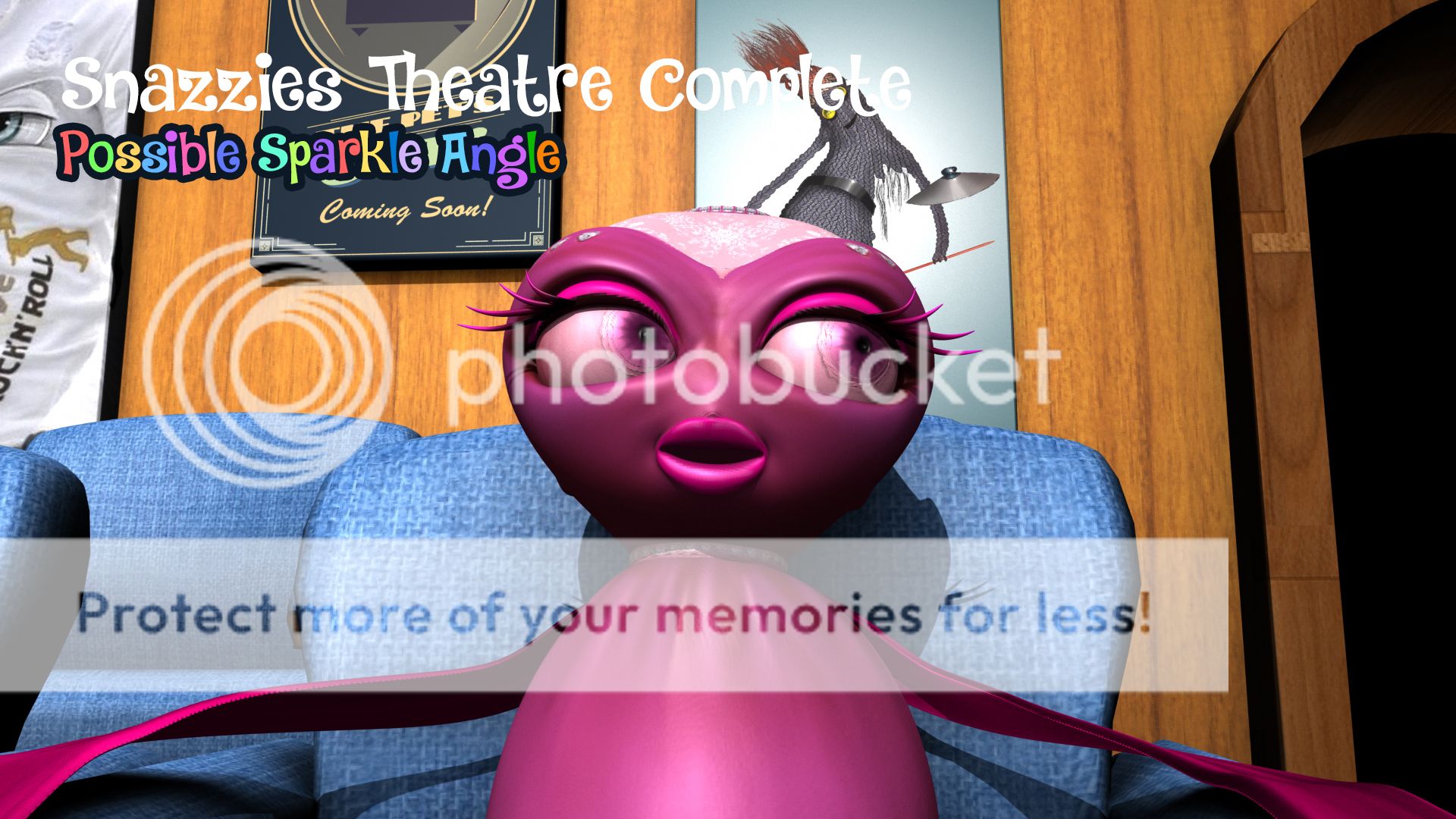
Next we have Sparkle at a slightly raised angle which I did similarly before... I kept these poses generic for now. No point in working your ass off on test shots. The lighting is quite nice here you cant even see the flaws in the geometry. If we had more time we could have done normal maps to give the chairs more depth and the walls but again that's more time on this and if I'm honest I wasn't supposed to go this far with the set.
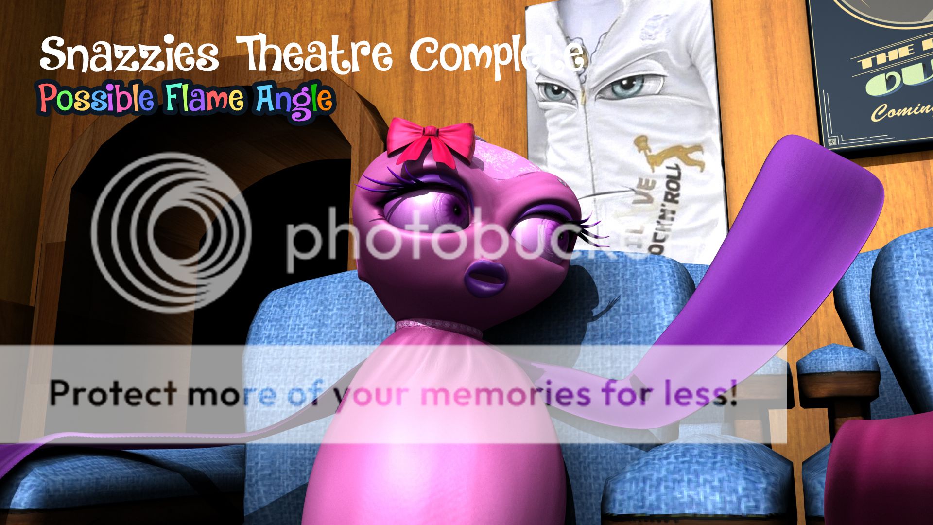
Last but not least we have flame I moved her hand out to get rid of the shadow but just so you know a front on light will cast shadows of their faces should they put their arm infront of their faces etc. so you'd best keep that in mind for the next post (lighting). Flames angle is less central here more off to the side. I figured you may want a bit of range in the camera angle as they discuss things... I don't mind going with my gut however.
Well I hope you have enjoyed this journey so far.
xXStItChXx


No comments:
Post a Comment