Monday 27 April 2015

The Snazzies: Saggy Texture Turnaround Mk1

Hey Catherine,

Okay sorry it took a while to get this over but I think you will agree that it was worth the wait. I'm hoping that this is the final version as it took a while to get these textures working so nicely. That being said I still want you to be happy so please send this to whoever you need to. I know you like to confirm certain things and that's totally fine. Regardless I hope its acceptable. The boxer shorts were not easy to texture. I may have to charge you a little for alternate boxer short textures (when we get to that).
The only thing I'm not entirely happy with is the eyes but again that may be something we address down the line (when you make your millions). Apologies again for the speed but like I said the larger I make these the worse they are on slower internet speeds. Anyway these Saggies were coated in my jeans (the textures) so you will be leaving this little outing with a piece of me regardless lol. I have to go mow lawns now but I'll fix the Slinky tomorrow.

Anyway let me know what you think!
> xXStItChXx

Sunday 26 April 2015

The Snazzies: Saggy Texture Renders

Hey Catherine,

Okay I went a bit insane with this model (lost a night or so's sleep) even looked to align a lot of it up with custom bumps. I also added rips in the geometry and lined most things up with the normal placements on the model. Anyway its reached a level which makes it look pretty authentic, its probably the best alignment job I have done on a model yet. I hope you like how he looks now.

As you can see from the image above he looks pretty badass, the textures are high resolution the only area which was hard was the boxers. The looping textures needed a seam so I had to add one down the back. The image above also has the eyes slightly repositioned just to give the face a little life (he's not rigged yet so its simple). I just thought you'd want to see how he looks.

These are a small selection of the textures used, the most commonly I'd say. I used the edges to spray my seams on. They were also handy to use for indentations around the back pockets/brows. I jumped between two pieces of software to texture this character more realistic and less uniform. Like I said I've never done this good of a job before and I'm really happy with how he looks.

I also remembered to knock up a small video showing me adding the rips to the Saggy. Please check out the video above! I thought it would be good for you to be able to see a little behind the scenes action of the modelling process. I meant to do more recording earlier on but I didn't want to go over board, some of this stuff can be hard to follow. This video is rather simple.

The image above shows the textures used in this particular model. As I mentioned before the texture maps are for paint details/colour/shade/etc. Normal maps create the illusion of depth and shadow when scene lighting hits them. They are key for adding an extra layer of detail on models. These particular normals come from a higher polygonal mesh and are projected onto a lower poly mesh.

Last but not least is the front and back sides of the model from a 3/4 perspective (its more dynamic then front or side on). You can see how tight the texture maps are, they should be though I got them from a HD camera and scans. Like I said I got a bit carried away with this but I wanted to give you a winner first time round I hope it is acceptable for his final look. I'm really happy with him!

I will do a turnaround next so please watch this space!
xXStItChXx

Thursday 23 April 2015

The Snazzies: Saggy Stitching Normals

Hey Catherine,

I have another small update for you just so you have further steps into the development process of these characters. Now I'm pretty sure I mentioned the use of normal maps particularly for the Slinky scarf post. That was a more minor use they can be used to add a number of details without compromising mesh flow. In this post I have used normal maps to extrude the pockets and seam surface detail.

The image above shows the model with seam detail from the front and rear (or reverse I'm torn between calling the back of jeans the front but its his face so lol anyway). I made all of these images quite big mainly because I want you to be able to get a closer look. I plan to add jean sewing texture to bump the mesh a little as well as add your rips going forward. That's next anyway.

The image above shows the model rendered in ZBrush and the resulting normal map which I use to add the surface detail to your mesh in Maya (our animation package). It creates the illusion of surface detail on lower polygonal meshes and makes things just generally look better without adding a chore for your animators/riggers/etc. I think you will agree its starting to look really good!

The image above shows the model in Maya rendered in wire (to show the edge flow of the model), basic (to show you the model without the normals) and normal mapped so you can see the differences between everything. Like I told you its always a smarter way of working if you can get things looking good with less (this is what I meant) low polygonal counts make things much easier performance wise.

The next image shows the reverse side of the model like I said none of this is etched into the model the map tricks the rendering engine into creating light and shadow which is not in fact on the lower polygonal version of the model. These normals are drawn from the higher model in ZBrush and then exported via map and plugged into a bump channel within the model texture.

Now the GoZ images are just to show you the a close up of the detail. GoZ was actually what I used to quickly port the model into an active scene. I probably won't do this when I export the final version just because it can leave a bit of a mess in the scene. Ideally you want to keep scenes clean to avoid any unnecessary lag, for characters you want everything to be clean so they can easily be added to another scene or environment.

I will post the final details tonight hopefully
xXStItChXx

Saturday 18 April 2015

The Snazzies: Logo Rough Ideas

Hey Catherine,

Okay I had a little play with your logos yesterday I wanted to roll the logo into something that could encompass the Snazzies (kind of like what you were trying to do with the "scarf S"). What struck me about the logos Matilda knocked up is that for an idea you are trying to brand to both genders it is very effeminate. Considering this I tried a few things professional and unprofessional but disregarding the pink pallet.

The image above shows the original vector images (2 tone black and white) and the same vectors after I have played with some effects. The key here as I said to you is that the shapes are interesting & dynamic not just horizontal. If I had more time to play I would have dabbled more but alas like I said duty calls lol. Hopefully though these prick your imagination a little, they are also more fun and are not particularly aimed at any gender.

The vectors can easily be used for anything (particularly t-shirts) they work without all of the detail and odds and sods. The shapes are what keep the eye interested. The colours just provide a little glamour. Again I am sorry for changing things quite so drastically but it was just to convey the dynamic angle which I felt was missing from Matilda's designs. Also you really should consider less gender centric colours if you wish to attract the male demographic.

The images above show these logos used on concept art or correspondence again you don't have to use the vector but its nice to be able to. The shape to any design is the real key because people respond to an interesting logo, typeface or exaggeration like they do professional works of art. A logo is art after all. Colours, tone and depth just make a logo more interesting but they are not needed.

Lastly more professional logos such as "Building" (above) are even simpler because they are usually standard block shapes with a static text. That being said I still prefer the logos and don't just follow the norm. You will see what I mean if you google any professional company logo (I used warner bros as an example). Anyway I hope all this helps, I didn't mean to lecture you about it but if none of these are for you perhaps it can help you find the ideal logo.

I hope this helps you Catherine,
xXStItChXx

Thursday 16 April 2015

The Snazzies: Slinky Vs. Saggy Scale

Hey Catherine,

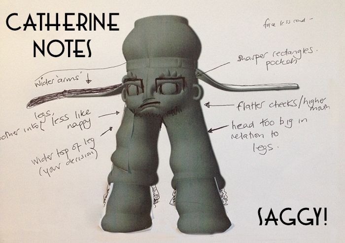
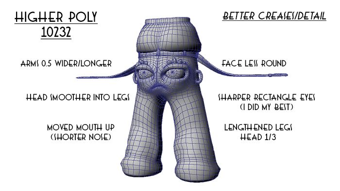
This update is a day or so late and well it would be nice to know because once I rig your options for rescaling diminish drastically. This is only because from my experience without certain adjustments rigged character meshes don't like to be scaled. I've had eyebrows distort, control curves move... it can be funky. So I did research which would diminish your need for rescaling after rigging. Lets get down to it.

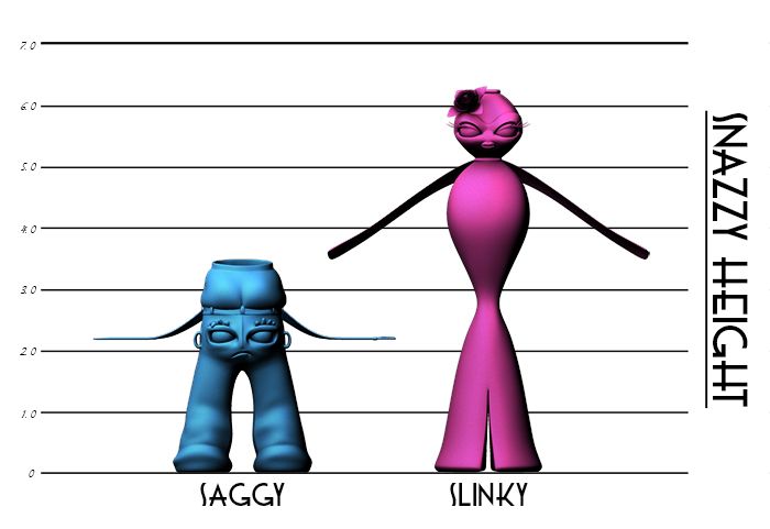
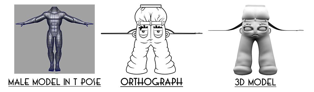
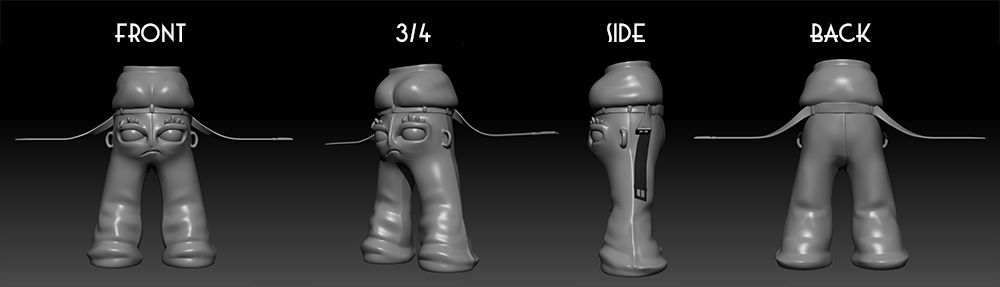
Firstly we have to find a size your happy with (real world). The image above shows the two characters in sizes which I like, this is based on a number of comparable scale factors: Eye size, arm length, body width and just general artistic observation. Of course please do give me your specifications if you think it isn't quite what you had in mind. If you could decide this before we rig that would be great.

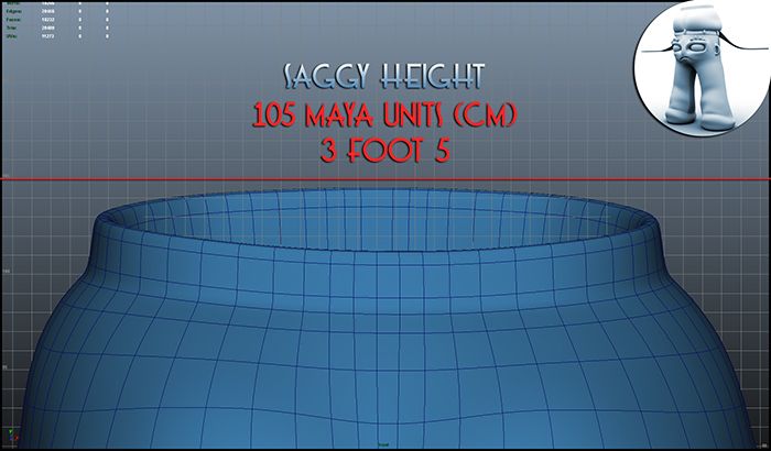
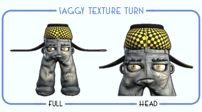
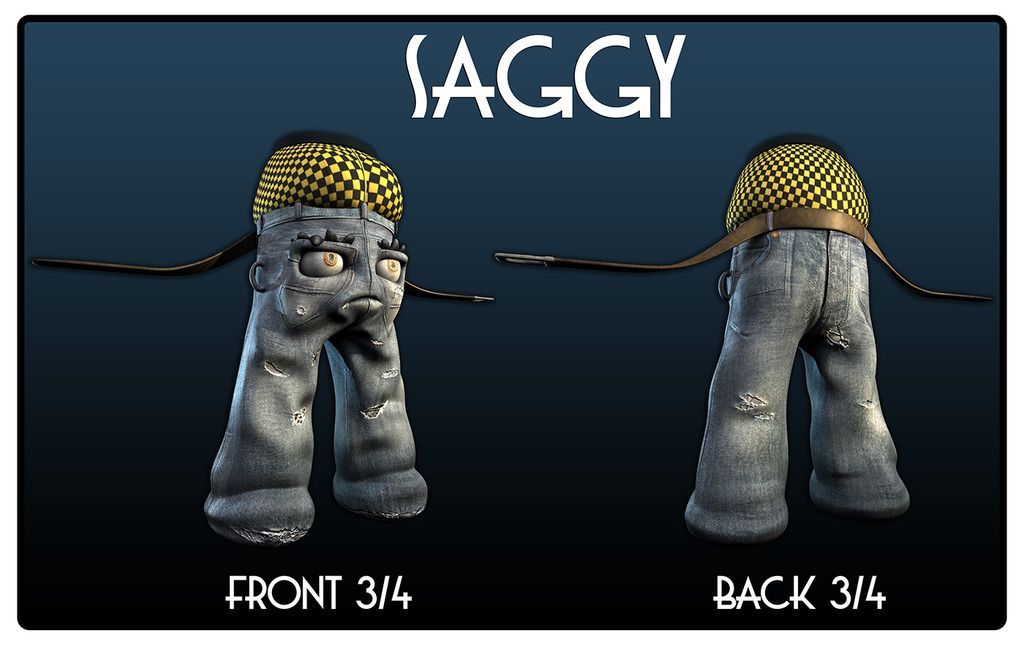
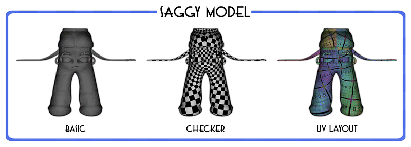
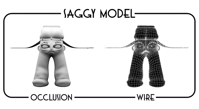
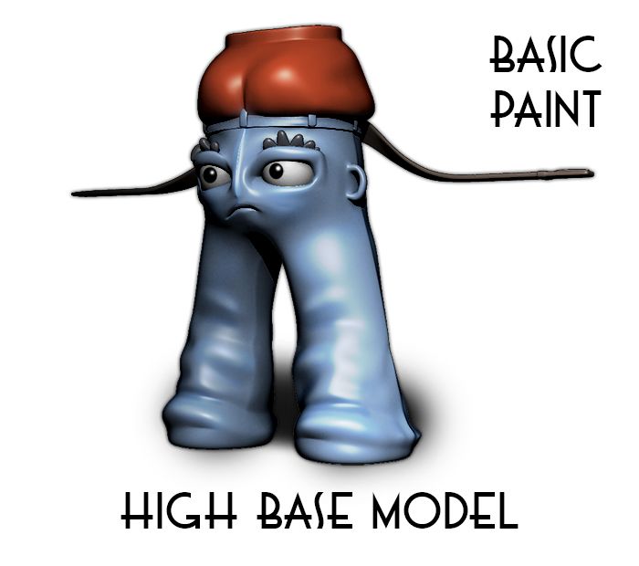
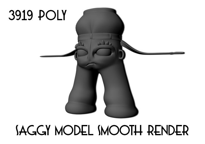
The Saggy I worked out at around half the size of the Slinky (less refined, lower class, an I don't give a f*** kind of character). The industry standard for figuring accurate scale is working it out in real world values (Maya by default uses cm). 105cm is 3 foot 5 give or take. Working it out to real world also enables the people who create 3D worlds or anything after to scale from the character. It becomes a rule for future animations.

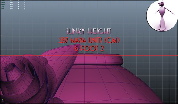
Now as far as the Slinky goes I thought tall, obviously (refined, upper class, a gown only for elite rich folk). This meant essentially making her double the size of the Saggy (give or take). 187cm is 6 foot 2 which felt right generally as I always imagine super models wearing this type of gown lol. Having seen both of them in the scene together I think it just works I can't really explain it (that's a good thing).

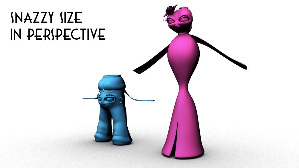
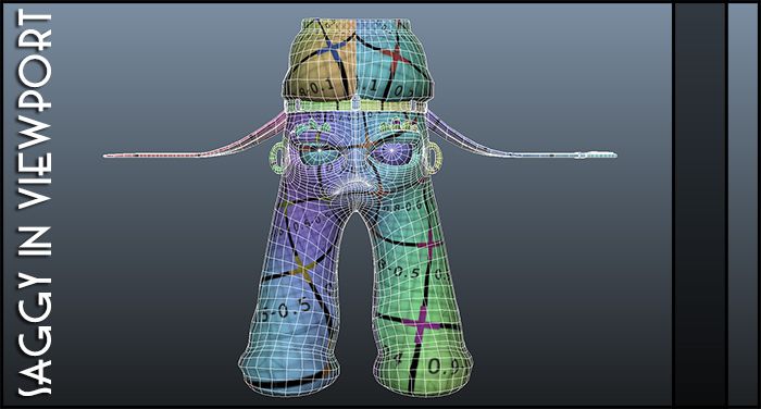
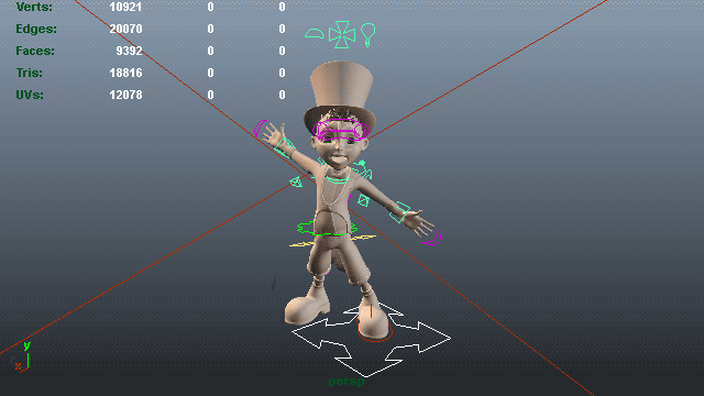
The last image (above) shows the characters in the viewport together (in perspective). It bothered me at one point how high her waist in comparison to his but that's anatomically/realistically. This is animation and if it works to the eye it just has a way of looking right. Anyway please let me know If you don't like how they scale together, like I said you can figure out the size of your world from these 2 starting blocks.

I hope this is okay, get back to me for confirmation.
xXStItChXx

The Snazzies: Saggy UV Mapping

Hey Catherine,

Its been a busy few days the UV mapping of this particular character I think I underestimated. It took all of yesterday and a bit of today just to get the UV maps to a place where I was happy. Its because of the higher polygonal mesh and some of the more intricate details built into the model (the belt buckle for instance was a total nightmare). The goal of UV mapping is to make things flat but damn it gave me a hard time lol.

Like the Slinky the image above shows the placement of the seams across the checker and UV grid test texture layouts. We are also looking for severe surface deformation. If a texture is pulling it won't lay correctly on the model and can look messy if you are not careful. There was slight puling on the Slinky and on the Saggy there was around the legs but I offset it so it should be good now.

The next image is the Saggy UV Layout. This is basically where I have spent my last day or so, making the model flat so it can be painted on with textures. The more dense the mesh the tougher it is to map because the model doesn't know where to put itself. You essentially have to break the model apart and reassemble it so it works correctly. This mesh is higher then the Slinky and that detail is in the arms mostly.

However what you are left with is quite a nice looking model here. It's already a better quality model then the Slinky at the atomic level. That being said the Slinky was a simpler shape and did not require a great amount of additional detail. I am going to have a little play over tomorrow to see if I can get the quality of these up, I am also going to investigate specular maps (for your slinky sparkly's).

Last but not least are your basic uv turnaround passes to show you the placement of the seams, etc, etc. You have heard this all before. I am happy with how this model has turned out, now I'm just looking forward to getting him textured/rigged and over to you. Please keep me apprised of the situation with the Slinky when Matilda has given you a confirmation on her look. We can chat a little tomorrow.

Well I think that's that, I hope you like what you are seeing.
xXStItChXx

Wednesday 15 April 2015

The Snazzies: Slinky Scarf or Fur

Hey Catherine,

I have a few more minor updates before setting into the rig and I'm going to need you to look at and consider all of them so we don't have to alter much after the rig. The less shifting we do after the better it is. Now where the Slinky is concerned I sat down and found a way to create a mesh scarf. I then used normal maps to create surface deformation so it has your folds but the geometry is good for a rig.

Having done it, I feel I had to share it with you and get your observations. Not to be too bias but this would be simpler to rig and less taxing on most computer systems (mine included). Again I'm not sure of your personal visual preference but that's why I felt I should give you the choices. I have however gotten normal maps working so the scarf deforms correctly. Please let me know what you think.

The image above is a normal map and I put the mesh UV over it so you could see where the model poly's go. Again more techno jargon but I think by now you are probably used to it lol. I feel the fabric is a little more in-keeping with your Saggy model too (thin material vs. thin belt). You ask how I know this? I put them into a shot together (next post) but yeah the fur felt a little much compared to the basic Saggy.

In static the image above shows the angle you can appreciate the scarf. I don't have to tell you that when these characters move they won't be doing "T-Poses" as much, if at all. I may even be able to rig the scarf in a similar way to the Saggy belt. Meaning it could elongate, curl, etc. Kind of like a cartoon limb, the technique is called "rubber hosing" or in the more technical sense "Ribbon spine".

My Benjamin character had a Ribbon spine it basically allows the character to stretch unrealistically. It kind of simulates the squash and stretch principles of cartoon animation which is quite cool. Please see my Benjamin character stretching his spine above. While we are on the subject though you are going to let me know if you have any rigging specifics or if it is just a basic rig.

Okay that's one of my concerns out of the way.... next.
xXStItChXx

Monday 13 April 2015

The Snazzies: Saggy Belt Debate

Hey Catherine, The name of this post is probably a little more full on then I meant but it made sense. Basically in order for the belt to look like an actual belt it kind of needs to be thin. Now the reason is probably because the pose of the character is throwing you a little. The base pose for most models (for rigging purposes) is known as the "T Pose". Its because it allows you easy access to the model without grabbing incorrect vertice points.

The image above shows a model someone else made in the T Pose (Generic Male) side to side with the Saggy Ortho and the 3D model. Now when we (humans) do the "T Pose" the upper arm faces down while the forearm faces out to the side (front on). In the Saggies case (a belt) the side (front on) is flat to make it too thick means it wont look like a belt but a blocky arm. This is only the pose for when I rig, and if you look at it from the top the arms are thicker...

As you can see its just how it looks from the front of the model. When he's rigged you will be able to pose him into loads of positions but his base pose will always be the "T Pose" its the standard pose for all models. When rigging you bind points of the mesh to bones within the model and then when you move the bones the model moves. That's how 3D animation works and for ease the "T Pose" is the standard for ease of rigging.

When you get close to the belt it looks fine its just because its at a funny angle (side on) so it looks small. The distance of the camera also doesn't help and the size of the image on these pages. If you look back at my former post you will see how thick the belt is and that it is pretty much on the money.

I hope that explains it, if not give me a call and I'll do my best.
xXStItChXx

Sunday 12 April 2015

The Snazzies: Saggy Adjusted Turnaround

Hello Catherine,

Okay I decided to do another rendering of your Saggys which are now adjusted to your specifications. I thought I would also provide the original turnaround in here so you can do some on the spot comparison. As I said on the phone to you the reason I keep the frame count low on these turns is so they don't take ages to load if you want it higher however let me know. Its just smarter for loading on the internet.

The turnaround above as you know is the original Saggy (you can click through the two to compare). Now after looking at it I can understand what you were saying about the full face. Either way when its textured you will not notice these issues so much I guarantee. This model was also a lower poly-count but I didn't want to sacrifice all of my crease detail... The higher you go the more detail you can have.

The turnaround above is the revised Saggy as per your requirements. Like I said previously the only thing that isn't too easy to do is make the eyes square. I tried doing it with the inside but they need to accommodate a sphere and go in to create eye sockets. This will look better when its textured. I'll have another look after I have UV Mapped it for now though I dunno its up to you.

Please let me know how you want to proceed.
xXStItChXx

The Snazzies: Saggy Model Revisions

Hey Catherine,

Okay to help me I went through your revisions I copied them into a notepad document and went through them one by one. I had to take it into my sculpting package to move the mouth seamlessly. I also used this opportunity to sculpt in some extra details, this is when I put the poly-count up. I also put the belt through the loops so it didn't just float. I hope that was okay. Please let me know if there's anything else!

I took your notes on board with the image in consideration and I think it looks more like what you had in mind. I was a little confused when I first looked at my text messages but your email helped clear things up so thanks for that. I tried to do my best but a few things may be a little less like what you had in mind but as I said there are reasons why things on models have to be specific. With that said lets get into it...

Okay as you can see I made the legs longer so the head is 1/3, the arms are slightly longer/wider & I flattened the face so it doesn't look like a nappy. The legs didn't need widening at the top the scaling was seamless. The pockets are a difficult promise to keep because as I said they need to support a sphere making sharp edges with that isn't easy... I did try though... It will look better when textured trust me.

The image above shows the high resolution Saggy model it retains some of this detail in the Maya version. This program allowed me to move the mouth up and shorten the nose. Making the eyes smaller will be something done on the texture. The spheres should be the same shape just make the cornea texture smaller. I also made the arms fit a little better and they are slightly longer/thicker. I hope this is all okay.

The final image is something I did so you could see the model crudely painted. I did some retouching in Photoshop because I wanted you to get a feel for how he is going to look in this form. Sometimes it helps to see the model in colour to help make an informed decision. When I sit down to do the real texture paint I will use what you guys suggest (again provide the textures if you can and suggest a scale).

Anyway please let me know if there are any issues!
xXStItChXx

Tuesday 7 April 2015

The Snazzies: Saggy Initial Turnaround

Hello Catherine,

Okay the initial turnaround is here for you approval. I haven't added the chains (as I mentioned in the prior post). I felt they were a little much. I didn't even know where to put them on the model. If you have them hanging that's more Maya dynamics (like the fur). I could rig the chains but again what do they need to do. You already have arms (I.E. the Belt). Anyway again please let me know if there is any more that needs doing before I get texturing. You may want to consult your artist about textures for the Saggy (just trying to save us time here) prior to me texturing. If you do please send me the textures you want.

I understand this is a bit of an overload of information, please check out my other posts and just confirm if/when you want me to texture. If you have any textures on hand that you want send/scan me them and ill apply them. Also let me know when Matilda comes back with the proposed texture changes on the Slinky. Once these are done I can get rigging and then you will have your models. When I am rigging though I am going to need a list of expressions you need the Saggy, etc to be able to do, etc. You may want to start researching that soon. Also think about how you want things to move, etc.

I hope you had a lovely Easter weekend!
xXStItChXx

The Snazzies: Saggy Model Final Dev

Hey Catherine,

Okay I am happy where the Saggy model is at present - I have laid in a tongue and a mouth box so it is pretty much ready to be textured (barring you approval on the turnaround - next post). The only thing I missed was the chain (mainly because I wasn't sure how it was going to work on your model. I think the belt pretty much does the job. The chain just feels a bit like overkill. Let me know if your sure you want it I'll add it in.

The image above shows once again how the model lines up to the Orthographic (still pretty nicely). I sagged the bum of the jeans a little more to make the eyes work more. It also makes the jeans ride a little lower on the back which is correct when we consider the ass of some guy rides above these jeans (in the boxers region). Anyway, that brings me to my next point (visualise away).

The image above is the model on a wire/shaded view (this allows you to appreciate the face more). I opted not to knock in the back pocket seams or the side pocket seams. As I told you before that may be difficult geometrically I don't want to add too much to mess up the rigging phase. The eyes also had to be a specific depth to fit. DW though I will put these details through on the texture as I said previously.

The next image is a comparison between the smooth and low original model view (using the face). Basically models at their roots are built low polygonal and are subdivided (smoothed) up so they look high quality (yes even films like Avatar). This is where discussions of poly-counts come in basically the lower the count the more you can have in a scene (without a powerful computer). I make my models low and generally rely on the renderer to smooth them keeping the scene small making things easy to navigate in the viewport and also making rigging a quicker process.

The image above is a render of the Saggy model smoothed in mental ray. The poly-count is quite low when you consider film artists don't generally care about it. I, however am a gamer at heart and games modellers optimise for games engines. It is nice to have a pretty model don't get me wrong but I like to do it so most machines can run it. If you can make a model look good with less its the best policy in my opinion.

Okay I hope this didn't go over your head too much, I hope you like it!
xXStItChXx

The Snazzies: Saggy Model Detailing

Hey Catherine,

Apologies for the delay on getting this post over to you I wanted it on here yesterday but I had to go out to a family function. This has resulted in a bit of a backlog on my part so I'm sorry for that. With that said I have a few things to show you please let me know if there are any problems with how he looks now. I am kind of happy where he is and the extra details were fun to make.

The Belt quite a simple thing really I wasn't concerned about it I just wanted to make sure I could get it to wrap round the waist quite nice (similar to your drawing and thus the Orthograph). It is probably quite high in poly-count (techno speak) in comparison with the Saggy Body. But I am optimising for performance here and if it looks good I don't see a problem. It should work to your favour.

The Glove Brows were a little more organic to make (obviously) I just mirrored them across once I made one and altered the second very slightly. Probably the hardest part of doing this was making it so one of the fingers flaps down over his eye. This model is largely asymmetrical so I figured I'd copy that detail over too. I hope you like it, I think it makes him look funnier.

The Seams (which I matched to create your centre bum line for the boxers) were again a little fidgety but I thought it make the jeans look more refined in the viewport. The thing that bothered me most about the slinky was how spherical things were. Things tend to look more authentic when they sag but the slinky was a pristine thing (I'm not used to that haha), still it was fun!

The last thing and its minor but I thought it was worth mentioning. The Belt Loops for the model are in place its a bit of an issue to fit the belt through (mainly because the front doesn't have loops as such). You also cannot appreciate the button on the jeans because its hidden behind the belt. I didn't think this through when modelling but I was following the original concept to the letter.

Anyway let me know if there's anything you don't like here...
xXStItChXx