Hey Catherine,
Okay I had a little play with your logos yesterday I wanted to roll the logo into something that could encompass the Snazzies (kind of like what you were trying to do with the "scarf S"). What struck me about the logos Matilda knocked up is that for an idea you are trying to brand to both genders it is very effeminate. Considering this I tried a few things professional and unprofessional but disregarding the pink pallet.
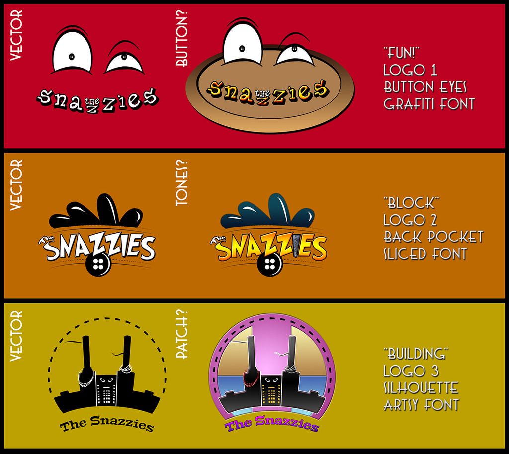
The image above shows the original vector images (2 tone black and white) and the same vectors after I have played with some effects. The key here as I said to you is that the shapes are interesting & dynamic not just horizontal. If I had more time to play I would have dabbled more but alas like I said duty calls lol. Hopefully though these prick your imagination a little, they are also more fun and are not particularly aimed at any gender.
The vectors can easily be used for anything (particularly t-shirts) they work without all of the detail and odds and sods. The shapes are what keep the eye interested. The colours just provide a little glamour. Again I am sorry for changing things quite so drastically but it was just to convey the dynamic angle which I felt was missing from Matilda's designs. Also you really should consider less gender centric colours if you wish to attract the male demographic.
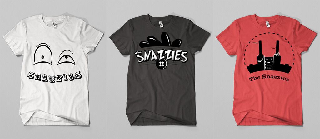
The images above show these logos used on concept art or correspondence again you don't have to use the vector but its nice to be able to. The shape to any design is the real key because people respond to an interesting logo, typeface or exaggeration like they do professional works of art. A logo is art after all. Colours, tone and depth just make a logo more interesting but they are not needed.
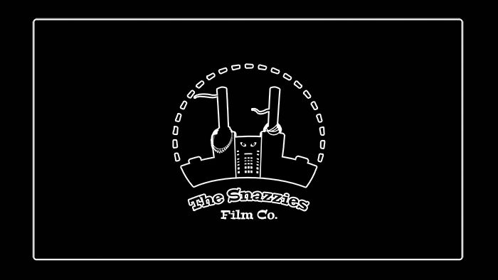
Lastly more professional logos such as "Building" (above) are even simpler because they are usually standard block shapes with a static text. That being said I still prefer the logos and don't just follow the norm. You will see what I mean if you google any professional company logo (I used warner bros as an example). Anyway I hope all this helps, I didn't mean to lecture you about it but if none of these are for you perhaps it can help you find the ideal logo.
I hope this helps you Catherine,
xXStItChXx

No comments:
Post a Comment