Sunday 29 March 2015

The Snazzies: Saggy Model Day 4-5

Hey Catherine,

I spent a few days getting your model "correct" which means getting it into the correct shape, playing with creases for the jeans, making sure the topology played right and I also sculpted a bit of detail into the mesh. What this means is the model will hold most of its shape meaning the textures should add to the density. Anyway you will see what I mean when you look at the photos below.

The image above shows the Orthographic view in Maya (which I use to plot the model from flat planes. There is no perspective in these views as I explained before which is what makes the view so unique. Anyway as you can see the model folds rather nicely. I could go to town with it in my sculpting program but I want to get the model made and I'm sure by now you want to be able to use these lol.

The above are screenshots of the model so far, don't worry I haven't forgotten about your bum crack and I am well aware of the lack of eyes etc. I just wanted your feedback on my comments in the Orthograph post before committing to the design. I wanted to make sure you are happy with how he looks now. If you could get back to me on that as soon as you can I will proceed with the next phase.

The next shot is the back of the model, I thought you'd want to see how it looks in contrast to the front. Notice that I added the jeans seam down the side I'll see about etching in the pockets in a similar fashion. The eyes are my next move, after that the lips are not really a big challenge. Again though I would like to know what you think of keeping exterior lips which lead to an interior tear (mouth box).

Last but not least the last image is a smooth render of the model, I think it looks on the money as far as the design is concerned and I hope it conveys drapery weight. I had to study drapery closely to get a good idea but I think this works now. The front profile (derived from your artist) is a little incorrect. Jeans for the most part are straight they only bag up at the bottom.

Anyway please let me know what you think and give me your opinion on the new Orthos!
xXStItChXx

Saturday 28 March 2015

The Snazzies: Saggy Orthograph Revisions

Hey Catherine,

As per your instructions I have adjusted the Orthographics accordingly apologies for the delay in getting in touch had a few interviews last week. Anyway there are a few technical issues to discuss in regard to how you want the model to look. I'm going to suggest a few ideas and yeah you let me know which one you think sounds about right. This model is going to be easy once I get into it so going forward there shouldn't be much of a wait.

Okay I'm going to rattle off what you asked for first of all straighter tops to the boxers easy peasy and no problem. I have added folds and your bum-crack but as I stated aside from the key creases (that change the shape of the model) the fabric folds are going to be drawn on via the texture... its just simpler and results in a clean animation ready model. The more complexity the more your risk of getting weird deformation when it animates.

The image above shows some guys asscrack (which I used for reference - go me) I will make sure the crack is a defining feature in the geometry but it may be more evident in the texture... just to let ya know. Added his ears/hoops simple to add that to the model. I sagged his eyes but again they have to accommodate a sphere so shapes may vary. I also changed the brows into gloves erm I'm not sure how that's going to work on the model yet it will probably be separate like the lashes.

The image above shows the altered head turns on the orthograph sheet. Now last but not least is the mouth shape which I know you want to be some kind of tear. Rips are okay but it is essentially a mouth so lips are needed unless the character always has an open mouth. They can be asymmetrical, hell when he opens his mouth there could be a tear inside which leads to the interior mouth. That would probably be perfect, I recommend that!

Last but not least you have the full body turns. At this point the creases don't line up (one of the reasons I didn't want to put them on the Orthographs). I did manage to get them better this time round (having studied a pair of my own Jeans carefully - how they drape, etc). Funny I never really paid attention to it before lol. Anyway it will be different then the model but as a rule of thumb it usually is. The modelling process helps iron out lots of flaws in the design.

Anyway I hope this helps!
xXStItChXx

Monday 23 March 2015

The Snazzies: Saggy Model Day 1-3

Hey Catherine,

Okay for this particular model I dived right in without the Orthographics at first just to block in a shape of some shorts. Its quite simple and I've already done it with a few characters. I added boxers but the size is not quite exact and I would like to have a better bunching of the material. This will probably involve a bit of sculpting but it should be pretty straight forward.

The image above shows how the rough shorts look smoothed again these are more to block the shape I will be making them according to the specifics of the orthographics from this point. All the same I need your confirmation of the Orthographics so I can get working on the model revisions. So please refer to the Saggy Orthographics and give me your approval and I will adjust this model so it looks similar.

I have some toon eyes which I have created for a number of characters. One thing I will remind you of when it comes to making eyes for these characters is that the brow has to be further protruded then the eye socket. I know you like the idea of buttons as eyes but again they have to follow rules so they rotate without protruding through the characters head. They also have to rotate evenly so spheres are a must.

The image above shows the back view of the model where the face will be. I will do my best to make the eyes function as back pockets but again they cannot be too long they have to accommodate spheres. I also wanted to say to you that we should cover the inside top of the trousers so once again you cannot see inside the head of the trousers (where the eye-spheres and mouth-box will be).

Anyway confirm the Orthographics and I will continue onward on Weds.
xXStItChXx

The Snazzies: Orthographics Dev Saggy

Hello Catherine,

Thought I'd get this over to you before the power cut in my area tomorrow so please take your time to peruse. We can have our chat on Wednesday. Suffice to say I completed your Orthographics and started the Saggy model. Things are coming along quicker but I knew they would, fur can pose problems and feathered arms was always going to be a little issue. After this we can revisit the texture job on the Slinky.

This is the image I used to create the Saggy Orthos, I used it as a basis for the front... the same as the Slinky. Created the other sides based on my own interpretation. Please let me know if you don't like the shape and we can do what you did with the Slinky before: Draw your own lines and I will copy them to the specifications you require. Regardless the turnaround should be pretty quick.

The image above shows the original full body image of the Saggy character with a turnaround for the head. I created simple chain links separately and the belt is obviously going to be asymmetrical in regard to the hands and movement. You will probably have to tell me what you want to do with that when it comes to rigging. Either way this should be pretty easy to recreate.

Next comes the full body Saggy Orthographs. I don't mind saying that this character is quite nifty looking even in the Orthographs I wasn't sure what to do when it came to the side legs. I'm not very seasoned in drawing drapery (pooled Jeans) but I gave it my best shot. The front and back is a little wider then the sides but that is how jeans are meant to be (to accommodate a human waist).

Anyway I hope these are okay, let me know if there are any issues!
xXStItChXx

Wednesday 18 March 2015

The Snazzies: Slinky Texture Turnaround Mk1

Hey Catherine,

I got your emails don't worry I am ploughing away at the Saggies but I did spend a little weekend time rendering out a full turnaround of the Slinky texture job I did. Now I know you have adjustments but I thought it would help if you could see the whole model to decide if there was anything more you wanted me to change. I made the texture more discernable by enlarging the sequins and thus their respective bumps. I will adjust these based on your instructions but let me know if there is anything more.

The image above shows the turnaround of the model as it stands now. Please ignore the fur misplaced fur patch on the full model its something I overlooked its fixed now. In this case just look at the model and textures and decide if there is anything more then the instructions you gave. I don't mind changing anything I'll give you a costing for the adjustments you want. Anyway I just thought this would help in your diagnosis of the model while I get the Saggy to the same place.

xXStItChXx

Wednesday 11 March 2015

The Snazzies: Slinky Texture Renders

Hey Catherine, Spent most of today playing with your slinky getting her nice and textured. I have done a quick once over in ZBrush before moving things to photoshop for some detail tweaking. I have also did a test render with some fur just to get an idea of how she looks in her complete form. The renders will take a while to complete but I think you will agree it looks pretty nice so far. I'll have another play tomorrow.

The image above shows how the face looks now that it is textured. You are going to have to let me know if you like how she looks and if there is anything you wish to change at this phase. I painted the brow section of the dress using the colours provided by the material sample you gave me. Transparency is not something you can have on this section without it showing the inside of the dress and yeah its best if that doesn't happen unless you want people to see the back of her eyes, etc.

The image above shows the textures I used, some of which you provided me others I had to research to get something that had less lighting effects (textures have to be flat so the shaders can do the light, dark, etc. The colours are easily interchangeable in photoshop so if youd rather things were more pink just let me know. I based this initial texture job on the original concept art that you sent me I hope that's okay.

This is how the texture looks when it is flattened down. I can paint on this or do whatever and it will translate onto the model when I update the texture maps in Maya. As you can see things are relatively flat. I wasn't sure how big you needed the sequin dress design but as I said let me know if there's anything you don't like. Regardless the render settings look quite nice and so far I think its looking good... See below!

Well as you can see from the 2 images above things are starting to look pretty nice here. Again let me know if there is anything that doesn't look right or has changed since its inception. The fur test is just a temporary small test I did because it was getting late. I still have to play with the settings a little but I had to get an idea of how it would look so I stuck some default fur on and changed the colour.

Anyway I hope you like the new developments!
xXStItChXx

Tuesday 10 March 2015

The Snazzies: Slinky UV Mapping

Hey Catherine,

Okay this is the UV Mapping post so I'll warn you know this is a bit technical but I'll do the best to explain. Basically UV Mapping is what allows us to place textures on otherwise simple shader models. It allows us to literally paint our model with textures or polypaint if we so choose. Its essentially painting on a 3D surface... we paint flat in 2D but the dimensions of the model make it 3D.

Probably one of the most important aspects of UV Mapping is seam placement. The seams of a model are areas which can pull or partially distort our 2D textures. So we have to place them in locations where they will mostly be ignored: Under an arm, on the very edge of a leaf, down the side of a dress. Places where the eye will not look for them. If the UV Mapping is done right they cause minor problems but placing them is still a key process.

Above is the UV Layout of the entire Slinky model. The UV Layout is a reference grid created by our model defining the surface where the artist is to paint or texture. We break these up to make it easier to know what we are painting. Where the models are broken is essentially where a seam is and like I said placing them on crevices or sharp edges is the best place if possible. If it isn't try to place them where they cannot be seen.

The image above shows the Slinky in the viewport of our 3D program Maya 2013. I have placed a UV Grid over the model to show me how the model distorts the model if any. This can also be done using the checker texture. These basically help us diagnose any problems within the texturing. A model with minimum distortion will paint with the slightest abnormalities. The z dimension of the 3D model will make our flat textures 3D.

Last but not least the animated gif above shows the models and their seem distortion from a 360 degree turnaround. From this you can see slight interruptions in the checker and layout patterns. These are essentially where the seams are placed, hidden from immediate viewpoints (like the front of the model). As I stated previously the textures are flat the model and its shaders/lighting are what give the character dimension.

Hope I didn't get too technical but I just thought you might like to understand it a little.

xXStItChXx

Sunday 8 March 2015

The Snazzies: Slinky Additional Fur Tests

Hey Catherine,

Apologies for the delay in getting back to you, my dogs been Ill all weekend and yeah sleep has been a bit troublesome. Never the less I have done the further renders you requested and I tried something else... I created another Fur test from Test no.3 only thing one has shorter fur (to take account for lack of dynamics in the fur. I have named it "Test no. 7" because it is new but I thought I'd try it to see what you thought.

Okay the image above is "Fur Test 3" from the original batch only now as requested it is full body. Again I'm not entirely sure what your looking for from this wreath. I just thought the fluffier the better. Having looked at these wreaths (and at one occasion having worn one) they are generally extremely soft. Never the less there's no rush just let me know which or if you need any further samples.

Next is the other favourite of ours "Fur Test 5" again my only concern with these furs being long is that they will look odd if they move without dynamics such as gravity and force. Once I have them rigged I will conduct a couple of experiments with the fur to see if they can be changed per character I know that was another concern of yours. I don't see a reason that it shouldn't be possible I just don't want to say with certainty.

Okay now based on my favouritism of Test 3 I have created "Fur Test 7" the only element which has changed is the noise length of the fur. I did this to give you another option. Basically the length of the fur is half of what Test 3 is. The only thing I wanted to consider here was making 3 more mobile... The mass of the fur is going to be the toughest sell when animating the character. Never the less don't let it sway you, if you like 5 or 3 or whatever we can make it work.

Okay, I hope everything is well and apologies for taking a while to get back its been a bit of a hectic weekend. If you need anything more on these fur tests let me know. I'm back on texturing.

xXStItChXx

Friday 6 March 2015

The Snazzies: Slinky Favourite Fur Test

Hey Catherine, Okay I've gone through your choices and changed the colours to the standard colour which I based on your concept art. In your email you asked if I like any of these and well to be honest the one I liked was the blue one. I guess I liked the idea of soft and fluffy and I gotta say I love the blue can't put my finger on why but I think I like the way it offsets the rose head detail.

Anyway, I brought down all of the colour options to the standard pink so now it should make it easier for you to choose based on fur style and not colour. Apologies for that I think I kind of got carried away trying out colour combinations. I concur with you though after the blue one my second was going to be No. 5 I just like the length and I just wasn't sure if it was too rough.

I think 5 kind of reminds me of fur from Sesame Street you know the cookie monster. It kind of feels much more like fur then feather maybe that's why I kind of swayed towards the blue soft feathers because I thought you wanted a feather style wreath. Don't take that as a bad thing though, I believe in trusting my gut and I think it could just be crazy enough to work.

Last but not least the infamous No. 6 which can now be seen without the balding black undertones which the white may have given it. Again this goes back to the fluffy side but brings the mass down quite a bit so you can really appreciate the tapering fur as it cascades down the arms. One of the things I was afraid of when doing these was that they wouldn't taper enough so I tried to keep the mass low.

I hope these help you make a decision.
xXStItChXx

Wednesday 4 March 2015

The Snazzies: Slinky Fur Test Passes

Hey Catherine,

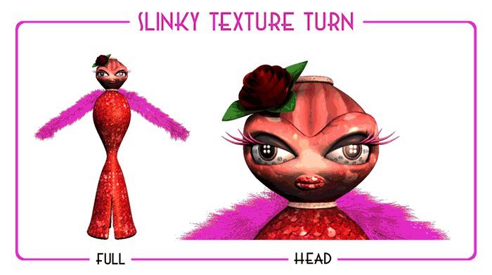
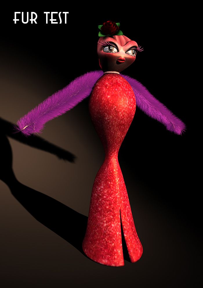
Okay I got a few test renders which I made using different settings in the fur options box. I also created a few colour variants so you can get a feel for the colour options. I get that the "rose" slinky has a pink waist wreath but this is so you can see some of the other colour options. Obviously when it comes to fur colour the sky is the limit. If you find any you like on the internet let me know I can recreate them.

Please let me know which one you prefer, you can click them to enlarge them.
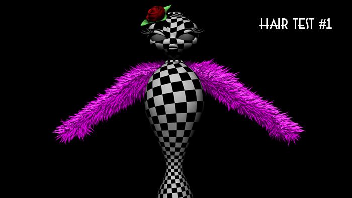
Hair Test #1 was my initial test, the roll of the fur is up quite high so it is more condensed. I also added small clumps to the fur to try to get it to feel more like feathers. The length is increased by a noise amplifier which I kept at a default setting. This gives the setting its fur volume. Everything else is kept close to its default the fur was slightly cut as it drives down the arms.

Hair Test #2 was adapted from its predecessor the roll has been lowered to spread the fur a little more outward. I also upped the noise amplitude in the length to retract it a little. The key here though was reducing the scale and density of the fur to get it more aligned with the underline arm geometry so the fur follows the shape of the arms a little more. I tried to keep it simple.
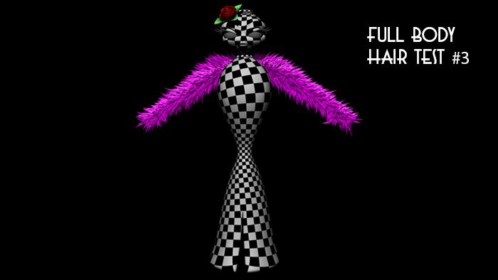
Hair Test #3 I wanted to go as close to default as possible so I got rid of most of the noise settings and tried my best to get a more "fluffy" fur style. I also emptied my "straggle" and "clump" settings to get things close to fluff. I also put the density back where it was and brought the scale back up. Also I have not mentioned this in the others but the colours differentiate with the root depths being obviously darker then their tips.
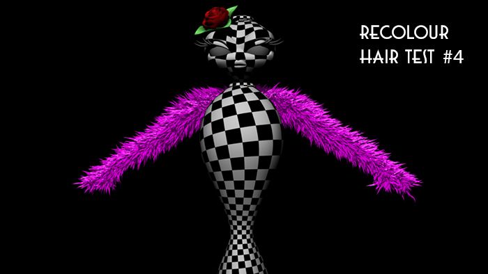
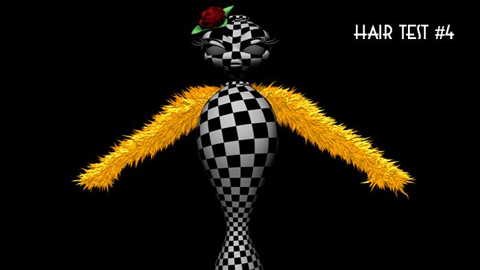
Hair Test #4 brings back the "clump" and "straggle" settings you can notice this by looking at the curly ends of the fur. I was also adding slight amplitude values to the noise properties for the "tip" and "base" settings of the fur. The "roll" setting also gets a higher value to bring the fur closer to the arm. I also brought the "density" of the fur back up to populate it fully due to the increased roll.
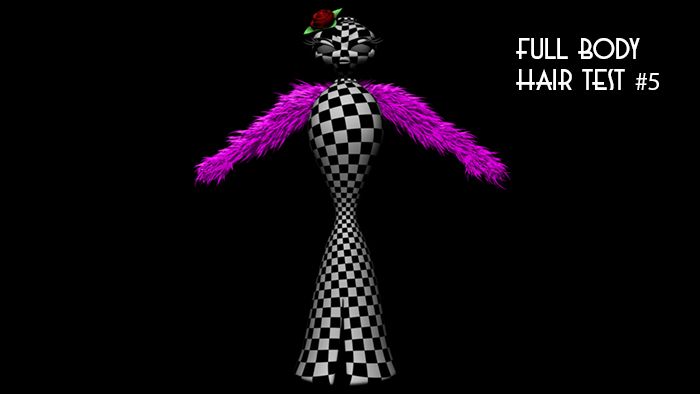
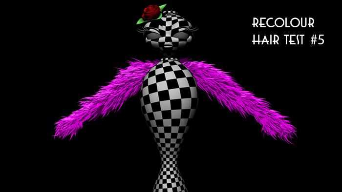
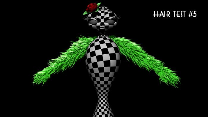
Hair Test #5 has a much lower tip and base curl increasing the volume of the individual hairs. I also upped the clump setting to bring these furs together I then increased the clump "frequency" and "shape". The amplitude of the length was also increased higher to bring the fur out further. The "roll" was also brought down slightly so the fur wasn't too close to the arm and so its length compensated for its depth.
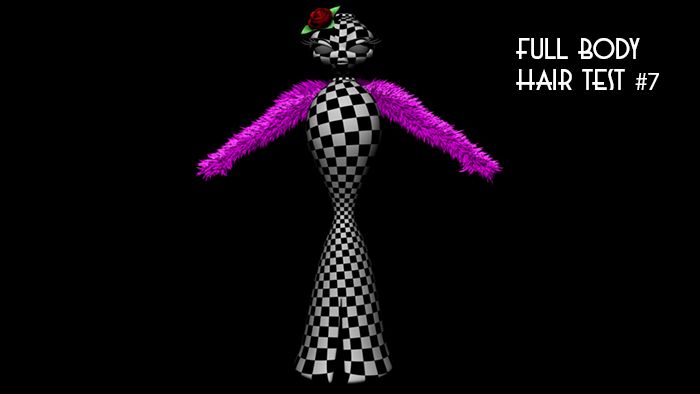
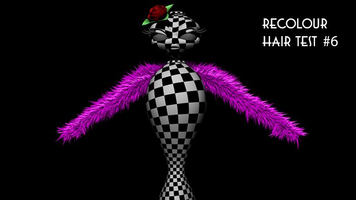
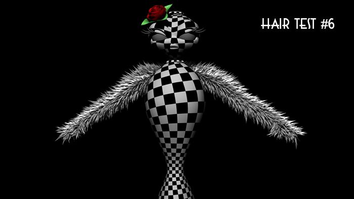
Hair Test #6 for this test I removed all "straggle" & "clump" settings back to 0 and brought the "base" and "tip curls" back to default. I then brought up the "length amplitude" and "offset" the fur depth so it was closer to the arm while keeping the fur volume. I also increased the "specular sharpness" to condense the light impacting the fur. I also brought the "roll" back to default to fluff the fur up a little.

All of these fur settings were creating using the base "squirrel" setting with various adjustments to the fur sliders. Sorry if this is all confusing to you Catherine. Please just check them out and see which one you like the best. Even if you like a combination of the two let me know.

xXStItChXx

The Snazzies: Slinky Nhair Tests

Hey Catherine,

As we discussed on the Phone the Nhair option is not viable for this particular stage in the project mainly because of its tax on mid range computers. On your reply email you also mentioned that this would make the download more intense. It wouldn't, the only thing that determines a videos download rate is the quality of the video. Everything is composited before then and used to create the short or VLog entry.

You may have to wait for these animated gifs to load to appreciate them properly.

The gif above is the default application of the nhair system. As you can imagine the only thing calculated initially is the gravity of the hair which you can alter by changing the gravity amount or altering the tensile strength of the hair. These hairs can be turned into mesh shapes (which can be changed into a shape similar to a feather. This was nice but as I said it slows the viewport and will be a nightmare for animation.

The gif above shows the forces that can be applied to the hair. You can turn on wind which reacts in addition to the gravity in the scene. Like I told you on the phone it is all very clever stuff. The problem as I mentioned is the more stuff you introduce to the scene the slower the scene gets bogged down. Its because it has to calculate a lot of things so it makes workflow quite hard unless you are on a high end machine.

Last but not least is the collision object settings which tell the hair that it cannot go through certain things. In the gif above I added collision to the body mesh and you can just see that the hair hits it but will not go through it. You may also notice that the scene is moving slower... that is the viewport lag I was talking about. If too much goes on my machine cannot handle it.

Anyway I thought I'd give you a bit of a looksee at the possibilities.
Like you said maybe in the future you can look at this method.

xXStItChXx